FabCon is coming to Atlanta
Join us at FabCon Atlanta from March 16 - 20, 2026, for the ultimate Fabric, Power BI, AI and SQL community-led event. Save $200 with code FABCOMM.
Register now!- Power BI forums
- Get Help with Power BI
- Desktop
- Service
- Report Server
- Power Query
- Mobile Apps
- Developer
- DAX Commands and Tips
- Custom Visuals Development Discussion
- Health and Life Sciences
- Power BI Spanish forums
- Translated Spanish Desktop
- Training and Consulting
- Instructor Led Training
- Dashboard in a Day for Women, by Women
- Galleries
- Data Stories Gallery
- Themes Gallery
- Contests Gallery
- QuickViz Gallery
- Quick Measures Gallery
- Visual Calculations Gallery
- Notebook Gallery
- Translytical Task Flow Gallery
- TMDL Gallery
- R Script Showcase
- Webinars and Video Gallery
- Ideas
- Custom Visuals Ideas (read-only)
- Issues
- Issues
- Events
- Upcoming Events
Get Fabric Certified for FREE during Fabric Data Days. Don't miss your chance! Request now
- Power BI forums
- Forums
- Get Help with Power BI
- Desktop
- Calculated measure based on date hierarchy
- Subscribe to RSS Feed
- Mark Topic as New
- Mark Topic as Read
- Float this Topic for Current User
- Bookmark
- Subscribe
- Printer Friendly Page
- Mark as New
- Bookmark
- Subscribe
- Mute
- Subscribe to RSS Feed
- Permalink
- Report Inappropriate Content
Calculated measure based on date hierarchy
Hi,
I have a calendar with date/week/month hierarchy on which I show a line with a calculated "Average Value".
I created another measure named "Trend" to calculate the ratio between the "Average Value" of the first selected date to the "Average Value" of the last selected date, as follows:
Backlog Trend = (CALCULATE([Average Value]),LASTDATE('Calendar'[Date]))-CALCULATE([Average Value]]),FIRSTDATE('Calendar'[Date])))/CALCULATE([Average Value]),FIRSTDATE('Calendar'[Date]))
This calculation will always show the same result, no matter which date hierarchy is selected (day, week, month)
I would like to calculate this measure based on the selected hierarchy so that:
If a "Week" hierarchy is selected, the "Trend" measure will show the ratio between the average value of the first selected week to the Average Value of the last selected week
In the same manner, If a "Month" hierarchy is selected, the "Trend" measure will show the ratio between the average value of the first selected Month to the Average Value of the last selected Month
Is this possible?
Thanks
- Mark as New
- Bookmark
- Subscribe
- Mute
- Subscribe to RSS Feed
- Permalink
- Report Inappropriate Content
Hi @Anonymous,
What do you mean about "a "Week" hierarchy is selected"? Are you using the custom visual HierarchySlicer? Could you be more precisely with it by posting some screenshots? ![]()
Regards
- Mark as New
- Bookmark
- Subscribe
- Mute
- Subscribe to RSS Feed
- Permalink
- Report Inappropriate Content
Sure, here are some screenshots that will explain this better.
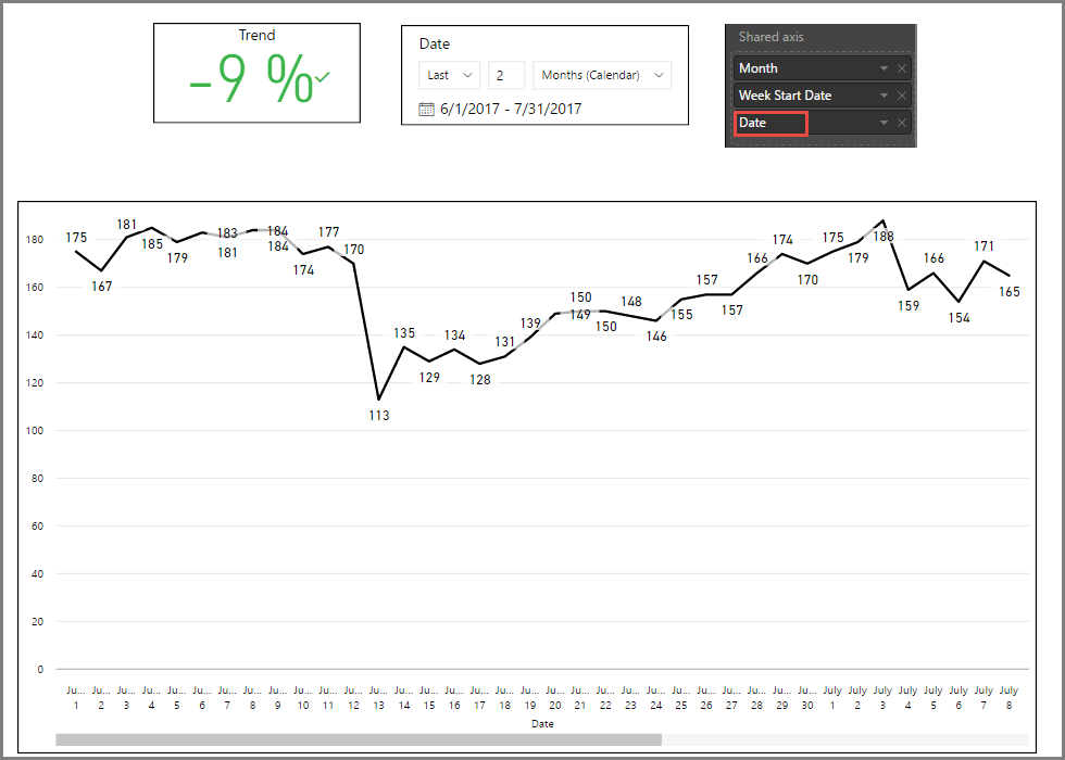
First, this is the line chart with values of last 2 months, where the Date axis is set to days/dates:
The last value on the line (which you cannot see) is 160, which is 9% less than the first value (175), therefore Trend=-9%
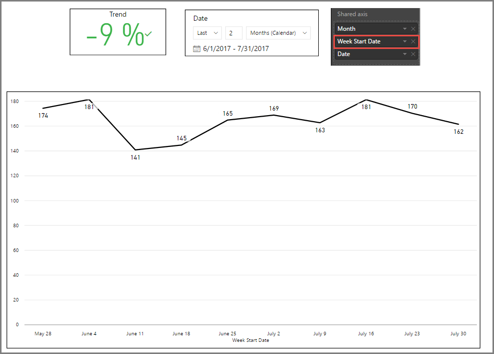
Now I change the date hierarchy to show weeks in the shared axis:

As you can see, the Trend result remains the same, as my "Trend" measure relates to the first and last values on the selected timeframe. However, it is now confusing. The values I show on the graph are averages. I would want now the measure to be able to compare the average value of the last week (162) with the average value of the first week (174). The result should be -7%.
So I am basically looking for a calculation that can be "aware" of the date hierarchy that I select in the graph.
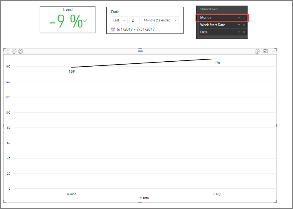
A monthly view demonstrates the issue even better, as there is an increase in the monthly average value from 159 to 170, while "Trend" still shows -9%

I hope this is now clearer. Thanks!
- Mark as New
- Bookmark
- Subscribe
- Mute
- Subscribe to RSS Feed
- Permalink
- Report Inappropriate Content
Hi @Anonymous,
So I am basically looking for a calculation that can be "aware" of the date hierarchy that I select in the graph.
Thanks for the detailed explanation! Now I can understand it totally. ![]()
Based on my experience, the calculation in a visual(Card visual in this case) cannot be "aware" of the date hierarchy that is selected in another visual(Line Chart in this case) currently. So an alternative way is to show the Trend measure in the same Chart with the Date Hierarchy, then use IF and ISFILTERED function to check which Hierarchy is selected, and use corresponding calculation to calculate the Trend. The formula below is for your reference. ![]()
Trend =
IF (
    ISFILTERED ( 'Calendar'[Date] ),
    [Measure for Date],
    IF (
        ISFILTERED ( 'Calendar'[Week] ),
        [Measure for Week],
        IF ( ISFILTERED ( 'Calendar'[Month] ), [Measure for Month] )
    )
)
Regards
- Mark as New
- Bookmark
- Subscribe
- Mute
- Subscribe to RSS Feed
- Permalink
- Report Inappropriate Content
Hi @v-ljerr-msft, This looks like a very smart idea, but I need help in actually calculating the Week measure and Month measure. How can I compare the Last week Average (from the selected timeframe) with the first week average? Same question for first month vs. last month.
Many Thanks!
- Mark as New
- Bookmark
- Subscribe
- Mute
- Subscribe to RSS Feed
- Permalink
- Report Inappropriate Content
Hi again @v-ljerr-msft,
OK, I managed to create separate calculations for weekly trend and monthly trend, by calculating average of first week/month and last week/month
Example (First Week Average):
Average First Week = CALCULATE (
[Value],
FILTER(ALLSELECTED('Calendar'),
weeknum('Calendar'[Date],1)= WEEKNUM(min('Calendar'[Date]),1)
))
I then calculated the trends as follows:
Weekly Trend = ([Average Last Week]-[Average First Week])/[Average First Week]
and finally, using your advice I created this measure:
Trend = IF( ISFILTERED ('Calendar'[Date]),[Daily Trend], IF (ISFILTERED ( 'Calendar'[Week] ),[Weekly Trend], IF(ISFILTERED( 'Calendar'[Month]),[Monthly Trend] ) ) )
How do I now add "Trend" to the chart? It creates a line with zeros....
Thanks!
- Mark as New
- Bookmark
- Subscribe
- Mute
- Subscribe to RSS Feed
- Permalink
- Report Inappropriate Content
Hi @Anonymous,
How do I now add "Trend" to the chart? It creates a line with zeros....
Oh, that could be a problem. The value of trend(percentage) is usually less then 1, but the Average Value is larger then 150. As they're shown on the same Y-Axis, the trend line will looks like zeros. ![]()
To solve this issue, you can try using a combine Chart(Line and Column Chart), and show Average Value as Column Values and show Trend as Line Values, so that they will be shown on different Y-Axis. ![]()
Regards
- Mark as New
- Bookmark
- Subscribe
- Mute
- Subscribe to RSS Feed
- Permalink
- Report Inappropriate Content
Yes, modifying the axis does help, but going back to what I wanted to achieve,
I now have 3 good Trend results for days, weeks and Months. Each trend resultvus a single number representing the difference in percents between the average of 1st day/week/month to last day/week/month
Placing a single result on a chart does not make sense, for example, if I calculate
The difference between average of July May, the result on the graph will look like a moving average, right?
If I want to stick to a kpi/trend, is ihere trend formula that I can add, that
Will look like a real trend line?
Using my phone for this post. If scteenshots are required I will add some early next week.
Thanks a lot. And keep this smilies coming ☺👍
- Mark as New
- Bookmark
- Subscribe
- Mute
- Subscribe to RSS Feed
- Permalink
- Report Inappropriate Content
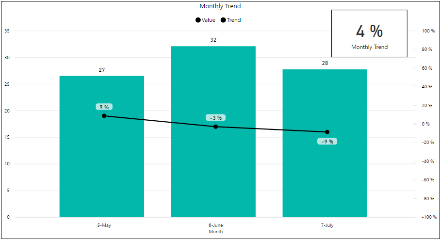
Here's a screenshot that will probably help us conclude this thread (-;
As you can see, the "Monthly Trend" measure returns the correct result ((28-27)/27)=4%
However, when using the conditional "Trend" measure as a line, it does some calculations on every month, like a moving average or something like that.
Is it possible to make the measure result (In this case 4%) displayed like a dotted average line with the same value along the whole chart? (As if Y=0.04 all the way?)
Thanks!
- Mark as New
- Bookmark
- Subscribe
- Mute
- Subscribe to RSS Feed
- Permalink
- Report Inappropriate Content
Hi @Anonymous,
Is it possible to make the measure result (In this case 4%) displayed like a dotted average line with the same value along the whole chart? (As if Y=0.04 all the way?)
I think this could be done. Could you share a sample pbix file which can reproduce the issue? So that I can further assist on this issue. You can upload it to OneDrive or Dropbox and post the link here, or sent it to me in private message. Do mask sensitive data before uploading. ![]()
Regards
Helpful resources

Power BI Monthly Update - November 2025
Check out the November 2025 Power BI update to learn about new features.

Fabric Data Days
Advance your Data & AI career with 50 days of live learning, contests, hands-on challenges, study groups & certifications and more!

| User | Count |
|---|---|
| 103 | |
| 81 | |
| 65 | |
| 50 | |
| 45 |

