Join us at FabCon Vienna from September 15-18, 2025
The ultimate Fabric, Power BI, SQL, and AI community-led learning event. Save €200 with code FABCOMM.
Get registered- Power BI forums
- Get Help with Power BI
- Desktop
- Service
- Report Server
- Power Query
- Mobile Apps
- Developer
- DAX Commands and Tips
- Custom Visuals Development Discussion
- Health and Life Sciences
- Power BI Spanish forums
- Translated Spanish Desktop
- Training and Consulting
- Instructor Led Training
- Dashboard in a Day for Women, by Women
- Galleries
- Data Stories Gallery
- Themes Gallery
- Contests Gallery
- Quick Measures Gallery
- Notebook Gallery
- Translytical Task Flow Gallery
- TMDL Gallery
- R Script Showcase
- Webinars and Video Gallery
- Ideas
- Custom Visuals Ideas (read-only)
- Issues
- Issues
- Events
- Upcoming Events
Enhance your career with this limited time 50% discount on Fabric and Power BI exams. Ends August 31st. Request your voucher.
- Power BI forums
- Forums
- Get Help with Power BI
- Desktop
- Calculate percentages for each month using multipl...
- Subscribe to RSS Feed
- Mark Topic as New
- Mark Topic as Read
- Float this Topic for Current User
- Bookmark
- Subscribe
- Printer Friendly Page
- Mark as New
- Bookmark
- Subscribe
- Mute
- Subscribe to RSS Feed
- Permalink
- Report Inappropriate Content
Calculate percentages for each month using multiple columns
Hi,
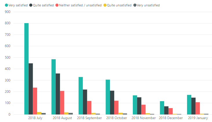
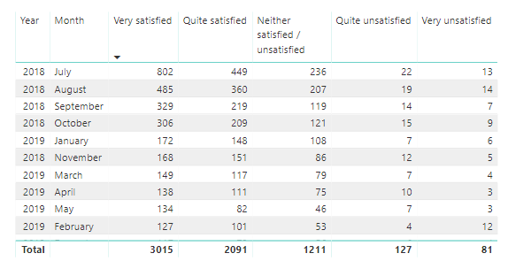
I'm wanting to create a column that calculates the percentage each month to a satisfaction survey with 5 possible responses.
Each row is currently time/date stamped and shows a singular response.
There are 5 possible responses ranked 1-5 that make up the columns and each row also has a unique identifier.
When i create a chart (below) it groups the data by month and each bar in the chart shows one of the 5 responses; I want the format to be the same but for the chart to show percentage instead.
How do I calculate the percentage (per month) in a calculated measure in Power BI?
Thanks in advance 🙂
Solved! Go to Solution.
- Mark as New
- Bookmark
- Subscribe
- Mute
- Subscribe to RSS Feed
- Permalink
- Report Inappropriate Content
Hi TanyaFozz,
Would a 100% stacked column chart do the same job but quicker?
- Mark as New
- Bookmark
- Subscribe
- Mute
- Subscribe to RSS Feed
- Permalink
- Report Inappropriate Content
Hi TanyaFozz,
Would a 100% stacked column chart do the same job but quicker?
- Mark as New
- Bookmark
- Subscribe
- Mute
- Subscribe to RSS Feed
- Permalink
- Report Inappropriate Content
Thanks,
Of course, silly me!
Helpful resources
| User | Count |
|---|---|
| 78 | |
| 77 | |
| 37 | |
| 32 | |
| 30 |
| User | Count |
|---|---|
| 92 | |
| 81 | |
| 58 | |
| 48 | |
| 48 |


