FabCon is coming to Atlanta
Join us at FabCon Atlanta from March 16 - 20, 2026, for the ultimate Fabric, Power BI, AI and SQL community-led event. Save $200 with code FABCOMM.
Register now!- Power BI forums
- Get Help with Power BI
- Desktop
- Service
- Report Server
- Power Query
- Mobile Apps
- Developer
- DAX Commands and Tips
- Custom Visuals Development Discussion
- Health and Life Sciences
- Power BI Spanish forums
- Translated Spanish Desktop
- Training and Consulting
- Instructor Led Training
- Dashboard in a Day for Women, by Women
- Galleries
- Data Stories Gallery
- Themes Gallery
- Contests Gallery
- QuickViz Gallery
- Quick Measures Gallery
- Visual Calculations Gallery
- Notebook Gallery
- Translytical Task Flow Gallery
- TMDL Gallery
- R Script Showcase
- Webinars and Video Gallery
- Ideas
- Custom Visuals Ideas (read-only)
- Issues
- Issues
- Events
- Upcoming Events
The Power BI Data Visualization World Championships is back! Get ahead of the game and start preparing now! Learn more
- Power BI forums
- Forums
- Get Help with Power BI
- Desktop
- Re: Calculate or add a future trendline to a line ...
- Subscribe to RSS Feed
- Mark Topic as New
- Mark Topic as Read
- Float this Topic for Current User
- Bookmark
- Subscribe
- Printer Friendly Page
- Mark as New
- Bookmark
- Subscribe
- Mute
- Subscribe to RSS Feed
- Permalink
- Report Inappropriate Content
Calculate or add a future trendline to a line graph
Hi all,
I tried to find a solution for my problem, but did not yet found an answer for this on this forum.
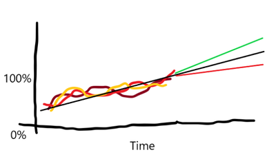
I have created a PowerBI dashboard that shows a few percentages lines in a graph. It shows the lines over time until today. I have added a trendline to the graph that shows the trend of all these percentages lines. What I would like to do is to show this trendline one year in the future. Is there a way to extend this line in the graph?
Bonus question: ultimately I would like to show 2 other trendlines, one that shows a line if the trendline is 95% of the average and one if it is 105%. Is there a way to do this?
Ultimate result:

Solved! Go to Solution.
- Mark as New
- Bookmark
- Subscribe
- Mute
- Subscribe to RSS Feed
- Permalink
- Report Inappropriate Content
Hi @michielolie ,
This is my test table:
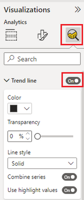
Create a line chart and then trend line switch:
Open forecast switch. If you want to show trendline is 95% of the average and one if it is 105%, please select 95% confidence interval.
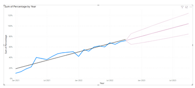
Last, you will get a line chart like this:
Best regards,
Yadong Fang
If this post helps, then please consider Accept it as the solution to help the other members find it more quickly.
- Mark as New
- Bookmark
- Subscribe
- Mute
- Subscribe to RSS Feed
- Permalink
- Report Inappropriate Content
Were those forecast options removed from the line chart visual, or is this a non-standard visual?
//Edit - X-Axis needs to be set to Continuous in order to see the option
- Mark as New
- Bookmark
- Subscribe
- Mute
- Subscribe to RSS Feed
- Permalink
- Report Inappropriate Content
Hi @KyleMB350
If you scroll down to the bottom of the Analytics pane, you should see it.

Proud to be a Super User!
daxformatter.com makes life EASIER!
- Mark as New
- Bookmark
- Subscribe
- Mute
- Subscribe to RSS Feed
- Permalink
- Report Inappropriate Content
Thanks! I discovered it's required you have the X-Axis set to Continuous in order to get the option.
- Mark as New
- Bookmark
- Subscribe
- Mute
- Subscribe to RSS Feed
- Permalink
- Report Inappropriate Content
Hi @michielolie ,
This is my test table:
Create a line chart and then trend line switch:
Open forecast switch. If you want to show trendline is 95% of the average and one if it is 105%, please select 95% confidence interval.
Last, you will get a line chart like this:
Best regards,
Yadong Fang
If this post helps, then please consider Accept it as the solution to help the other members find it more quickly.
Helpful resources

Power BI Dataviz World Championships
The Power BI Data Visualization World Championships is back! Get ahead of the game and start preparing now!

| User | Count |
|---|---|
| 38 | |
| 38 | |
| 37 | |
| 28 | |
| 28 |
| User | Count |
|---|---|
| 124 | |
| 89 | |
| 73 | |
| 66 | |
| 65 |


