FabCon is coming to Atlanta
Join us at FabCon Atlanta from March 16 - 20, 2026, for the ultimate Fabric, Power BI, AI and SQL community-led event. Save $200 with code FABCOMM.
Register now!- Power BI forums
- Get Help with Power BI
- Desktop
- Service
- Report Server
- Power Query
- Mobile Apps
- Developer
- DAX Commands and Tips
- Custom Visuals Development Discussion
- Health and Life Sciences
- Power BI Spanish forums
- Translated Spanish Desktop
- Training and Consulting
- Instructor Led Training
- Dashboard in a Day for Women, by Women
- Galleries
- Data Stories Gallery
- Themes Gallery
- Contests Gallery
- QuickViz Gallery
- Quick Measures Gallery
- Visual Calculations Gallery
- Notebook Gallery
- Translytical Task Flow Gallery
- TMDL Gallery
- R Script Showcase
- Webinars and Video Gallery
- Ideas
- Custom Visuals Ideas (read-only)
- Issues
- Issues
- Events
- Upcoming Events
Get Fabric Certified for FREE during Fabric Data Days. Don't miss your chance! Request now
- Power BI forums
- Forums
- Get Help with Power BI
- Desktop
- Re: Calculate and charting "no reply"
- Subscribe to RSS Feed
- Mark Topic as New
- Mark Topic as Read
- Float this Topic for Current User
- Bookmark
- Subscribe
- Printer Friendly Page
- Mark as New
- Bookmark
- Subscribe
- Mute
- Subscribe to RSS Feed
- Permalink
- Report Inappropriate Content
Calculate and charting "no reply"
Hi!
I'm trying to visualise 'no returns' in the results from a rolling tracker survey.
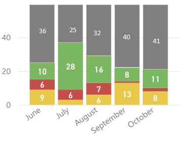
Currently, users anonymously score a series of questions from good to bad (represented as 1 to 3), and select their department. Each response is continously appended to a SharePoint List. I visualise the data in terms of monthly totals of scores from each question, split per department (example below). Currently my visuals consist of pie charts (%) and stacked bar charts (values). What I would really like is to include a calculated estimate of non-returns for each question.
I have tried creating calculated tables, calculated columns and measures - but I can't frame my thoughts quite right to find the right solution.
Question1_NoReturn = SizeOfDepartment - (count(Question1 = 1)+count(Question1 = 2)+count(Question1 = 3))
And then somehow include the above DAX in the visualisation alongside the data from my input table.
It must remain anonymous, so I can't relate responses to a predefined list of employees (even if that risks some duplicate submissions).
My input table looks like this:
| Timestamp of response | Qu.1 | Qu.2 | Qu.etc... | Department |
| 13/01/2024 | 1 | 1 | .. | A |
| 21/11/2023 | 2 | 3 | .. | B |
| 18/12/2023 | 3 | 3 | .. | B |
| 22/12/2023 | 2 | 2 | .. | A |
| 21/12/2023 | 3 | null | .. | C |
| 06/12/2023 | 1 | 1 | .. | B |
| 23/12/2023 | 3 | 3 | .. | A |
| 14/01/2024 | 2 | 2 | .. | C |
| 22/12/2023 | 1 | 1 | .. | A |
My department table looks like this:
| Department | People |
| A | 7 |
| B | 25 |
| C | 12 |
My visualisations currently look like this - one for each department:
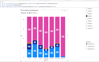
And I want my visualisations to look like this:
I could just set the ymax to the department size, but I want an explicit 'no return' estimate.
Solved! Go to Solution.
- Mark as New
- Bookmark
- Subscribe
- Mute
- Subscribe to RSS Feed
- Permalink
- Report Inappropriate Content
- Mark as New
- Bookmark
- Subscribe
- Mute
- Subscribe to RSS Feed
- Permalink
- Report Inappropriate Content
It looks really good - I've almost got it working on the real dataset. I'll have another look on Monday and come back.
I'm amazed at what you have done - thank you for your help so far 🙂
- Mark as New
- Bookmark
- Subscribe
- Mute
- Subscribe to RSS Feed
- Permalink
- Report Inappropriate Content
Sorry it has taken a while to reply, I have been busy.
Here is a link the cleansed and clipped data.
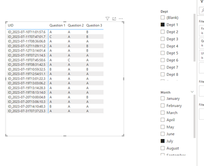
There are two tables. The main table - sampledata.csv - contains responses to 3 questions (with the answers being A, B or C), the date/time submitted, department code and a UID.
We invite everyone to respond once per month, if they would like to, so we can how people feel about the topics in questions. There are more questions in the full dataset.
The second table is a list of the departments and the total number of people in each department.
I currently have one of the below charts per department. Which shows count of A, B or C, split per month submitted.
Department A
I am looking for away to produce the following chart (again, one for each department) that also includes a count of "no reply". I have all the data I need between the various tables (number of responses, department, number of people in each department and date/time of each response).

For each department, for each month (or other timescale), I need to subtract the number of A, B or C responses from the number of people in that department - but I can't work out how to build the measure or query to allow this.
I could always build the data outside PowerBI, padding it with null-response rows in Excel - but I would rather keep it all automated if possible.
- Mark as New
- Bookmark
- Subscribe
- Mute
- Subscribe to RSS Feed
- Permalink
- Report Inappropriate Content
Each employee can respond to the three questions differently, so showing the responses by A/B/C without showing the questions is meaningless. You have four dimensions
- dept
- month
- uid
- question
These cannot be represented in a column chart all at the same time.
- Mark as New
- Bookmark
- Subscribe
- Mute
- Subscribe to RSS Feed
- Permalink
- Report Inappropriate Content
- Mark as New
- Bookmark
- Subscribe
- Mute
- Subscribe to RSS Feed
- Permalink
- Report Inappropriate Content
your sample data and the expected outcome do not match. Please provide sample data that fully covers your issue.
Please show the expected outcome based on the sample data you provided.
- Mark as New
- Bookmark
- Subscribe
- Mute
- Subscribe to RSS Feed
- Permalink
- Report Inappropriate Content
Apologies. I should have been clearer. There should be one chart per department per question - and I'm showing one chart for one question for one department - just a sample.
On the actual report, - there are a number of pages (one per department) and on each page, a matrix of charts on each page (one per Qu. - i.e. question).
Doi you want to see the whole dataset? 10s of columns and1000s of rows? I have simplified it down to the key issue for the sake of the question.
- Mark as New
- Bookmark
- Subscribe
- Mute
- Subscribe to RSS Feed
- Permalink
- Report Inappropriate Content
Whatever is needed to fully describe the scenario.
Please provide sample data that covers your issue or question completely, in a usable format (not as a screenshot).
Do not include sensitive information or anything not related to the issue or question.
If you are unsure how to upload data please refer to https://community.fabric.microsoft.com/t5/Community-Blog/How-to-provide-sample-data-in-the-Power-BI-...
Please show the expected outcome based on the sample data you provided.
Want faster answers? https://community.fabric.microsoft.com/t5/Desktop/How-to-Get-Your-Question-Answered-Quickly/m-p/1447...
Helpful resources

Power BI Monthly Update - November 2025
Check out the November 2025 Power BI update to learn about new features.

Fabric Data Days
Advance your Data & AI career with 50 days of live learning, contests, hands-on challenges, study groups & certifications and more!


