FabCon is coming to Atlanta
Join us at FabCon Atlanta from March 16 - 20, 2026, for the ultimate Fabric, Power BI, AI and SQL community-led event. Save $200 with code FABCOMM.
Register now!- Power BI forums
- Get Help with Power BI
- Desktop
- Service
- Report Server
- Power Query
- Mobile Apps
- Developer
- DAX Commands and Tips
- Custom Visuals Development Discussion
- Health and Life Sciences
- Power BI Spanish forums
- Translated Spanish Desktop
- Training and Consulting
- Instructor Led Training
- Dashboard in a Day for Women, by Women
- Galleries
- Data Stories Gallery
- Themes Gallery
- Contests Gallery
- Quick Measures Gallery
- Notebook Gallery
- Translytical Task Flow Gallery
- TMDL Gallery
- R Script Showcase
- Webinars and Video Gallery
- Ideas
- Custom Visuals Ideas (read-only)
- Issues
- Issues
- Events
- Upcoming Events
To celebrate FabCon Vienna, we are offering 50% off select exams. Ends October 3rd. Request your discount now.
- Power BI forums
- Forums
- Get Help with Power BI
- Desktop
- Re: Calculate Percentages on Bar Chart
- Subscribe to RSS Feed
- Mark Topic as New
- Mark Topic as Read
- Float this Topic for Current User
- Bookmark
- Subscribe
- Printer Friendly Page
- Mark as New
- Bookmark
- Subscribe
- Mute
- Subscribe to RSS Feed
- Permalink
- Report Inappropriate Content
Calculate Percentages on Bar Chart
Hello,
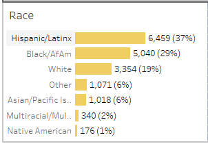
I have some demographic data and I am creating bar charts. The dataset is one row per respondant. I'd like to display both the number of and percentage of respondants for each race category in the bar chart, like in the example below (generated in Tableau). I have seen solutions for creating stacked column and line charts as a workaround, but the percentages do not display well on the smallest categories.
Any solutions for easily displaying displaying percentages? It does not necessarily need to be in the bar chart format, though that is preferable.
Solved! Go to Solution.
- Mark as New
- Bookmark
- Subscribe
- Mute
- Subscribe to RSS Feed
- Permalink
- Report Inappropriate Content
Bar charts and column charts by default can't include percentages in the labels but a workaround that may work is the next one.
Create a measure like this:

Did I answer your question? Give your kudos and mark my post as a solution!
Proud to be a Super User!

- Mark as New
- Bookmark
- Subscribe
- Mute
- Subscribe to RSS Feed
- Permalink
- Report Inappropriate Content
Bar charts and column charts by default can't include percentages in the labels but a workaround that may work is the next one.
Create a measure like this:

Did I answer your question? Give your kudos and mark my post as a solution!
Proud to be a Super User!


