FabCon is coming to Atlanta
Join us at FabCon Atlanta from March 16 - 20, 2026, for the ultimate Fabric, Power BI, AI and SQL community-led event. Save $200 with code FABCOMM.
Register now!- Power BI forums
- Get Help with Power BI
- Desktop
- Service
- Report Server
- Power Query
- Mobile Apps
- Developer
- DAX Commands and Tips
- Custom Visuals Development Discussion
- Health and Life Sciences
- Power BI Spanish forums
- Translated Spanish Desktop
- Training and Consulting
- Instructor Led Training
- Dashboard in a Day for Women, by Women
- Galleries
- Data Stories Gallery
- Themes Gallery
- Contests Gallery
- QuickViz Gallery
- Quick Measures Gallery
- Visual Calculations Gallery
- Notebook Gallery
- Translytical Task Flow Gallery
- TMDL Gallery
- R Script Showcase
- Webinars and Video Gallery
- Ideas
- Custom Visuals Ideas (read-only)
- Issues
- Issues
- Events
- Upcoming Events
The Power BI Data Visualization World Championships is back! Get ahead of the game and start preparing now! Learn more
- Power BI forums
- Forums
- Get Help with Power BI
- Desktop
- Re: CREATE A TABLE - challenge
- Subscribe to RSS Feed
- Mark Topic as New
- Mark Topic as Read
- Float this Topic for Current User
- Bookmark
- Subscribe
- Printer Friendly Page
- Mark as New
- Bookmark
- Subscribe
- Mute
- Subscribe to RSS Feed
- Permalink
- Report Inappropriate Content
CREATE A TABLE - challenge
Hi!
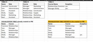
I have 3 tables (Datasets) as the ones on the top (A, B and C).
And I created a Visualization Table in PBA as the one on the left corner.
How can I create the orange Visualization Table needed?
Solved! Go to Solution.
- Mark as New
- Bookmark
- Subscribe
- Mute
- Subscribe to RSS Feed
- Permalink
- Report Inappropriate Content
Hi @Anonymous,
You have a problem in your data. I assume you have built your VISUALIZATION TABLE using the many-to-many relationship between the Table A and Table B. But if you take a close look at Shelly from Marketing in the Table A, you will see that there are two entries in the Table B which can be applied to her: Manager-Marketing and Relationships-Marketing.
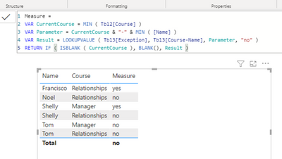
You can close your eyes, ignore this duality and solve your case with the crazy measure below, but I won't recommend doing that - it would be better to double check your data model.
Best Regards,
Alexander
Helpful resources

Power BI Dataviz World Championships
The Power BI Data Visualization World Championships is back! Get ahead of the game and start preparing now!

| User | Count |
|---|---|
| 41 | |
| 38 | |
| 36 | |
| 30 | |
| 28 |
| User | Count |
|---|---|
| 128 | |
| 88 | |
| 79 | |
| 67 | |
| 62 |


