- Subscribe to RSS Feed
- Mark Topic as New
- Mark Topic as Read
- Float this Topic for Current User
- Bookmark
- Subscribe
- Printer Friendly Page
- Mark as New
- Bookmark
- Subscribe
- Mute
- Subscribe to RSS Feed
- Permalink
- Report Inappropriate Content
Burnup Chart to compare hours spent and committed hours for project
Hi guys,
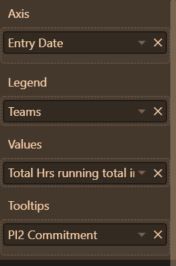
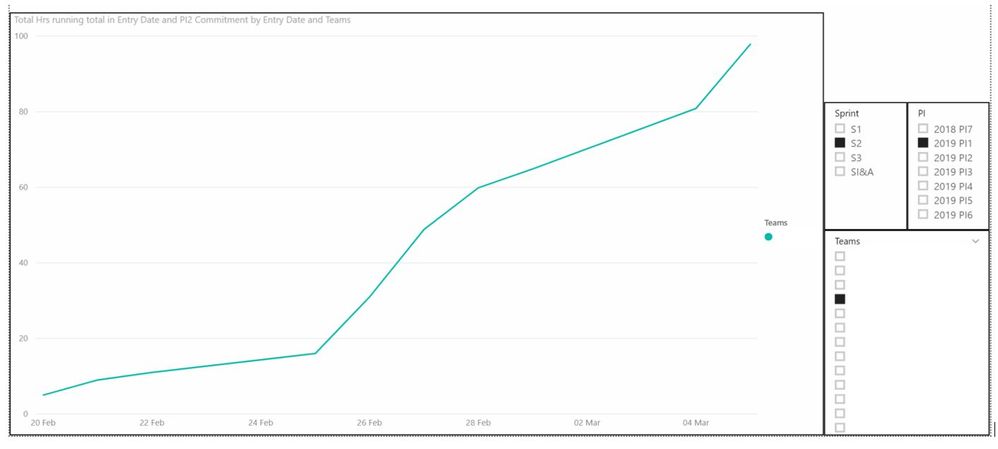
I'm working on creating a burnup chart of sorts in Power BI, and am trying to compare a team's cumulative hours (based on timesheet submissions) with their no. of committed hours to the project over PI2 (period of seven weeks). I've already created a new measure that calculates cumulative hours spent by each team, but have no idea how to create an accumulating linear trend line that pro ratas their committed hours over X time period (e.g. % of committed hours reached / exceeded at a certain point in time).
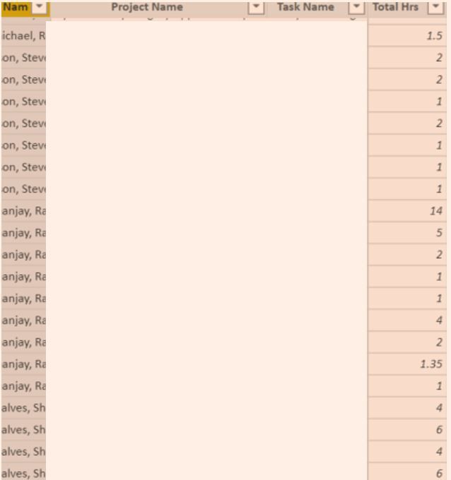
The source data is sorted per single entry: username / project name / task name / hours spent on project today / department name. I then created a "PI2 Commitment" conditional column to input committed hours (If team name is X, committed hours is 55).
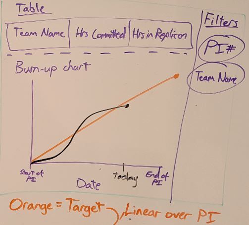
Final goal:
Already tried:
In-built trend line doesn't fit this purpose, as it creates a trend based on the diagram, rather than tracking committed hours over PI based on source data.
I'm a complete newbie to power bi, so any help would be appreciated! Thanks
- Mark as New
- Bookmark
- Subscribe
- Mute
- Subscribe to RSS Feed
- Permalink
- Report Inappropriate Content
@Anonymous ,
So can I understand that in the trend line you want to add a few conditions(e.g.: The "PI" or other X-axis, legend values) based on the data in your source?
If so, actually the built-in trend line may not meet your requirement because it's too naive. As suggestion, have you tried any Custom visual or Python/R visual?
Community Support Team _ Jimmy Tao
If this post helps, then please consider Accept it as the solution to help the other members find it more quickly.
- Mark as New
- Bookmark
- Subscribe
- Mute
- Subscribe to RSS Feed
- Permalink
- Report Inappropriate Content
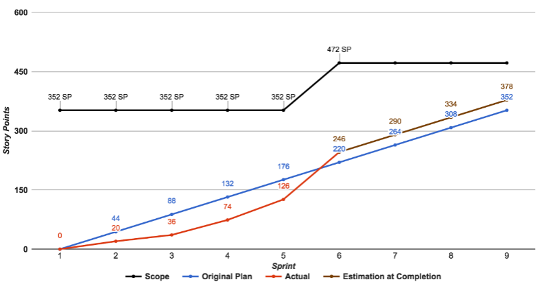
@v-yuta-msft the orange linear line should be the original, total time committed by the team at the start of the sprint e.g. 55 hours. Based on whiteboard diagram, The black line records the cumulative hours the team has recorded to date e.g. 22 hours. In the future, if the team exceeds the 55 hour estimation and instead spends 75 hours on the project, the black line will rise above the orange linear line
Example from another website - the red line has risen above the blue linear line (committed points) because they are making good progress:
Helpful resources
| Subject | Author | Posted | |
|---|---|---|---|
| 12-05-2024 04:12 AM | |||
| 12-06-2024 04:58 AM | |||
| 05-09-2024 02:33 PM | |||
| 01-08-2025 05:03 AM | |||
| 10-07-2024 03:08 AM |
| User | Count |
|---|---|
| 128 | |
| 100 | |
| 85 | |
| 53 | |
| 46 |
