Join us at FabCon Vienna from September 15-18, 2025
The ultimate Fabric, Power BI, SQL, and AI community-led learning event. Save €200 with code FABCOMM.
Get registered- Power BI forums
- Get Help with Power BI
- Desktop
- Service
- Report Server
- Power Query
- Mobile Apps
- Developer
- DAX Commands and Tips
- Custom Visuals Development Discussion
- Health and Life Sciences
- Power BI Spanish forums
- Translated Spanish Desktop
- Training and Consulting
- Instructor Led Training
- Dashboard in a Day for Women, by Women
- Galleries
- Data Stories Gallery
- Themes Gallery
- Contests Gallery
- Quick Measures Gallery
- Notebook Gallery
- Translytical Task Flow Gallery
- TMDL Gallery
- R Script Showcase
- Webinars and Video Gallery
- Ideas
- Custom Visuals Ideas (read-only)
- Issues
- Issues
- Events
- Upcoming Events
Compete to become Power BI Data Viz World Champion! First round ends August 18th. Get started.
- Power BI forums
- Forums
- Get Help with Power BI
- Desktop
- Re: Bullet Chart different size between desktop an...
- Subscribe to RSS Feed
- Mark Topic as New
- Mark Topic as Read
- Float this Topic for Current User
- Bookmark
- Subscribe
- Printer Friendly Page
- Mark as New
- Bookmark
- Subscribe
- Mute
- Subscribe to RSS Feed
- Permalink
- Report Inappropriate Content
Bullet Chart different size between desktop and web app
Hello there,
I have a problem regarding the Bullet Chart visual (Bullet Chart 2.0.1).
When I use the chart in the Desktop app and filter something, everything works perfect.
When I publish my report to the web app and then I filter something, the size is getting bigger.. And I don't know why. When I refresh the page (F5), then the chart looks normal, until I filter something again.
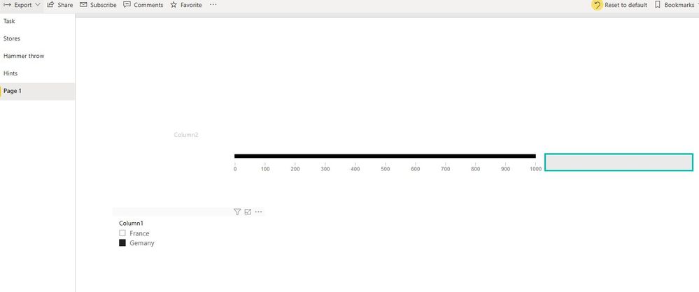
Picture 1 shows the sample file:
Column1 is the filter, I can filter either France or Germany. The black line above is the bullet chart (in its easiest way). The shape on the right is just to show the difference after I filter.
Picture 2 shows the sample after I filtered Germany:
As you can see, the chart moved down a bit. This is a problem for my original reports because they are pretty full and I need every space I can get.. Do you have an idea why this is moving down?
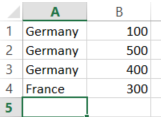
My input file for this test report was pretty basic (see Picture 3).
Can anybody help me with this problem?
Thanks in advance
- Mark as New
- Bookmark
- Subscribe
- Mute
- Subscribe to RSS Feed
- Permalink
- Report Inappropriate Content
hi, @mistertobi_1997
I have test on my side, it works well. What browser do you use? my is Microsoft Edge.
Best Regards,
Lin
If this post helps, then please consider Accept it as the solution to help the other members find it more quickly.
- Mark as New
- Bookmark
- Subscribe
- Mute
- Subscribe to RSS Feed
- Permalink
- Report Inappropriate Content
I am using Google Chrome, when I use Microsoft Edge I don't have this issue.. strange.
Is there a solution for using it with Google Chrome or is the only solution to use Microsoft Edge?
Best regards


