- Power BI forums
- Updates
- News & Announcements
- Get Help with Power BI
- Desktop
- Service
- Report Server
- Power Query
- Mobile Apps
- Developer
- DAX Commands and Tips
- Custom Visuals Development Discussion
- Health and Life Sciences
- Power BI Spanish forums
- Translated Spanish Desktop
- Power Platform Integration - Better Together!
- Power Platform Integrations (Read-only)
- Power Platform and Dynamics 365 Integrations (Read-only)
- Training and Consulting
- Instructor Led Training
- Dashboard in a Day for Women, by Women
- Galleries
- Community Connections & How-To Videos
- COVID-19 Data Stories Gallery
- Themes Gallery
- Data Stories Gallery
- R Script Showcase
- Webinars and Video Gallery
- Quick Measures Gallery
- 2021 MSBizAppsSummit Gallery
- 2020 MSBizAppsSummit Gallery
- 2019 MSBizAppsSummit Gallery
- Events
- Ideas
- Custom Visuals Ideas
- Issues
- Issues
- Events
- Upcoming Events
- Community Blog
- Power BI Community Blog
- Custom Visuals Community Blog
- Community Support
- Community Accounts & Registration
- Using the Community
- Community Feedback
Register now to learn Fabric in free live sessions led by the best Microsoft experts. From Apr 16 to May 9, in English and Spanish.
- Power BI forums
- Forums
- Get Help with Power BI
- Desktop
- Building chart in Charticulator
- Subscribe to RSS Feed
- Mark Topic as New
- Mark Topic as Read
- Float this Topic for Current User
- Bookmark
- Subscribe
- Printer Friendly Page
- Mark as New
- Bookmark
- Subscribe
- Mute
- Subscribe to RSS Feed
- Permalink
- Report Inappropriate Content
Building chart in Charticulator
Hi all,
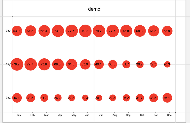
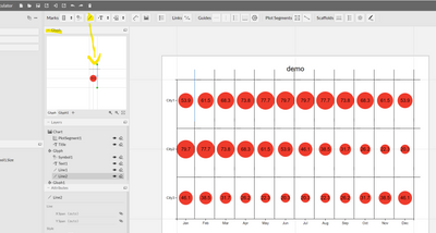
I am trying to build a bubble chart that accepts categorical values for both the x and y axes. And then the size of the bubbles determined by a measure. The standard (built-in) scatter/bubble chart in PBI does not allow for categorical values in the axes (only numerical). I've also checked and downloaded other available visuals but have not been able to find one that accepts categorical values in both axes, only this https://appsource.microsoft.com/en-us/product/power-bi-visuals/WA104381101 but it doesn't do exactly what I want. So i tried with Charticulator This is what I managed to do. You can get the .chart file to load on Charticulator from here
Some of the problems I have:
1. I want to add gridlines like in the following pic but haven't managed to
2. I haven't been able to understand how to change the relationship between the radius/area of the circle and the magnitude of the number shown. I'd like to make the difference between the largest and smallest circle larger.
3. When I import it in PBI, no tooltip is shown.
4. I'd like to have the option that other visuals have to show the result in thousands, millions, the plain number, etc. Not sure if that is possible with Charticulator?
5. Do you know if this can be done with a readily available visual
Thanks very much
Solved! Go to Solution.
- Mark as New
- Bookmark
- Subscribe
- Mute
- Subscribe to RSS Feed
- Permalink
- Report Inappropriate Content
Hi @AlB ,
Been looking at your issue and believe I have the problems handled
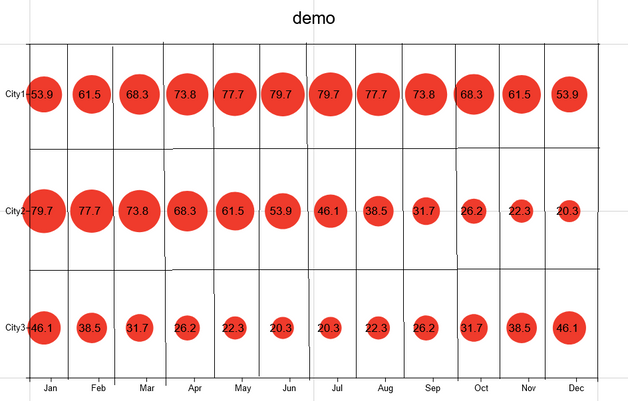
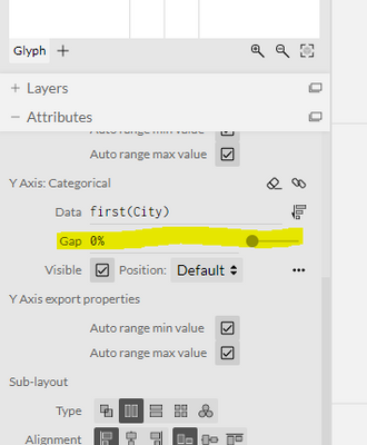
1. I want to add gridlines like in the following pic but haven't managed to
- Add them in the gliph (previous post) be aware you need to reduce the gap between the axis values:
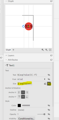
2. I haven't been able to understand how to change the relationship between the radius/area of the circle and the magnitude of the number shown. I'd like to make the difference between the largest and smallest circle larger.
- Size of the number should be added in the data label and link it to the average size:
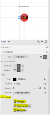
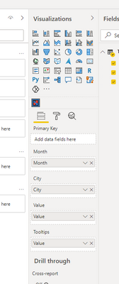
3. When I import it in PBI, no tooltip is shown.
- Tooltips you must activate them on each of the part of your chart on the interactivity:
And then add the values on the tooltip on PBI:
4. I'd like to have the option that other visuals have to show the result in thousands, millions, the plain number, etc. Not sure if that is possible with Charticulator?
This is the only question I'm not sure but I would use a iff statment to make this work in the values.
5. Do you know if this can be done with a readily available visual
- Don't know any.
Check PBIX file and Charticulator chart.
Hope this helps to achieve what you need.
Regards
Miguel Félix
Did I answer your question? Mark my post as a solution!
Proud to be a Super User!
Check out my blog: Power BI em Português- Mark as New
- Bookmark
- Subscribe
- Mute
- Subscribe to RSS Feed
- Permalink
- Report Inappropriate Content
Great. Thanks a lot. That's very helpful. A couple of follow-up questions:
1. On the tooltip, that is already what I was doing, but I couldn't get it to show. In fact, I have loaded your .chart file into Charticulator, exported it PBI visual (without changing anything) and loaded the visual into the pbix file you shared. It still does not show the tooltips (see page 2 in the attached), while i see it does in Page 1 that you created. Perhaps I am missing some step??
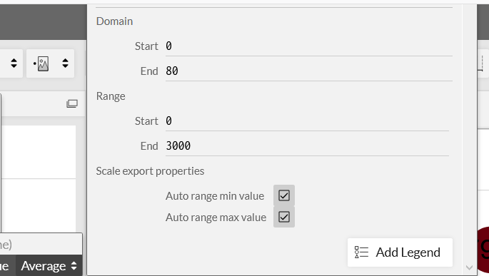
2. On setting the size of the bubbles, you can use the Auto range options so that the size adapts to the magnitude of the underlying values of the actual data. I have tried to use functions in Start, End at Domain and Range but it seems to reject them. Do you know if that is allowed at all?
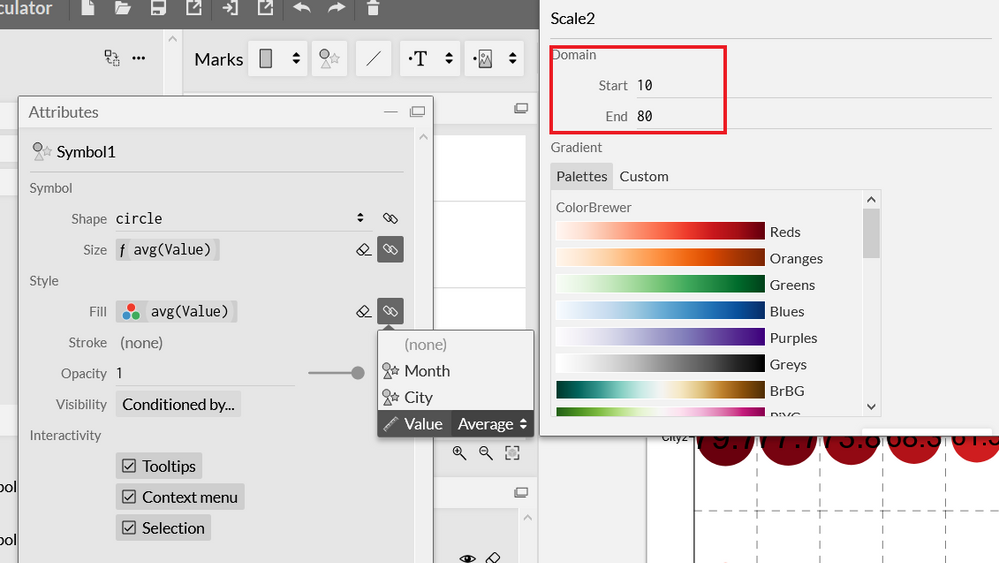
3. I've now linked the color of the bubble to Value as seen below. This works well in Page 3 (attached). However, I would like to have something dynamic, just as what we saw with the size. Otherwise if the magnitude of the values in the actual data is much larger than what we have when building the chart (Page 4 in the attached), the color difference will not be visible. That should be possible if Start, End under Domain (shown in within the red rectangle in the pic below) can be set dynamically but I doesn't seem to be allowed. Any ideas?
4. I'd like to have a similar color scaling in the font of the data labels, so that when using the color scaling in the bubbles, the text gets lighter when the bubble gets darker. I tried the same approach as with the bubbles but it messes it all up.
I realize I'm asking quite a lot of things, so don't worry if you don't have time for everything
Thank you very much
- Mark as New
- Bookmark
- Subscribe
- Mute
- Subscribe to RSS Feed
- Permalink
- Report Inappropriate Content
Thanks for this post.
Need your help with the similar issue i.e regarding tooltips. I have tried the given solution but tooltips are still not showing. Surely i must be missing some step.
Is there any documentaion regarding enabling toolitips using Charticulator.
Would appreciate your help.
Many thanks
- Mark as New
- Bookmark
- Subscribe
- Mute
- Subscribe to RSS Feed
- Permalink
- Report Inappropriate Content
- Mark as New
- Bookmark
- Subscribe
- Mute
- Subscribe to RSS Feed
- Permalink
- Report Inappropriate Content
Hi @AlB ,
Been looking at your issue and believe I have the problems handled
1. I want to add gridlines like in the following pic but haven't managed to
- Add them in the gliph (previous post) be aware you need to reduce the gap between the axis values:
2. I haven't been able to understand how to change the relationship between the radius/area of the circle and the magnitude of the number shown. I'd like to make the difference between the largest and smallest circle larger.
- Size of the number should be added in the data label and link it to the average size:
3. When I import it in PBI, no tooltip is shown.
- Tooltips you must activate them on each of the part of your chart on the interactivity:
And then add the values on the tooltip on PBI:
4. I'd like to have the option that other visuals have to show the result in thousands, millions, the plain number, etc. Not sure if that is possible with Charticulator?
This is the only question I'm not sure but I would use a iff statment to make this work in the values.
5. Do you know if this can be done with a readily available visual
- Don't know any.
Check PBIX file and Charticulator chart.
Hope this helps to achieve what you need.
Regards
Miguel Félix
Did I answer your question? Mark my post as a solution!
Proud to be a Super User!
Check out my blog: Power BI em Português- Mark as New
- Bookmark
- Subscribe
- Mute
- Subscribe to RSS Feed
- Permalink
- Report Inappropriate Content
Hi @AlB ,
For adding the grid lines you need to go to the glyph part and add the lines you need:
I will need to check the rest of the information but have you tried the help guide ofg charticulator?
Regards
Miguel Félix
Did I answer your question? Mark my post as a solution!
Proud to be a Super User!
Check out my blog: Power BI em PortuguêsHelpful resources

Microsoft Fabric Learn Together
Covering the world! 9:00-10:30 AM Sydney, 4:00-5:30 PM CET (Paris/Berlin), 7:00-8:30 PM Mexico City

Power BI Monthly Update - April 2024
Check out the April 2024 Power BI update to learn about new features.

| User | Count |
|---|---|
| 96 | |
| 92 | |
| 81 | |
| 70 | |
| 64 |
| User | Count |
|---|---|
| 115 | |
| 106 | |
| 96 | |
| 81 | |
| 72 |
