FabCon is coming to Atlanta
Join us at FabCon Atlanta from March 16 - 20, 2026, for the ultimate Fabric, Power BI, AI and SQL community-led event. Save $200 with code FABCOMM.
Register now!- Power BI forums
- Get Help with Power BI
- Desktop
- Service
- Report Server
- Power Query
- Mobile Apps
- Developer
- DAX Commands and Tips
- Custom Visuals Development Discussion
- Health and Life Sciences
- Power BI Spanish forums
- Translated Spanish Desktop
- Training and Consulting
- Instructor Led Training
- Dashboard in a Day for Women, by Women
- Galleries
- Data Stories Gallery
- Themes Gallery
- Contests Gallery
- QuickViz Gallery
- Quick Measures Gallery
- Visual Calculations Gallery
- Notebook Gallery
- Translytical Task Flow Gallery
- TMDL Gallery
- R Script Showcase
- Webinars and Video Gallery
- Ideas
- Custom Visuals Ideas (read-only)
- Issues
- Issues
- Events
- Upcoming Events
The Power BI Data Visualization World Championships is back! Get ahead of the game and start preparing now! Learn more
- Power BI forums
- Forums
- Get Help with Power BI
- Desktop
- Bug?: Line Chart Behavior When Plotting Data, Ins...
- Subscribe to RSS Feed
- Mark Topic as New
- Mark Topic as Read
- Float this Topic for Current User
- Bookmark
- Subscribe
- Printer Friendly Page
- Mark as New
- Bookmark
- Subscribe
- Mute
- Subscribe to RSS Feed
- Permalink
- Report Inappropriate Content
Bug?: Line Chart Behavior When Plotting Data, Instead Seems to Plot Data Aggregation (Sum, Count)
I’m a new user of Power BI Desktop, and was having a problem that seems fairly common based on seeing the same issue discussed on the Power BI forums, but without an apparent solution that worked for everyone. It involved Line Charts only allowing plotting of aggregate data (e.g., Count, Sum). In my playing around, I seem to have found a work-around (at least for my case), but it doesn’t make any sense to me, and I’m wondering if this is a bug, or I just don’t understand how Power BI works with its datasets. But I wanted to post this here in hopes it will get fixed if it is a bug, and help others struggling with the same issue.
I have a data set that is very simple, essentially a time series of battery state-of-charge data (e.g., battery voltage, amps in/out, temperature, etc.). I simply want to generate several Line Charts displaying time series of the data variable of interest (e.g., volts vs time, amps vs time, etc.).
As background, the data came from a folder of CSV files, each file being a single record of the data variables at one instant in time. The individual CSV files themselves did not contain any information on the time at which the data was gathered, either in the file data or the filename, but this information is reflected in the Windows file system “Date created” attribute. So I used the “Get Data\Folder” method to read all the CSV files, and then used the Query Editor to split the “Date created” column into separate “Date” and “Time” columns, and clicked the “Combine Files” icon on the Content column, to explicitly show/include all the columns of the CSV files. Did some more editing to remove extraneous columns and set formatting for all the imported numeric data to decimal number. Then I did “Close and Apply” to go back to the Desktop main window.
Here is a view of the data:
I followed all the suggestions in the other forum threads (see at end of this message) and made sure that the “Data Type” and “Default Summarization” fields on the Modeling tab were set correctly to “Decimal Number” and “Don’t summarize”, as shown here for the BatVolts column:
I made these setting before creating the Line Chart, as I read that these changes are only in effect for new charts, and do not affect existing charts.
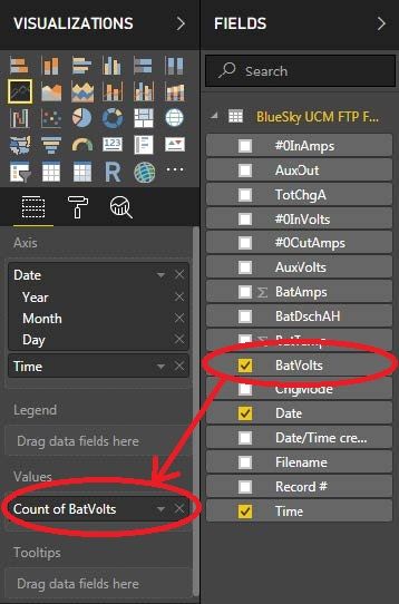
But with these settings, when I created a Line Chart using Date and Time fields as the Axis “variables”, and the BatVolts field as the Value “variable”, what is listed under Value changes to “Count of BatVolts”:
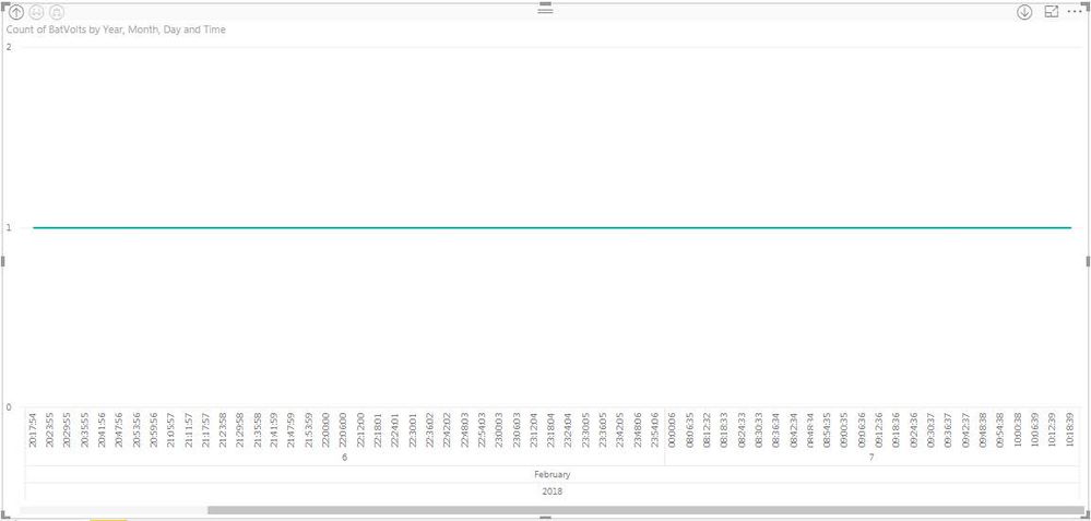
And the plot looks like this, showing a count of 1 for all times, instead of the actual values of BatVolt:
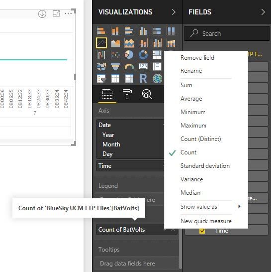
And if I click on the down arrow to the right of “Count of BatVolts”, under the Visualizations pane, at pointed out in the other threads on this issue, there is no “Don’t summarize” option:
Now for my “fix” or workaround, which I found by luck simply by trying stuff, and which makes no sense to me……
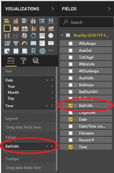
I deleted the Line Chart. Then went back to the data pane, again selected the BatVolts column and in the Modeling tab, set the “Default Summarization” to “Sum”. Note that the Sigma (aggregation) symbol is now displayed in front of BatVolts in the Fields subwindow:
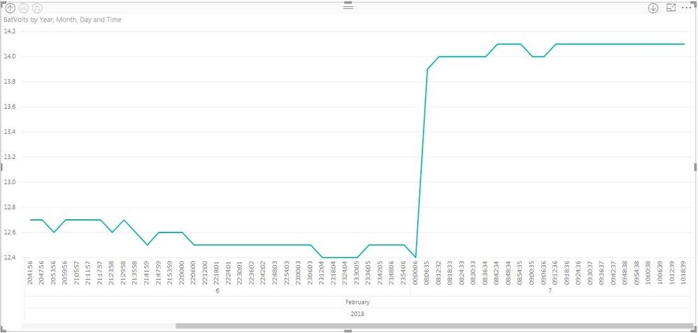
Now I go back to the Report pane, and again create a Line Chart of the BatVolt field vs the Date and Time fields. Note that now, under Values in the Visualization pane, the field is listed simply as “BatVolts” even though in the Fields pane, it is still shows the Sigma (aggregation) symbol in front of “BatVolts:
And the plot looks like this:
Which is exactly the time series plot I’m looking for! To me, unless I’m missing some major conception on how Power BI should work, this seems like a bug.
I’ve seen this problem discussed in several other threads, including:
http://community.powerbi.com/t5/Desktop/Make-a-column-not-sum-count/td-p/24672
In neither of them was there a definitive solution that seemed to work for everyone. I’ll post a reference to my “work around” solution in those threads, just to help anyone searching for a solution in the future.
- Mark as New
- Bookmark
- Subscribe
- Mute
- Subscribe to RSS Feed
- Permalink
- Report Inappropriate Content
@Deruth58,
What result would like to get in Line chart when you choose “Don’t summarize” option for your column under Modeling ribbon. In this case, if you want to get same result as that in the last screenshot, just change Count to Sum aggregation function.
In addition, when you choose “Don’t summarize” option for your column under Modeling ribbon, it doesn't mean that you can get "Don't summarize" option in Line chart. The "Don't summarize" option is only available in Table visual.
Regards,
Lydia
- Mark as New
- Bookmark
- Subscribe
- Mute
- Subscribe to RSS Feed
- Permalink
- Report Inappropriate Content
Hi Lydia,
Thanks for your response, but I'm a bit confused. If you reread my post you'll see that to get the result shown in the last screenshot, I did in fact have to select "Sum" for the "Default Summarization" field on the Modeling tab. But to me that seems confusing and non-intuitive.
Maybe I'm just not understanding the meaning of "Default Summarization" and what that field does for the various available values in the pulldown menu (i.e., Don't summarize, Sum, Count, etc.). But to me it seems unintuitive.
I want a simple time plot of the data itself, NOT an aggregation (Sum or Count, for example) of the data. So to me, the intuitive choice to make for the "Default Summarization" pulldown menu on the Modeling tab would be "Don't summarize". To me, the choices of Sum or Count imply an aggregation of my data, which is not what I want.
Again, maybe I'm just misunderstanding some Power BI concept, but it seems like I'm not alone in finding this unintuitive, if the intended behaviour to get a basic time series plot is that one has to select "Sum" instead of "Don't summize".
Thanks,
Doug
- Mark as New
- Bookmark
- Subscribe
- Mute
- Subscribe to RSS Feed
- Permalink
- Report Inappropriate Content
@Deruth58,
When you select "Don't summarize" for your field under Modeling tab, it doesn't impact the aggregation in Line chart. Because in line chart, bar chart and so on, there is no "Don't summarize" option, any data type of fields that are dragged into Values section of line chart will be aggregated by default.
If you need to use "Don't Summarize" in visual, please use table visual. Table visual has the "Don't summarize" option, in other words, even if you don't choose "Don't summarize" option for your numerical field under Modeling tab, you are able to use "Don't summarize" option in table visual to show actual data.
Regards,
Lydia
Helpful resources

Power BI Dataviz World Championships
The Power BI Data Visualization World Championships is back! Get ahead of the game and start preparing now!

| User | Count |
|---|---|
| 38 | |
| 36 | |
| 33 | |
| 32 | |
| 29 |
| User | Count |
|---|---|
| 129 | |
| 88 | |
| 79 | |
| 68 | |
| 63 |


