FabCon is coming to Atlanta
Join us at FabCon Atlanta from March 16 - 20, 2026, for the ultimate Fabric, Power BI, AI and SQL community-led event. Save $200 with code FABCOMM.
Register now!- Power BI forums
- Get Help with Power BI
- Desktop
- Service
- Report Server
- Power Query
- Mobile Apps
- Developer
- DAX Commands and Tips
- Custom Visuals Development Discussion
- Health and Life Sciences
- Power BI Spanish forums
- Translated Spanish Desktop
- Training and Consulting
- Instructor Led Training
- Dashboard in a Day for Women, by Women
- Galleries
- Data Stories Gallery
- Themes Gallery
- Contests Gallery
- Quick Measures Gallery
- Notebook Gallery
- Translytical Task Flow Gallery
- TMDL Gallery
- R Script Showcase
- Webinars and Video Gallery
- Ideas
- Custom Visuals Ideas (read-only)
- Issues
- Issues
- Events
- Upcoming Events
Calling all Data Engineers! Fabric Data Engineer (Exam DP-700) live sessions are back! Starting October 16th. Sign up.
- Power BI forums
- Forums
- Get Help with Power BI
- Desktop
- Re: Bubble Chart not Changing Sizes
- Subscribe to RSS Feed
- Mark Topic as New
- Mark Topic as Read
- Float this Topic for Current User
- Bookmark
- Subscribe
- Printer Friendly Page
- Mark as New
- Bookmark
- Subscribe
- Mute
- Subscribe to RSS Feed
- Permalink
- Report Inappropriate Content
Bubble Chart not Changing Sizes
I'm getting odd result from the bubble sizes on a scatter chart. I'm trying to recreate a classic Hans Rosling Gapminder animation (income versus life expectancy over time) and have everything working except the bubble sizes that map to population per country.
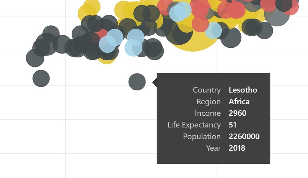
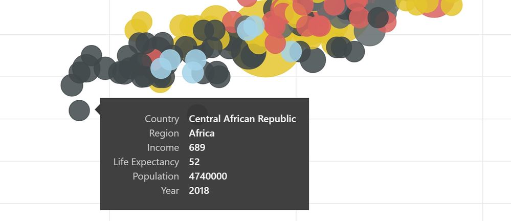
It feels like there are only a few, fixed sizes of bubbles and population numbers are being grossly matched to these. By grossly, I mean about 3 or 4 bubble sizes. The photos below show two bubbles of the same size yet with one population double the other.
Any MS scatter chart folks here who can explain how bubble sizing works in the current scatter chart?
-Todd
- Mark as New
- Bookmark
- Subscribe
- Mute
- Subscribe to RSS Feed
- Permalink
- Report Inappropriate Content
I have the same question. I would be great if I there was a way to adjust as a gradient of bubble sizes like in Tableau. Also please(!) add transparency to color selection! This is needed for scatter charts!
- Mark as New
- Bookmark
- Subscribe
- Mute
- Subscribe to RSS Feed
- Permalink
- Report Inappropriate Content
Hi @toddjneedham,
Can you please share some sample data for test? If is hard to troubleshoot your issue from snapshot.
Regards,
Xiaoxin Sheng
- Mark as New
- Bookmark
- Subscribe
- Mute
- Subscribe to RSS Feed
- Permalink
- Report Inappropriate Content
Note that Canada is 100x the population of Ecuador in this contrived example but is clearly NOT 100 times the size/area in the bubbles.
-Todd
- Mark as New
- Bookmark
- Subscribe
- Mute
- Subscribe to RSS Feed
- Permalink
- Report Inappropriate Content
It's been a year and I've seen no acknowledgement of this bug, no workarounds and no changes in the Scatter chart. Is there a specific place to file bug reports on Power BI? Thanks.
-Todd
Helpful resources

FabCon Global Hackathon
Join the Fabric FabCon Global Hackathon—running virtually through Nov 3. Open to all skill levels. $10,000 in prizes!

Power BI Monthly Update - September 2025
Check out the September 2025 Power BI update to learn about new features.


