FabCon is coming to Atlanta
Join us at FabCon Atlanta from March 16 - 20, 2026, for the ultimate Fabric, Power BI, AI and SQL community-led event. Save $200 with code FABCOMM.
Register now!- Power BI forums
- Get Help with Power BI
- Desktop
- Service
- Report Server
- Power Query
- Mobile Apps
- Developer
- DAX Commands and Tips
- Custom Visuals Development Discussion
- Health and Life Sciences
- Power BI Spanish forums
- Translated Spanish Desktop
- Training and Consulting
- Instructor Led Training
- Dashboard in a Day for Women, by Women
- Galleries
- Data Stories Gallery
- Themes Gallery
- Contests Gallery
- QuickViz Gallery
- Quick Measures Gallery
- Visual Calculations Gallery
- Notebook Gallery
- Translytical Task Flow Gallery
- TMDL Gallery
- R Script Showcase
- Webinars and Video Gallery
- Ideas
- Custom Visuals Ideas (read-only)
- Issues
- Issues
- Events
- Upcoming Events
The Power BI Data Visualization World Championships is back! Get ahead of the game and start preparing now! Learn more
- Power BI forums
- Forums
- Get Help with Power BI
- Desktop
- Breaking down values in a line chart
- Subscribe to RSS Feed
- Mark Topic as New
- Mark Topic as Read
- Float this Topic for Current User
- Bookmark
- Subscribe
- Printer Friendly Page
- Mark as New
- Bookmark
- Subscribe
- Mute
- Subscribe to RSS Feed
- Permalink
- Report Inappropriate Content
Breaking down values in a line chart
Hi
I'm trying to make a line chart with 4 lines, but with using only 3 variables.
The first line is simple, as the value is the average of a variable and the axis is date.
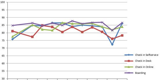
The remaining three lines are more complicated. As in the first line, I want it to be the average of a variable. But this variable has to be broken down by three different values, as it measures satisfaction on 3 different areas. So they are asked how they have checked-in and get 3 different options. Later, people are asked how satisfied they are with the process of checking in. I want the average line for each possible answer to be shown in the chart.
Does anyone have an idea that might work?
Thanks in advance!
Solved! Go to Solution.
- Mark as New
- Bookmark
- Subscribe
- Mute
- Subscribe to RSS Feed
- Permalink
- Report Inappropriate Content
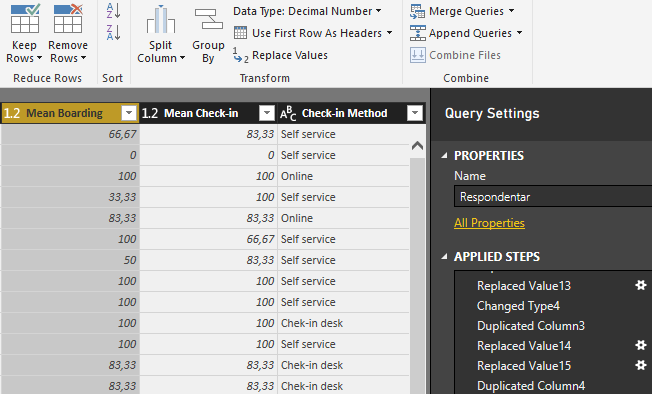
I think I have found a solution, although it may not be the optimal one. But it works. I've made three conditional columns. So "If Check-in Method = Self service Then ValueFromMeanCheckIn" This gives me the values that I'm looking for.
- Mark as New
- Bookmark
- Subscribe
- Mute
- Subscribe to RSS Feed
- Permalink
- Report Inappropriate Content
Hi @kjartank,
Base on my understanding, you should be able to create different measures with the three variables correspondingly, then show all the measures on the line chart in this scenario.
Could you post your table structures with some sample data and your expected result, so that we can further assist on it? ![]()
Regards
- Mark as New
- Bookmark
- Subscribe
- Mute
- Subscribe to RSS Feed
- Permalink
- Report Inappropriate Content
I think I have found a solution, although it may not be the optimal one. But it works. I've made three conditional columns. So "If Check-in Method = Self service Then ValueFromMeanCheckIn" This gives me the values that I'm looking for.
- Mark as New
- Bookmark
- Subscribe
- Mute
- Subscribe to RSS Feed
- Permalink
- Report Inappropriate Content
Hi @kjartank,
Great to hear the problem got resolved! Could you accept your reply above as solution to close this thread? ![]()
Regards
- Mark as New
- Bookmark
- Subscribe
- Mute
- Subscribe to RSS Feed
- Permalink
- Report Inappropriate Content
Hi.
I'm attaching two pictures. One of the chart I want to produce and one of the data structure. I simply want to break it down to the average mean of each chech-in method.
Regards
- Mark as New
- Bookmark
- Subscribe
- Mute
- Subscribe to RSS Feed
- Permalink
- Report Inappropriate Content
Hi,
could you show us some example data. In that way it is hard to understand.
My first thought is just to make the Averages of those 3 (part) Measures and calculate them strictly mathematically.
=(AVG(Values1) + AVG(Values2) + AVG(Values3))/3
Helpful resources

Power BI Dataviz World Championships
The Power BI Data Visualization World Championships is back! Get ahead of the game and start preparing now!

| User | Count |
|---|---|
| 39 | |
| 38 | |
| 38 | |
| 28 | |
| 27 |
| User | Count |
|---|---|
| 124 | |
| 88 | |
| 73 | |
| 66 | |
| 65 |


