- Power BI forums
- Updates
- News & Announcements
- Get Help with Power BI
- Desktop
- Service
- Report Server
- Power Query
- Mobile Apps
- Developer
- DAX Commands and Tips
- Custom Visuals Development Discussion
- Health and Life Sciences
- Power BI Spanish forums
- Translated Spanish Desktop
- Power Platform Integration - Better Together!
- Power Platform Integrations (Read-only)
- Power Platform and Dynamics 365 Integrations (Read-only)
- Training and Consulting
- Instructor Led Training
- Dashboard in a Day for Women, by Women
- Galleries
- Community Connections & How-To Videos
- COVID-19 Data Stories Gallery
- Themes Gallery
- Data Stories Gallery
- R Script Showcase
- Webinars and Video Gallery
- Quick Measures Gallery
- 2021 MSBizAppsSummit Gallery
- 2020 MSBizAppsSummit Gallery
- 2019 MSBizAppsSummit Gallery
- Events
- Ideas
- Custom Visuals Ideas
- Issues
- Issues
- Events
- Upcoming Events
- Community Blog
- Power BI Community Blog
- Custom Visuals Community Blog
- Community Support
- Community Accounts & Registration
- Using the Community
- Community Feedback
Register now to learn Fabric in free live sessions led by the best Microsoft experts. From Apr 16 to May 9, in English and Spanish.
- Power BI forums
- Forums
- Get Help with Power BI
- Desktop
- Re: Box & Whisker Plot (Basic Statistics & Mean Ca...
- Subscribe to RSS Feed
- Mark Topic as New
- Mark Topic as Read
- Float this Topic for Current User
- Bookmark
- Subscribe
- Printer Friendly Page
- Mark as New
- Bookmark
- Subscribe
- Mute
- Subscribe to RSS Feed
- Permalink
- Report Inappropriate Content
Box & Whisker Plot (Basic Statistics & Mean Calculation)
Hi all,
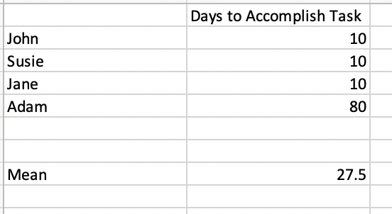
I work with Power BI & I am calculating average days to accomplish a task with a Box & Whisker plot. I noticed that it, by default, only captures unique values. However, some individuals of course take the same amount of days to complete a task (see attached picture). I am trying to do outlier & mean analysis for many individuals and how long they take to complete a task on average.
This now has me wondering is mean based on unique values only for true average hence why box & whisker plots don't include duplicate values? In this case, the calculation would only include unique values, but then does that change the "n" you divide by to all values in the sample or just unique ones?
Or should the duplicates still be accounted for in calculating the average days it takes to accomplish a task. I am not very well versed in statistics so anything would help in calculating average/mean.
The main concern here is when I put the "Days to Accomplish Task" average in tabular format it is giving different values than the mean in the Box & Whisker plot and I believe it is because it is not accounting for duplicate values when calculating the mean. Any suggestions/thoughts?
Solved! Go to Solution.
- Mark as New
- Bookmark
- Subscribe
- Mute
- Subscribe to RSS Feed
- Permalink
- Report Inappropriate Content
Hey @learning_dax ,
the mean/average is a beast, not just in Power BI or DAX, but basically everywhere 🙂
Nevertheless, you stumbled on something that you (meaning we) have to be aware of, whenever we throw data to data visualizations. There is a default behavior that we can not change, this behavior is the grouping of rows. Assume we have this simple dataset:
With a given aggregation function of SUM for the column amount:
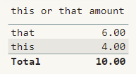
When we drag the columns to a table visual everything is behaving as expected:
We see the value 4 on the category this.
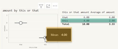
When we switch the aggregation to mean we see a value of two, the next screenshot shows this (I dragged the numeric column to the visual a 2nd time), it's important to understand that the mean is calculated by SUM( ... ) / NumberOfRows.
Next to that the screenshot also shows the "Box and Whisker by MAQ Software" visual, and now we see the different means:
Basically, this issue can not be resolved due to the default behavior of Power BI: grouping of rows, the number of rows is not available to the visuals.
Most of the time, this is exactly what we want, but from now and then this behavior creates an issue.
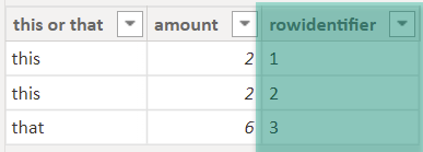
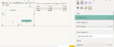
You can change this either by changing the default aggregation of the numeric column, from SUM to AVERAGE (of course this is not an option if we are using an explicit measure), this will lead to the same MEAN in the Box and Whisker visual and the table visual, or add a rowidentifier to the dataset:
Using this in combination with the Box and Whisker plot yields the same MEAN as the table visual:
Hopefully, this helps to tackle your challenge and provides some insights on what's going on.
Regards,
Tom
Did I answer your question? Mark my post as a solution, this will help others!
Proud to be a Super User!
I accept Kudos 😉
Hamburg, Germany
- Mark as New
- Bookmark
- Subscribe
- Mute
- Subscribe to RSS Feed
- Permalink
- Report Inappropriate Content
@TomMartens this explanation is exactly what I was inquiring about and it makes sense as to why it behaves that way. The "row identifier" solution will work, but do you mind sharing the formula for the measure or calculated column that may work?
I have tried a couple different methods but again duplicate values pose another challenge when I index columns when we need all unique row identifiers. Thanks for all of your help.
- Mark as New
- Bookmark
- Subscribe
- Mute
- Subscribe to RSS Feed
- Permalink
- Report Inappropriate Content
Hey @learning_dax ,
there is not DAX solution, as the number of rows that will be passed to the visuals will not change. What I was trying to say was this, if you pass a measure to the visual, then you have to use a row identifier. If you use a numeric column then you can maybe overcome the issue by changing the default aggregation function to AVERAGE.
Regards,
Tom
Did I answer your question? Mark my post as a solution, this will help others!
Proud to be a Super User!
I accept Kudos 😉
Hamburg, Germany
Helpful resources

Microsoft Fabric Learn Together
Covering the world! 9:00-10:30 AM Sydney, 4:00-5:30 PM CET (Paris/Berlin), 7:00-8:30 PM Mexico City

Power BI Monthly Update - April 2024
Check out the April 2024 Power BI update to learn about new features.

| User | Count |
|---|---|
| 109 | |
| 106 | |
| 87 | |
| 75 | |
| 66 |
| User | Count |
|---|---|
| 125 | |
| 114 | |
| 98 | |
| 81 | |
| 73 |
