FabCon is coming to Atlanta
Join us at FabCon Atlanta from March 16 - 20, 2026, for the ultimate Fabric, Power BI, AI and SQL community-led event. Save $200 with code FABCOMM.
Register now!- Power BI forums
- Get Help with Power BI
- Desktop
- Service
- Report Server
- Power Query
- Mobile Apps
- Developer
- DAX Commands and Tips
- Custom Visuals Development Discussion
- Health and Life Sciences
- Power BI Spanish forums
- Translated Spanish Desktop
- Training and Consulting
- Instructor Led Training
- Dashboard in a Day for Women, by Women
- Galleries
- Data Stories Gallery
- Themes Gallery
- Contests Gallery
- QuickViz Gallery
- Quick Measures Gallery
- Visual Calculations Gallery
- Notebook Gallery
- Translytical Task Flow Gallery
- TMDL Gallery
- R Script Showcase
- Webinars and Video Gallery
- Ideas
- Custom Visuals Ideas (read-only)
- Issues
- Issues
- Events
- Upcoming Events
Learn from the best! Meet the four finalists headed to the FINALS of the Power BI Dataviz World Championships! Register now
- Power BI forums
- Forums
- Get Help with Power BI
- Desktop
- Re: Box Plot color consistency
- Subscribe to RSS Feed
- Mark Topic as New
- Mark Topic as Read
- Float this Topic for Current User
- Bookmark
- Subscribe
- Printer Friendly Page
- Mark as New
- Bookmark
- Subscribe
- Mute
- Subscribe to RSS Feed
- Permalink
- Report Inappropriate Content
Box Plot color consistency
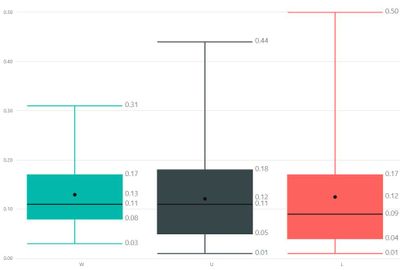
Hello. I have created a boxplot (box and whisker) chart using Jan Pieter Posthumas visual. Here is a snapshot of what it looks like:
As you can see, I have 3 boxplots (W,U,L) with 3 consistent colors. The problem I have is that the colors do not remain consistent when items are filtered out. Based on some filters I have chosen, "U" no longer has data, so the boxplot does not show and then the colors for "W" and "L" change - see below:
How can I keep the colors consistent? Or is there a way to keep the 3 boxplots in the report regardless of the filters chosen?
Thanks!
- Mark as New
- Bookmark
- Subscribe
- Mute
- Subscribe to RSS Feed
- Permalink
- Report Inappropriate Content
You can set specific colours for each category under the 'Data colors' section of the Format pane.
Make sure the 'Show all' switch is on and then you'll see each category and a colour selector listed below.
Best regards,
Martyn
- Mark as New
- Bookmark
- Subscribe
- Mute
- Subscribe to RSS Feed
- Permalink
- Report Inappropriate Content
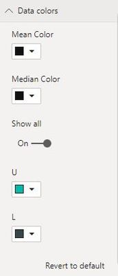
Hi @MartynRamsden I appreciate the suggestion, but the problem I am having is that when I filter down the data based on several different criteria, the population size decreases. This means that sometimes "W" has no records to build a boxplot and then my colors shift or don't stay the same. Here is a screenshot of the "Data Colors" area and as you can see "W" can not be found:
- Mark as New
- Bookmark
- Subscribe
- Mute
- Subscribe to RSS Feed
- Permalink
- Report Inappropriate Content
I've done some testing and now fully understand your issue. Unfortunately, I don't think there's a solution.
I was under the impression that when using the 'Data colours' formatting option, you were assigning colours directly to categories - it appears this isn't the case in this visual!
It looks like the colours are actually being assigned to the order the categories appear in. Hence, if a category is filtered out, the remaining visible categories will change colour, as you're seeing.
Most of the built in Power BI visuals now support Conditional Formatting but this isn't an option in the Box Plot visual you're using.
Sorry I can't be of any more help!
Best regards,
Martyn
- Mark as New
- Bookmark
- Subscribe
- Mute
- Subscribe to RSS Feed
- Permalink
- Report Inappropriate Content
Thanks @MartynRamsden - you are spot on. The colors are based upon sorting, unfortunately. At this moment I do not know a better way to color the boxplots. Oh well! I'll keep trying.
Helpful resources

Join our Fabric User Panel
Share feedback directly with Fabric product managers, participate in targeted research studies and influence the Fabric roadmap.

Power BI Monthly Update - February 2026
Check out the February 2026 Power BI update to learn about new features.

| User | Count |
|---|---|
| 52 | |
| 51 | |
| 35 | |
| 15 | |
| 14 |
| User | Count |
|---|---|
| 92 | |
| 75 | |
| 41 | |
| 26 | |
| 25 |


