Become a Certified Power BI Data Analyst!
Join us for an expert-led overview of the tools and concepts you'll need to pass exam PL-300. The first session starts on June 11th. See you there!
Get registered- Power BI forums
- Get Help with Power BI
- Desktop
- Service
- Report Server
- Power Query
- Mobile Apps
- Developer
- DAX Commands and Tips
- Custom Visuals Development Discussion
- Health and Life Sciences
- Power BI Spanish forums
- Translated Spanish Desktop
- Training and Consulting
- Instructor Led Training
- Dashboard in a Day for Women, by Women
- Galleries
- Webinars and Video Gallery
- Data Stories Gallery
- Themes Gallery
- Contests Gallery
- Quick Measures Gallery
- Notebook Gallery
- Translytical Task Flow Gallery
- R Script Showcase
- Ideas
- Custom Visuals Ideas (read-only)
- Issues
- Issues
- Events
- Upcoming Events
Power BI is turning 10! Let’s celebrate together with dataviz contests, interactive sessions, and giveaways. Register now.
- Power BI forums
- Forums
- Get Help with Power BI
- Desktop
- Bottom part of x-axis labels cut off
- Subscribe to RSS Feed
- Mark Topic as New
- Mark Topic as Read
- Float this Topic for Current User
- Bookmark
- Subscribe
- Printer Friendly Page
- Mark as New
- Bookmark
- Subscribe
- Mute
- Subscribe to RSS Feed
- Permalink
- Report Inappropriate Content
Bottom part of x-axis labels cut off
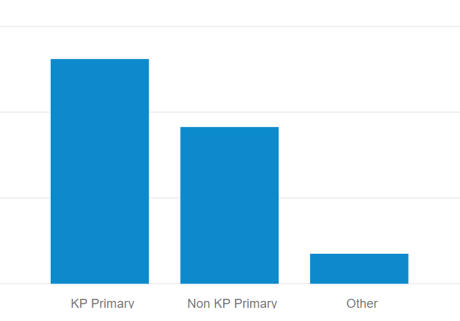
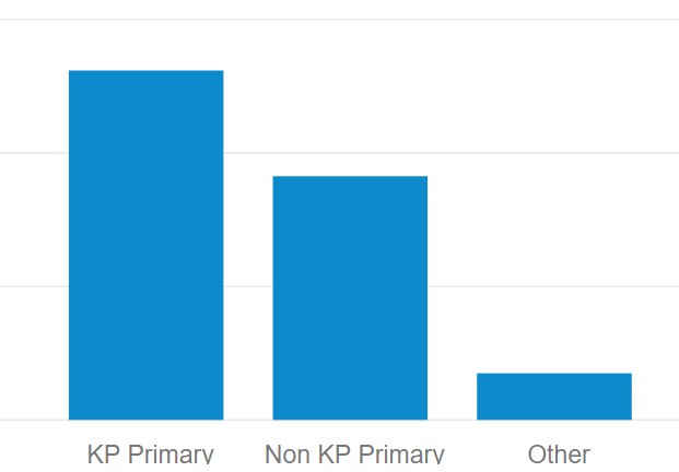
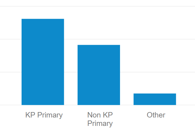
The bottom part of my x-axis labels seem to be getting cut off, and I can't find the proper setting to fix it. For example, the word "Primary" loses the bottom part of the letter y, and it ends up looking like "Primarv". Does anyone else have this issue, and if so, how do I rectify it? Thanks in advance for your time.
- Mark as New
- Bookmark
- Subscribe
- Mute
- Subscribe to RSS Feed
- Permalink
- Report Inappropriate Content
Fairly new to Power BI. but I think I found the solution. if you go to Visualizations -> Format Visual -> Visual -> X-axis -> Values -> Max area height. Here you increase the % shown, or move the slicer to the right to fit the cut off x-axis labels.
Hope this was helpful!
- Mark as New
- Bookmark
- Subscribe
- Mute
- Subscribe to RSS Feed
- Permalink
- Report Inappropriate Content
I get the same thing, although I have to go down to size 9 font (using Arial) to get it to stop. Very annoying!
I dont have a proper solution but have found a workaround - I enabled the x-axis title and set the font colour to white so that you can't see it
- Mark as New
- Bookmark
- Subscribe
- Mute
- Subscribe to RSS Feed
- Permalink
- Report Inappropriate Content
Someone buy this genius a beer. Saved my ass.
- Mark as New
- Bookmark
- Subscribe
- Mute
- Subscribe to RSS Feed
- Permalink
- Report Inappropriate Content
Hi @Shefik,
Could you please tell me if you solved it? Can you share the answer or mark the proper answer as a solution, please?
Best Regards,
Dale
If this post helps, then please consider Accept it as the solution to help the other members find it more quickly.
- Mark as New
- Bookmark
- Subscribe
- Mute
- Subscribe to RSS Feed
- Permalink
- Report Inappropriate Content
Hi @v-jiascu-msft,
This unfortunately does not fix the issue. (I had already attempted to turn Responsive on.)
Here are a few screenshots (and take note that Responsive is on for all of these). Font sizes for the four screenshots are 10, 11, 14, and 15. Notice that 10 is fine, 11 cuts off the very bottom of the word "Primary" (look at the letter "y"), as does 14, but 15 introduces a new line, and the problem goes away.
Let me know if I can provide further information. Thanks!


- Mark as New
- Bookmark
- Subscribe
- Mute
- Subscribe to RSS Feed
- Permalink
- Report Inappropriate Content
Hi @Shefik,
Which version of Desktop did you have? It's fine in my test. Please use the latest version.
Best Regards,
Dale
If this post helps, then please consider Accept it as the solution to help the other members find it more quickly.
- Mark as New
- Bookmark
- Subscribe
- Mute
- Subscribe to RSS Feed
- Permalink
- Report Inappropriate Content
I am on the June 2018 version of Power BI Desktop. As far as I can tell, July 2018 has not yet been released as of the time of this writing.
- Mark as New
- Bookmark
- Subscribe
- Mute
- Subscribe to RSS Feed
- Permalink
- Report Inappropriate Content
Hi @Shefik,
Which visual is it? It seems good.
Best Regards,
Dale
If this post helps, then please consider Accept it as the solution to help the other members find it more quickly.
Helpful resources

Join our Fabric User Panel
This is your chance to engage directly with the engineering team behind Fabric and Power BI. Share your experiences and shape the future.

Power BI Monthly Update - June 2025
Check out the June 2025 Power BI update to learn about new features.

| User | Count |
|---|---|
| 76 | |
| 76 | |
| 55 | |
| 36 | |
| 34 |
| User | Count |
|---|---|
| 99 | |
| 56 | |
| 53 | |
| 44 | |
| 40 |
