FabCon is coming to Atlanta
Join us at FabCon Atlanta from March 16 - 20, 2026, for the ultimate Fabric, Power BI, AI and SQL community-led event. Save $200 with code FABCOMM.
Register now!- Power BI forums
- Get Help with Power BI
- Desktop
- Service
- Report Server
- Power Query
- Mobile Apps
- Developer
- DAX Commands and Tips
- Custom Visuals Development Discussion
- Health and Life Sciences
- Power BI Spanish forums
- Translated Spanish Desktop
- Training and Consulting
- Instructor Led Training
- Dashboard in a Day for Women, by Women
- Galleries
- Data Stories Gallery
- Themes Gallery
- Contests Gallery
- QuickViz Gallery
- Quick Measures Gallery
- Visual Calculations Gallery
- Notebook Gallery
- Translytical Task Flow Gallery
- TMDL Gallery
- R Script Showcase
- Webinars and Video Gallery
- Ideas
- Custom Visuals Ideas (read-only)
- Issues
- Issues
- Events
- Upcoming Events
The Power BI Data Visualization World Championships is back! Get ahead of the game and start preparing now! Learn more
- Power BI forums
- Forums
- Get Help with Power BI
- Desktop
- Bing Map Options
- Subscribe to RSS Feed
- Mark Topic as New
- Mark Topic as Read
- Float this Topic for Current User
- Bookmark
- Subscribe
- Printer Friendly Page
- Mark as New
- Bookmark
- Subscribe
- Mute
- Subscribe to RSS Feed
- Permalink
- Report Inappropriate Content
Bing Map Options
Hello,
I have a map visual created and am trying to do a couple of things I cannot seem to get.
1: Is there a way to show the scale legend you see on maps IE |------| 1km that usually appears in the lower right on the bing map in a browser.
2: I have cars gps coordinates displayed. I put the car name into the legend and it makes all cars a different colour on the map but I would like to somehow make all cars EXCEPT a known 2 one colour and the rest another color. I know I can change the color individually but I have 75 different ones.
Thanks,
--James
Solved! Go to Solution.
- Mark as New
- Bookmark
- Subscribe
- Mute
- Subscribe to RSS Feed
- Permalink
- Report Inappropriate Content
Hi JSher,
Question 1: I have not seen how to do this with Bing or ArcGIS. Try the custom visual iconMapv3. This visual includes a scale in the map control settings.
Question 2: From my understanding of your post, the following may work.
I have used Australian cities as your "car GPS coordinates".
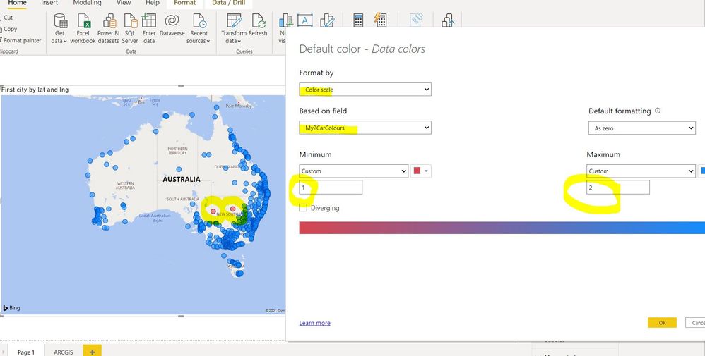
Create a measure for the 2 car types in question, assigning a value of 1 to your two cars and a value of 2 to all other cars.
My2CarColours = IF(MAX(AUS[city]) = "Broken Hill" || MAX(AUS[city]) = "Cobar" , 1, 2 )
Only use lat and long on the map. Do not add anything to legend.
Then, via Format-> Data Colours, use the Fx function to format by colour scale setting your two cars (Custom Value of 1) to one colour and all others to another colour (Custom Value of 2).
You can see the 2 cities, Broken Hill and Cobar are red, and all other cities are blue.
Sample: https://www.dropbox.com/s/7lmmki6612ihp6o/Show2Cars.pbix?dl=0

Helpful resources

Power BI Dataviz World Championships
The Power BI Data Visualization World Championships is back! Get ahead of the game and start preparing now!

| User | Count |
|---|---|
| 39 | |
| 35 | |
| 34 | |
| 32 | |
| 27 |
| User | Count |
|---|---|
| 136 | |
| 96 | |
| 77 | |
| 67 | |
| 65 |

