Fabric Data Days starts November 4th!
Advance your Data & AI career with 50 days of live learning, dataviz contests, hands-on challenges, study groups & certifications and more!
Get registered- Power BI forums
- Get Help with Power BI
- Desktop
- Service
- Report Server
- Power Query
- Mobile Apps
- Developer
- DAX Commands and Tips
- Custom Visuals Development Discussion
- Health and Life Sciences
- Power BI Spanish forums
- Translated Spanish Desktop
- Training and Consulting
- Instructor Led Training
- Dashboard in a Day for Women, by Women
- Galleries
- Data Stories Gallery
- Themes Gallery
- Contests Gallery
- Quick Measures Gallery
- Visual Calculations Gallery
- Notebook Gallery
- Translytical Task Flow Gallery
- TMDL Gallery
- R Script Showcase
- Webinars and Video Gallery
- Ideas
- Custom Visuals Ideas (read-only)
- Issues
- Issues
- Events
- Upcoming Events
Join us at FabCon Atlanta from March 16 - 20, 2026, for the ultimate Fabric, Power BI, AI and SQL community-led event. Save $200 with code FABCOMM. Register now.
- Power BI forums
- Forums
- Get Help with Power BI
- Desktop
- Best way to share an axis for different data field...
- Subscribe to RSS Feed
- Mark Topic as New
- Mark Topic as Read
- Float this Topic for Current User
- Bookmark
- Subscribe
- Printer Friendly Page
- Mark as New
- Bookmark
- Subscribe
- Mute
- Subscribe to RSS Feed
- Permalink
- Report Inappropriate Content
Best way to share an axis for different data fields using the same scale?
all hope someone can help me
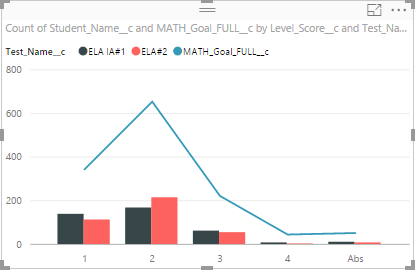
I am having trouble showing a line and clustered column chart whereby the shared axis is used for 2 sets of data each using the same scale. This is what I have:
Field called ELA Goal which is 1, 2 ,3 or 4
Test Results for different tests (2 types in same area) which is also 1,2,3,4
Students who have data for both
There are two tables linked together by student name. The results currently dont look right as can be seen here. I know this as the line part is showing the wrong number of each (we only have 650 students and around 450-500 with actual data that should be shown in the line.
Any help much appreciated!
Solved! Go to Solution.
- Mark as New
- Bookmark
- Subscribe
- Mute
- Subscribe to RSS Feed
- Permalink
- Report Inappropriate Content
In this scenario, the reason why the line shows higher values is that the count of students names are aggregated on ELA Goal level (for both type). However, it's not possible to have line sliced by the column series which separates into multiple lines in this kind of combine chart. So I suggest you show the count of students in another chart and make it sliced my different type of tests.
Regards,
- Mark as New
- Bookmark
- Subscribe
- Mute
- Subscribe to RSS Feed
- Permalink
- Report Inappropriate Content
Thanks so much! That does make sense.


