Join us at FabCon Vienna from September 15-18, 2025
The ultimate Fabric, Power BI, SQL, and AI community-led learning event. Save €200 with code FABCOMM.
Get registeredGo To
- Power BI forums
- Get Help with Power BI
- Desktop
- Service
- Report Server
- Power Query
- Mobile Apps
- Developer
- DAX Commands and Tips
- Custom Visuals Development Discussion
- Health and Life Sciences
- Power BI Spanish forums
- Translated Spanish Desktop
- Training and Consulting
- Instructor Led Training
- Dashboard in a Day for Women, by Women
- Galleries
- Data Stories Gallery
- Themes Gallery
- Contests Gallery
- Quick Measures Gallery
- Notebook Gallery
- Translytical Task Flow Gallery
- TMDL Gallery
- R Script Showcase
- Webinars and Video Gallery
- Ideas
- Custom Visuals Ideas (read-only)
- Issues
- Issues
- Events
- Upcoming Events
Turn on suggestions
Auto-suggest helps you quickly narrow down your search results by suggesting possible matches as you type.
Showing results for
Enhance your career with this limited time 50% discount on Fabric and Power BI exams. Ends September 15. Request your voucher.
- Power BI forums
- Forums
- Get Help with Power BI
- Desktop
- Best visual to compare multiple values across 2 Gr...
Reply
Topic Options
- Subscribe to RSS Feed
- Mark Topic as New
- Mark Topic as Read
- Float this Topic for Current User
- Bookmark
- Subscribe
- Printer Friendly Page
- Mark as New
- Bookmark
- Subscribe
- Mute
- Subscribe to RSS Feed
- Permalink
- Report Inappropriate Content
Best visual to compare multiple values across 2 Groups/categories
04-22-2020
07:37 AM
Hi guys,
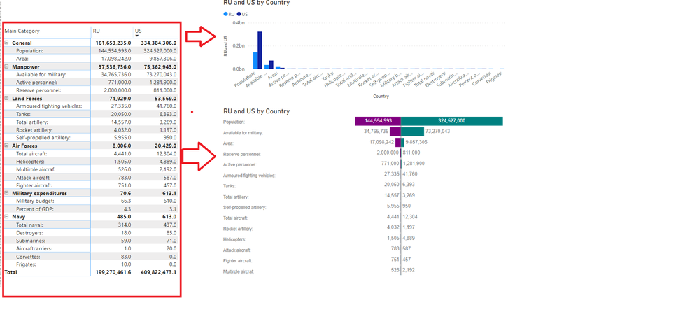
What do you think is the best visual to compare multiple values across 2 Groups/categories.
I tried with Column chart and Tornado but they look horrible becasue the 2 bars/columns to be compared are not sized according to each group of 2 values separately.
Here is the sample data. Comparing Military power of US and Russia(RU)
| Main Category | Sub Category | US | RU |
| Air Forces | Fighter aircraft: | 457.0 | 751.0 |
| Air Forces | Helicopters: | 4,889.0 | 1,505.0 |
| Air Forces | Multirole aircraf: | 2,192.0 | 526.0 |
| Air Forces | Total aircraft: | 12,304.0 | 4,441.0 |
| Air Forces | Attack aircraft: | 587.0 | 783.0 |
| General | Area: | 9,857,306.0 | 17,098,242.0 |
| General | Population: | 324,527,000.0 | 144,554,993.0 |
| Land Forces | Total artillery: | 3,269.0 | 14,557.0 |
| Land Forces | Armoured fighting vehicles: | 41,760.0 | 27,335.0 |
| Land Forces | Rocket artillery: | 1,197.0 | 4,032.0 |
| Land Forces | Self-propelled artillery: | 950.0 | 5,955.0 |
| Land Forces | Tanks: | 6,393.0 | 20,050.0 |
| Manpower | Available for military: | 73,270,043.0 | 34,765,736.0 |
| Manpower | Reserve personnel: | 811,000.0 | 2,000,000.0 |
| Manpower | Active personnel: | 1,281,900.0 | 771,000.0 |
| Military expenditures | Military budget: | 610.0 | 66.3 |
| Military expenditures | Percent of GDP: | 3.1 | 4.3 |
| Navy | Total naval: | 437.0 | 314.0 |
| Navy | Aircraftcarriers: | 20.0 | 1.0 |
| Navy | Corvettes: | 0.0 | 83.0 |
| Navy | Destroyers: | 85.0 | 18.0 |
| Navy | Frigates: | 0.0 | 10.0 |
| Navy | Submarines: | 71.0 | 59.0 |
2 REPLIES 2
- Mark as New
- Bookmark
- Subscribe
- Mute
- Subscribe to RSS Feed
- Permalink
- Report Inappropriate Content
04-22-2020
09:57 AM
It occurs to me that the problem is not the visual but that you need to normalize those numbers. Like:
Normalized = [US] / [RU]
Then put that in a graph. Note, in this circumstance you would not unpivot the last two columns.
Follow on LinkedIn
@ me in replies or I'll lose your thread!!!
Instead of a Kudo, please vote for this idea
Become an expert!: Enterprise DNA
External Tools: MSHGQM
YouTube Channel!: Microsoft Hates Greg
Latest book!: DAX For Humans

DAX is easy, CALCULATE makes DAX hard...
Normalized = [US] / [RU]
Then put that in a graph. Note, in this circumstance you would not unpivot the last two columns.
Follow on LinkedIn
@ me in replies or I'll lose your thread!!!
Instead of a Kudo, please vote for this idea
Become an expert!: Enterprise DNA
External Tools: MSHGQM
YouTube Channel!: Microsoft Hates Greg
Latest book!: DAX For Humans
DAX is easy, CALCULATE makes DAX hard...
- Mark as New
- Bookmark
- Subscribe
- Mute
- Subscribe to RSS Feed
- Permalink
- Report Inappropriate Content
04-23-2020
02:26 AM
Hi @Greg
Thanks for your help.
Could you illustrate this in the form of a chart with the help of sample data I provided above
Many thanks in advance
Helpful resources
Featured Topics
Top Solution Authors
| User | Count |
|---|---|
| 68 | |
| 63 | |
| 59 | |
| 54 | |
| 28 |
Top Kudoed Authors
| User | Count |
|---|---|
| 182 | |
| 81 | |
| 63 | |
| 47 | |
| 41 |


