FabCon is coming to Atlanta
Join us at FabCon Atlanta from March 16 - 20, 2026, for the ultimate Fabric, Power BI, AI and SQL community-led event. Save $200 with code FABCOMM.
Register now!- Power BI forums
- Get Help with Power BI
- Desktop
- Service
- Report Server
- Power Query
- Mobile Apps
- Developer
- DAX Commands and Tips
- Custom Visuals Development Discussion
- Health and Life Sciences
- Power BI Spanish forums
- Translated Spanish Desktop
- Training and Consulting
- Instructor Led Training
- Dashboard in a Day for Women, by Women
- Galleries
- Data Stories Gallery
- Themes Gallery
- Contests Gallery
- QuickViz Gallery
- Quick Measures Gallery
- Visual Calculations Gallery
- Notebook Gallery
- Translytical Task Flow Gallery
- TMDL Gallery
- R Script Showcase
- Webinars and Video Gallery
- Ideas
- Custom Visuals Ideas (read-only)
- Issues
- Issues
- Events
- Upcoming Events
The Power BI Data Visualization World Championships is back! Get ahead of the game and start preparing now! Learn more
- Power BI forums
- Forums
- Get Help with Power BI
- Desktop
- Best visual to compare multiple values across 2 Gr...
- Subscribe to RSS Feed
- Mark Topic as New
- Mark Topic as Read
- Float this Topic for Current User
- Bookmark
- Subscribe
- Printer Friendly Page
- Mark as New
- Bookmark
- Subscribe
- Mute
- Subscribe to RSS Feed
- Permalink
- Report Inappropriate Content
Best visual to compare multiple values across 2 Groups/categories
Hi guys,
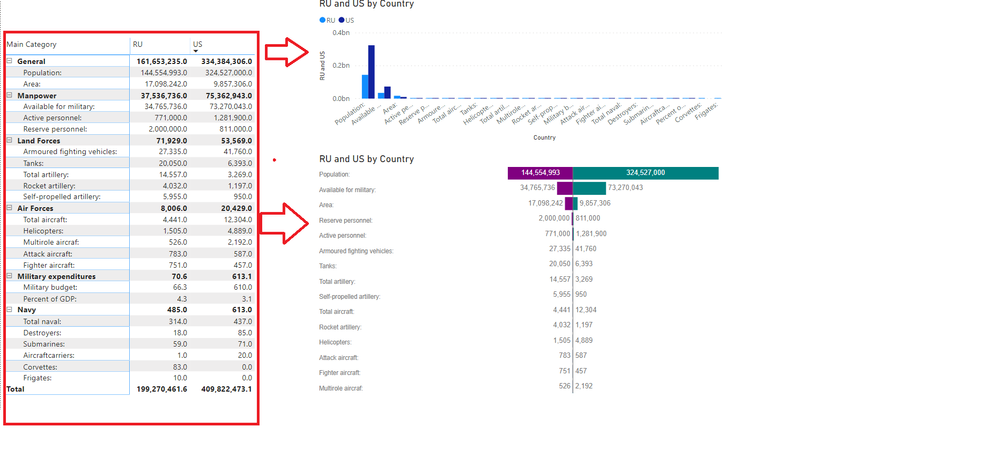
What do you think is the best visual to compare multiple values across 2 Groups/categories.
I tried with Column chart and Tornado but they look horrible becasue the 2 bars/columns to be compared are not sized according to each group of 2 values separately.
Here is the sample data. Comparing Military power of US and Russia(RU)
| Main Category | Sub Category | US | RU |
| Air Forces | Fighter aircraft: | 457.0 | 751.0 |
| Air Forces | Helicopters: | 4,889.0 | 1,505.0 |
| Air Forces | Multirole aircraf: | 2,192.0 | 526.0 |
| Air Forces | Total aircraft: | 12,304.0 | 4,441.0 |
| Air Forces | Attack aircraft: | 587.0 | 783.0 |
| General | Area: | 9,857,306.0 | 17,098,242.0 |
| General | Population: | 324,527,000.0 | 144,554,993.0 |
| Land Forces | Total artillery: | 3,269.0 | 14,557.0 |
| Land Forces | Armoured fighting vehicles: | 41,760.0 | 27,335.0 |
| Land Forces | Rocket artillery: | 1,197.0 | 4,032.0 |
| Land Forces | Self-propelled artillery: | 950.0 | 5,955.0 |
| Land Forces | Tanks: | 6,393.0 | 20,050.0 |
| Manpower | Available for military: | 73,270,043.0 | 34,765,736.0 |
| Manpower | Reserve personnel: | 811,000.0 | 2,000,000.0 |
| Manpower | Active personnel: | 1,281,900.0 | 771,000.0 |
| Military expenditures | Military budget: | 610.0 | 66.3 |
| Military expenditures | Percent of GDP: | 3.1 | 4.3 |
| Navy | Total naval: | 437.0 | 314.0 |
| Navy | Aircraftcarriers: | 20.0 | 1.0 |
| Navy | Corvettes: | 0.0 | 83.0 |
| Navy | Destroyers: | 85.0 | 18.0 |
| Navy | Frigates: | 0.0 | 10.0 |
| Navy | Submarines: | 71.0 | 59.0 |
- Mark as New
- Bookmark
- Subscribe
- Mute
- Subscribe to RSS Feed
- Permalink
- Report Inappropriate Content
Normalized = [US] / [RU]
Then put that in a graph. Note, in this circumstance you would not unpivot the last two columns.
Follow on LinkedIn
@ me in replies or I'll lose your thread!!!
Instead of a Kudo, please vote for this idea
Become an expert!: Enterprise DNA
External Tools: MSHGQM
YouTube Channel!: Microsoft Hates Greg
Latest book!: DAX For Humans
DAX is easy, CALCULATE makes DAX hard...
- Mark as New
- Bookmark
- Subscribe
- Mute
- Subscribe to RSS Feed
- Permalink
- Report Inappropriate Content
Hi @Greg
Thanks for your help.
Could you illustrate this in the form of a chart with the help of sample data I provided above
Many thanks in advance
Helpful resources

Power BI Dataviz World Championships
The Power BI Data Visualization World Championships is back! Get ahead of the game and start preparing now!

| User | Count |
|---|---|
| 38 | |
| 36 | |
| 33 | |
| 31 | |
| 28 |
| User | Count |
|---|---|
| 129 | |
| 88 | |
| 79 | |
| 68 | |
| 63 |


