FabCon is coming to Atlanta
Join us at FabCon Atlanta from March 16 - 20, 2026, for the ultimate Fabric, Power BI, AI and SQL community-led event. Save $200 with code FABCOMM.
Register now!- Power BI forums
- Get Help with Power BI
- Desktop
- Service
- Report Server
- Power Query
- Mobile Apps
- Developer
- DAX Commands and Tips
- Custom Visuals Development Discussion
- Health and Life Sciences
- Power BI Spanish forums
- Translated Spanish Desktop
- Training and Consulting
- Instructor Led Training
- Dashboard in a Day for Women, by Women
- Galleries
- Data Stories Gallery
- Themes Gallery
- Contests Gallery
- Quick Measures Gallery
- Notebook Gallery
- Translytical Task Flow Gallery
- TMDL Gallery
- R Script Showcase
- Webinars and Video Gallery
- Ideas
- Custom Visuals Ideas (read-only)
- Issues
- Issues
- Events
- Upcoming Events
Calling all Data Engineers! Fabric Data Engineer (Exam DP-700) live sessions are back! Starting October 16th. Sign up.
- Power BI forums
- Forums
- Get Help with Power BI
- Desktop
- Re: Best visual for longitudinal repeating instrum...
- Subscribe to RSS Feed
- Mark Topic as New
- Mark Topic as Read
- Float this Topic for Current User
- Bookmark
- Subscribe
- Printer Friendly Page
- Mark as New
- Bookmark
- Subscribe
- Mute
- Subscribe to RSS Feed
- Permalink
- Report Inappropriate Content
Best visual for longitudinal repeating instruments data
Hello, first time asking a question so please be patient with me.
I have data like this:
| protocol_title | redcap_event_name | redcap_survey_identifier | short_title | principal_investigator | filepath_for_protocol | is_imaging_manual_included | filepath_for_imaging_manua | number_of_patients_expecte | approximate_length_of_the | approximate_number_of_part | name_of_research_coordinat | email_address_of_research | any_other_special_instruct | method_of_image | is_this_the_most_recent_ve | protocol_information_complete | collaboration_survey_timestamp | is_this_study_feasible | please_advise | collaboration_survey_complete |
| protocol test 1 | protocol_informati_arm_1 | test 1 | joe | www.google.com | 1 | www.cnn.com | 100 | 5 years | 20 | Joe Bob | JoeBob@mail.com | nothing special | 2 | 1 | 2 | |||||
| protocol test 1 | survey_1_arm_1 | ######## | 1 | Looks good to me | 2 | |||||||||||||||
| protocol test 1 | survey_2_arm_1 | 0 | I personally hate it | 2 | ||||||||||||||||
| protocol test 1 | survey_3_arm_1 | 1 | What is this? 1998? Email it to me | 2 | ||||||||||||||||
| Study2 | protocol_informati_arm_1 | Second study | Ali C | www.life.org | 0 | 225 | 5 years | 40 | Bob Ross | Bob@gmail.com | nope | 1 | 1 | 2 | ||||||
| Study2 | survey_1_arm_1 | 0 | I want a disc instead | 2 | ||||||||||||||||
| Study2 | survey_2_arm_1 | 1 | Love it | 2 |
Where most of the rows are mostly blank. What I'd like to do is create a visual somewhat like this:
Where the top visual (whether its a table/matrix/etc) has information from the first row for each respective "protocol_title". The visual on the bottom right would have the information from the 'other' rows for each protocol_title. I.e. if I clicked on the top visual to select 'study2', all of the other rows for study 2 would show up in the other visual.
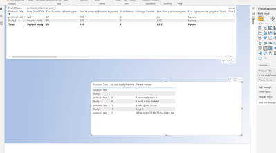
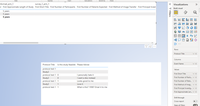
To be honest the way I have it set up now (top visual is matrix , bottom visual table) is kind of doing that, but I dont understand why its adding the prefix "first" to everything, and its also adding a whole bunch of useless columns:
I had though I could filter the top visual to "redcap_event_name"="protocol_information" and that may help? Any other suggestions are appreciated.
Solved! Go to Solution.
- Mark as New
- Bookmark
- Subscribe
- Mute
- Subscribe to RSS Feed
- Permalink
- Report Inappropriate Content
Hi @JoeCrozier ,
Please add Index column for each group in Power Query Editor.
Create Row Number for Each Group in Power BI using Power Query
Then select the rows with index = 0 for the first table.
And select the rows with index <> 0 for the second table.
If the problem is still not resolved, please provide detailed error information or the expected result you expect. Let me know immediately, looking forward to your reply.
Best Regards,
Winniz
If this post helps, then please consider Accept it as the solution to help the other members find it more quickly.
- Mark as New
- Bookmark
- Subscribe
- Mute
- Subscribe to RSS Feed
- Permalink
- Report Inappropriate Content
Update: I've tried putting a filter on the top visual, to filter specifically to protocol_information, but because the other visual is linked to it, if that top visual is filtered, nothing will show up in the bottom. I also understand why its saying "First" and can change that, but its still not the best visual for it.
I've thought one way to do it might be to "split" the raw data into two tables (one with basic info from the top visual and another with comments from the bottom visual) and then merge them back together on protocol title. Any thoughts are appreciated.
- Mark as New
- Bookmark
- Subscribe
- Mute
- Subscribe to RSS Feed
- Permalink
- Report Inappropriate Content
Hi @JoeCrozier ,
Please add Index column for each group in Power Query Editor.
Create Row Number for Each Group in Power BI using Power Query
Then select the rows with index = 0 for the first table.
And select the rows with index <> 0 for the second table.
If the problem is still not resolved, please provide detailed error information or the expected result you expect. Let me know immediately, looking forward to your reply.
Best Regards,
Winniz
If this post helps, then please consider Accept it as the solution to help the other members find it more quickly.
Helpful resources

FabCon Global Hackathon
Join the Fabric FabCon Global Hackathon—running virtually through Nov 3. Open to all skill levels. $10,000 in prizes!

Power BI Monthly Update - September 2025
Check out the September 2025 Power BI update to learn about new features.


