FabCon is coming to Atlanta
Join us at FabCon Atlanta from March 16 - 20, 2026, for the ultimate Fabric, Power BI, AI and SQL community-led event. Save $200 with code FABCOMM.
Register now!- Power BI forums
- Get Help with Power BI
- Desktop
- Service
- Report Server
- Power Query
- Mobile Apps
- Developer
- DAX Commands and Tips
- Custom Visuals Development Discussion
- Health and Life Sciences
- Power BI Spanish forums
- Translated Spanish Desktop
- Training and Consulting
- Instructor Led Training
- Dashboard in a Day for Women, by Women
- Galleries
- Data Stories Gallery
- Themes Gallery
- Contests Gallery
- QuickViz Gallery
- Quick Measures Gallery
- Visual Calculations Gallery
- Notebook Gallery
- Translytical Task Flow Gallery
- TMDL Gallery
- R Script Showcase
- Webinars and Video Gallery
- Ideas
- Custom Visuals Ideas (read-only)
- Issues
- Issues
- Events
- Upcoming Events
Get Fabric Certified for FREE during Fabric Data Days. Don't miss your chance! Request now
- Power BI forums
- Forums
- Get Help with Power BI
- Desktop
- Best method for smoothing the data in a line graph
- Subscribe to RSS Feed
- Mark Topic as New
- Mark Topic as Read
- Float this Topic for Current User
- Bookmark
- Subscribe
- Printer Friendly Page
- Mark as New
- Bookmark
- Subscribe
- Mute
- Subscribe to RSS Feed
- Permalink
- Report Inappropriate Content
Best method for smoothing the data in a line graph
I am trying to get a polynomial style curve however I hear that there is no direct way of doing this in a line chart currently?
I know this can be done in Deneb but if I went that way I'd need some guidance on that too.
I could settle for a method such as a rolling 3 month average (or any other method that reasonably smooths the data and that I can explain to users).
Also, I am currently using a parameter to display the data (sales/margin/volume/revenue) in the same graph and I am hoping to incorporate that and haven’t got very far. I also kept ending up with the wrong date range on the x axis when trying to enter the 3 months rolling average.
Solved! Go to Solution.
- Mark as New
- Bookmark
- Subscribe
- Mute
- Subscribe to RSS Feed
- Permalink
- Report Inappropriate Content
Hi @ScottPat ,
As far as I know, currently Power BI doesn't support us to smooth line chart like the Excel. I think you need to create custom visuals. You may refer to attach file to try the "Advanced Line Chart".
Result:
Your demand is a good idea, while it is not supported to implement in Power BI currently.
You can vote up this idea for this function: "Smooth" Line Chart, Area Chart
Or you can submit a new idea to improve the Power BI.
It is a place for customers provide feedback about Microsoft Office products . What’s more, if a feedback is high voted there by other customers, it will be promising that Microsoft Product Team will take it into consideration when designing the next version in the future.
Best Regards,
Rico Zhou
If this post helps, then please consider Accept it as the solution to help the other members find it more quickly.
- Mark as New
- Bookmark
- Subscribe
- Mute
- Subscribe to RSS Feed
- Permalink
- Report Inappropriate Content
Hello @ScottPat and @Anonymous
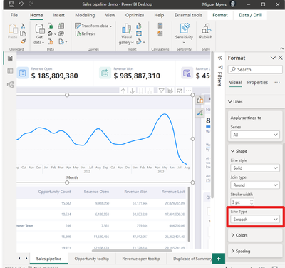
From the july 2023 release - you can now change the line type to "smooth"-
See release note : Release note july 2023
or the snippet from the release note below to see how you can change line type to smooth:
Kind regards!
If this solved your problem, consider marking this answer as a solution.
- Mark as New
- Bookmark
- Subscribe
- Mute
- Subscribe to RSS Feed
- Permalink
- Report Inappropriate Content
I'm fairly sure PBI used to allow you to do this but that functionality was dropped somewhere along the way.
- Mark as New
- Bookmark
- Subscribe
- Mute
- Subscribe to RSS Feed
- Permalink
- Report Inappropriate Content
Hi @ScottPat ,
As far as I know, currently Power BI doesn't support us to smooth line chart like the Excel. I think you need to create custom visuals. You may refer to attach file to try the "Advanced Line Chart".
Result:
Your demand is a good idea, while it is not supported to implement in Power BI currently.
You can vote up this idea for this function: "Smooth" Line Chart, Area Chart
Or you can submit a new idea to improve the Power BI.
It is a place for customers provide feedback about Microsoft Office products . What’s more, if a feedback is high voted there by other customers, it will be promising that Microsoft Product Team will take it into consideration when designing the next version in the future.
Best Regards,
Rico Zhou
If this post helps, then please consider Accept it as the solution to help the other members find it more quickly.
Helpful resources

Power BI Monthly Update - November 2025
Check out the November 2025 Power BI update to learn about new features.

Fabric Data Days
Advance your Data & AI career with 50 days of live learning, contests, hands-on challenges, study groups & certifications and more!


