FabCon is coming to Atlanta
Join us at FabCon Atlanta from March 16 - 20, 2026, for the ultimate Fabric, Power BI, AI and SQL community-led event. Save $200 with code FABCOMM.
Register now!- Power BI forums
- Get Help with Power BI
- Desktop
- Service
- Report Server
- Power Query
- Mobile Apps
- Developer
- DAX Commands and Tips
- Custom Visuals Development Discussion
- Health and Life Sciences
- Power BI Spanish forums
- Translated Spanish Desktop
- Training and Consulting
- Instructor Led Training
- Dashboard in a Day for Women, by Women
- Galleries
- Data Stories Gallery
- Themes Gallery
- Contests Gallery
- QuickViz Gallery
- Quick Measures Gallery
- Visual Calculations Gallery
- Notebook Gallery
- Translytical Task Flow Gallery
- TMDL Gallery
- R Script Showcase
- Webinars and Video Gallery
- Ideas
- Custom Visuals Ideas (read-only)
- Issues
- Issues
- Events
- Upcoming Events
Get Fabric Certified for FREE during Fabric Data Days. Don't miss your chance! Request now
- Power BI forums
- Forums
- Get Help with Power BI
- Desktop
- Re: Best Visual for Drilldown in Matrix, Table or ...
- Subscribe to RSS Feed
- Mark Topic as New
- Mark Topic as Read
- Float this Topic for Current User
- Bookmark
- Subscribe
- Printer Friendly Page
- Mark as New
- Bookmark
- Subscribe
- Mute
- Subscribe to RSS Feed
- Permalink
- Report Inappropriate Content
Best Visual for Drilldown in Matrix, Table or Heat Chart
Hi
New to Power BI and was wondering if someone could recommend me the visualization for the following problem:
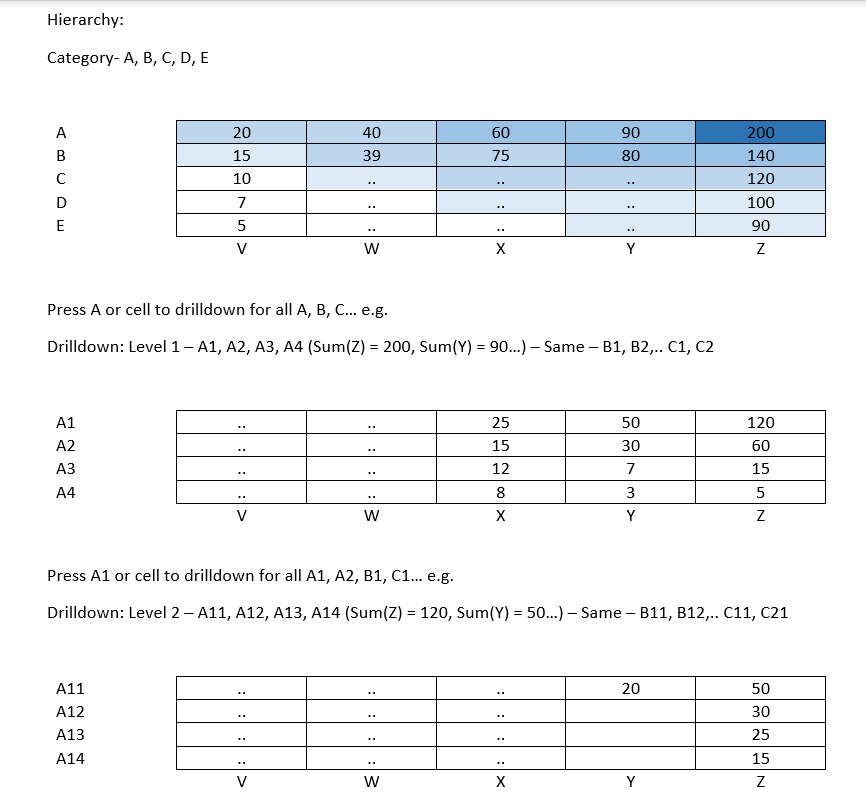
Visualization – Matrix, Table, Heat Chart (example in the image)
X axis - Catagory 1
Y axis - Catagory 2, with subsets
Values - Number of cases (which belong to both Catagory 1 and Catagory 2)
Feature – Conditional Formatting (shades of blue – high/low) and Drilldown using one table
Thanks
Solved! Go to Solution.
- Mark as New
- Bookmark
- Subscribe
- Mute
- Subscribe to RSS Feed
- Permalink
- Report Inappropriate Content
Hi @Anonymous
Drilldown works on many different types of visuals. You could use a matrix or a column chart or maybe a treemap.
Why not try a bunch of different viz types and see which represents your data best?
- Michele
- Mark as New
- Bookmark
- Subscribe
- Mute
- Subscribe to RSS Feed
- Permalink
- Report Inappropriate Content
@Anonymous , Matrix seems to be a better option for you
These 4 should help you
https://www.burningsuit.co.uk/blog/2019/04/7-secrets-of-the-matrix-visual/
https://docs.microsoft.com/en-us/power-bi/visuals/desktop-matrix-visual
https://docs.microsoft.com/en-us/power-bi/desktop-conditional-table-formatting
- Mark as New
- Bookmark
- Subscribe
- Mute
- Subscribe to RSS Feed
- Permalink
- Report Inappropriate Content
Yup matrix seems like the best choice 🙂 thanks a lot for the solution.
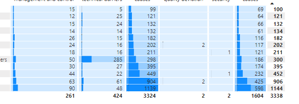
I had a question relating to the automatic sorting (higher number on the bottom left). Is there a way I can do this? I tried the ellipsis -> sort by. But this only rearranges rows but not columns (higher values on the bottom). How can I move these to values to bottom left? (prefer if I can avoid the rankx function)
E.g. Automatically Move columns 3 and 6 to rows 1 and 2, even when I drill-down into subcategory/subsubcatagory.
Sort each row - row 2 highest value is 285 but it is not at the bottom.
- Mark as New
- Bookmark
- Subscribe
- Mute
- Subscribe to RSS Feed
- Permalink
- Report Inappropriate Content
Hi @Anonymous ,
As far as i know you should be able to sort the martix by column header but not by the coulumn value.
Best Regards,
Jay
- Mark as New
- Bookmark
- Subscribe
- Mute
- Subscribe to RSS Feed
- Permalink
- Report Inappropriate Content
Oh, wait, you already tried that. OK. Do this instead...
Hover over the column you want to sort and a tiny arrow will appear. Click the arrow to change the sort order. Sometimes you can simply click on the column header to change the sort too.
Ignore my previous reply 😉
Michele
- Mark as New
- Bookmark
- Subscribe
- Mute
- Subscribe to RSS Feed
- Permalink
- Report Inappropriate Content
Unfortunately, that does not work for columns (no little arrow appears at the edge of the cells). In the entire visualization, the little arrow only appears once - over only the rows subtotal field. It doesn't appear for the subtotal column field. It also does not appear for separate rows (clicking on row leads to drill down) or columns (stay the same, no arrow)
Cheers for the quick replies
Rudra
- Mark as New
- Bookmark
- Subscribe
- Mute
- Subscribe to RSS Feed
- Permalink
- Report Inappropriate Content
Hi @Anonymous
To change the sorting
- Select the visual to make it active
- From the More options (...), select "Sort by" and make sure to select your Y axis (that's the one you want to change, right)
- Then from More options(...), select Ascending or Descending.
HTH
Michele
- Mark as New
- Bookmark
- Subscribe
- Mute
- Subscribe to RSS Feed
- Permalink
- Report Inappropriate Content
Hi @Anonymous
Drilldown works on many different types of visuals. You could use a matrix or a column chart or maybe a treemap.
Why not try a bunch of different viz types and see which represents your data best?
- Michele
Helpful resources

Power BI Monthly Update - November 2025
Check out the November 2025 Power BI update to learn about new features.

Fabric Data Days
Advance your Data & AI career with 50 days of live learning, contests, hands-on challenges, study groups & certifications and more!


