Huge last-minute discounts for FabCon Vienna from September 15-18, 2025
Supplies are limited. Contact info@espc.tech right away to save your spot before the conference sells out.
Get your discount- Power BI forums
- Get Help with Power BI
- Desktop
- Service
- Report Server
- Power Query
- Mobile Apps
- Developer
- DAX Commands and Tips
- Custom Visuals Development Discussion
- Health and Life Sciences
- Power BI Spanish forums
- Translated Spanish Desktop
- Training and Consulting
- Instructor Led Training
- Dashboard in a Day for Women, by Women
- Galleries
- Data Stories Gallery
- Themes Gallery
- Contests Gallery
- Quick Measures Gallery
- Notebook Gallery
- Translytical Task Flow Gallery
- TMDL Gallery
- R Script Showcase
- Webinars and Video Gallery
- Ideas
- Custom Visuals Ideas (read-only)
- Issues
- Issues
- Events
- Upcoming Events
Score big with last-minute savings on the final tickets to FabCon Vienna. Secure your discount
- Power BI forums
- Forums
- Get Help with Power BI
- Desktop
- Re: Bell curve with date ranges
- Subscribe to RSS Feed
- Mark Topic as New
- Mark Topic as Read
- Float this Topic for Current User
- Bookmark
- Subscribe
- Printer Friendly Page
- Mark as New
- Bookmark
- Subscribe
- Mute
- Subscribe to RSS Feed
- Permalink
- Report Inappropriate Content
Bell curve with date ranges
Hi, I'm trying to create a Bell Curve with an average spread along the weeks between the date range. What's the best way to do it. I'm getting my feet wet in BI and wanted to try this out.
Thanks
Solved! Go to Solution.
- Mark as New
- Bookmark
- Subscribe
- Mute
- Subscribe to RSS Feed
- Permalink
- Report Inappropriate Content
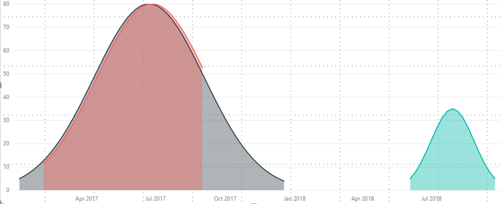
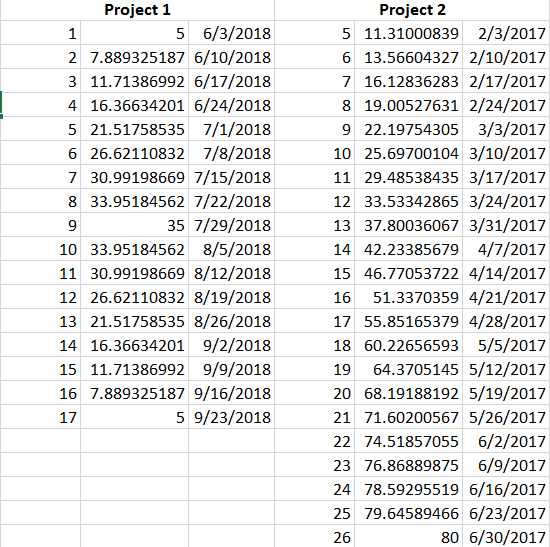
Hi, I found a way to generate the points. I used the Normal Distribution formula with some assumptions. Now visualizing them in BI is a challenge. I have different datasets for different projects and would like to show all of them overlapping in one graph. Which means there must one column with all the projects and it's Normally disributed curve points. Please see the image below. I moved the columns manually Please see image 2 for understanding how the dataset is setup.
- Mark as New
- Bookmark
- Subscribe
- Mute
- Subscribe to RSS Feed
- Permalink
- Report Inappropriate Content
Hi @drallam,
After search, there is a blog which describe the sample table and how to create a bell curve and histogram, please review and see: Create Bell Curve and Histogram with Power BI Desktop using DAX.
If you have your own sample data, you can share and list the expected result, we can help you to create report.
Best Regards,
Angelia
- Mark as New
- Bookmark
- Subscribe
- Mute
- Subscribe to RSS Feed
- Permalink
- Report Inappropriate Content
Hi, I found a way to generate the points. I used the Normal Distribution formula with some assumptions. Now visualizing them in BI is a challenge. I have different datasets for different projects and would like to show all of them overlapping in one graph. Which means there must one column with all the projects and it's Normally disributed curve points. Please see the image below. I moved the columns manually Please see image 2 for understanding how the dataset is setup.
- Mark as New
- Bookmark
- Subscribe
- Mute
- Subscribe to RSS Feed
- Permalink
- Report Inappropriate Content
Helpful resources
| User | Count |
|---|---|
| 67 | |
| 61 | |
| 47 | |
| 33 | |
| 32 |
| User | Count |
|---|---|
| 87 | |
| 72 | |
| 56 | |
| 49 | |
| 45 |


