- Power BI forums
- Get Help with Power BI
- Desktop
- Service
- Report Server
- Power Query
- Mobile Apps
- Developer
- DAX Commands and Tips
- Custom Visuals Development Discussion
- Health and Life Sciences
- Power BI Spanish forums
- Translated Spanish Desktop
- Training and Consulting
- Instructor Led Training
- Dashboard in a Day for Women, by Women
- Galleries
- Data Stories Gallery
- Themes Gallery
- Contests Gallery
- QuickViz Gallery
- Quick Measures Gallery
- Visual Calculations Gallery
- Notebook Gallery
- Translytical Task Flow Gallery
- TMDL Gallery
- R Script Showcase
- Webinars and Video Gallery
- Ideas
- Custom Visuals Ideas (read-only)
- Issues
- Issues
- Events
- Upcoming Events
Learn from the best! Meet the four finalists headed to the FINALS of the Power BI Dataviz World Championships! Register now
- Power BI forums
- Forums
- Get Help with Power BI
- Desktop
- Re: Basic Single Bar Graph with target
- Subscribe to RSS Feed
- Mark Topic as New
- Mark Topic as Read
- Float this Topic for Current User
- Bookmark
- Subscribe
- Printer Friendly Page
- Mark as New
- Bookmark
- Subscribe
- Mute
- Subscribe to RSS Feed
- Permalink
- Report Inappropriate Content
Basic Single Bar Graph with target
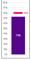
I am looking to replicate in PowerBI this visual (see image) someone did in a PowerPoint presentation.
The red line is a target and the purple bar is the actual. Is it possible to do with the standard visuals or do I need a custom one?
Solved! Go to Solution.
- Mark as New
- Bookmark
- Subscribe
- Mute
- Subscribe to RSS Feed
- Permalink
- Report Inappropriate Content
Hi @madmanmark198 ,
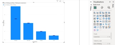
You can try using the Line and Clustered Column Chart as shown below by replacing the marker shape from Dot to a line and it will give similar look and feel.
Hope this helps!
Regards,
Avantika Thakur
Helpful resources
| User | Count |
|---|---|
| 44 | |
| 35 | |
| 27 | |
| 17 | |
| 14 |
| User | Count |
|---|---|
| 64 | |
| 56 | |
| 40 | |
| 21 | |
| 20 |


