Join us at FabCon Vienna from September 15-18, 2025
The ultimate Fabric, Power BI, SQL, and AI community-led learning event. Save €200 with code FABCOMM.
Get registered- Power BI forums
- Get Help with Power BI
- Desktop
- Service
- Report Server
- Power Query
- Mobile Apps
- Developer
- DAX Commands and Tips
- Custom Visuals Development Discussion
- Health and Life Sciences
- Power BI Spanish forums
- Translated Spanish Desktop
- Training and Consulting
- Instructor Led Training
- Dashboard in a Day for Women, by Women
- Galleries
- Data Stories Gallery
- Themes Gallery
- Contests Gallery
- Quick Measures Gallery
- Notebook Gallery
- Translytical Task Flow Gallery
- TMDL Gallery
- R Script Showcase
- Webinars and Video Gallery
- Ideas
- Custom Visuals Ideas (read-only)
- Issues
- Issues
- Events
- Upcoming Events
Enhance your career with this limited time 50% discount on Fabric and Power BI exams. Ends August 31st. Request your voucher.
- Power BI forums
- Forums
- Get Help with Power BI
- Desktop
- Re: Barchart conditional formatting of the labels ...
- Subscribe to RSS Feed
- Mark Topic as New
- Mark Topic as Read
- Float this Topic for Current User
- Bookmark
- Subscribe
- Printer Friendly Page
- Mark as New
- Bookmark
- Subscribe
- Mute
- Subscribe to RSS Feed
- Permalink
- Report Inappropriate Content
Barchart conditional formatting of the labels using "fx" button
Hi all,
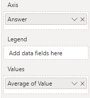
In a graph, I'd like to show values below fifty in red, and values above fifty in green. This is a simplified version of our actual data setup. This works perfectly when I use a graph without a legend:
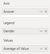
However, when I add a legend, the "fx" option at data colors disappears. This is expected.
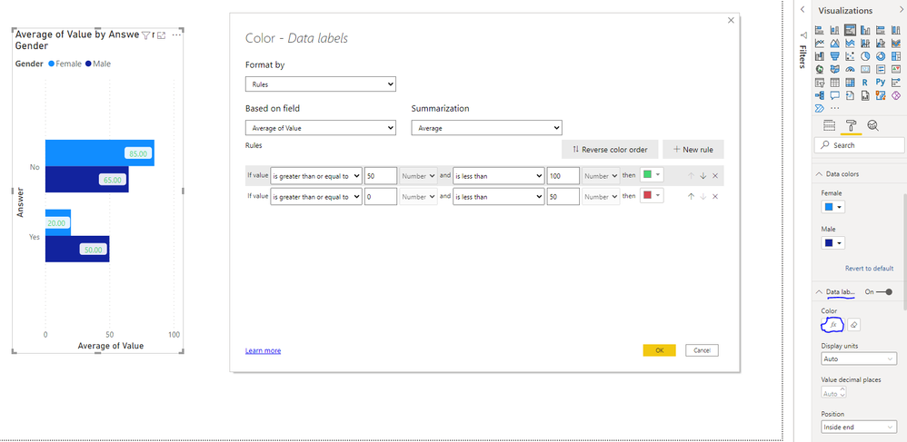
So I thought, instead of using data colors, I'd use the "fx" button on data labels color, as introduced in July 2021. However, this doesn't give the desired results. The labels do not color differently for "below 50" and "above 50" values:
Am I missing something? Am I doing something wrong? Any help would be greatly appreciated!
The .pbix can be found here: https://we.tl/t-QeI1QCKxHX
Solved! Go to Solution.
- Mark as New
- Bookmark
- Subscribe
- Mute
- Subscribe to RSS Feed
- Permalink
- Report Inappropriate Content
Hi @Barendnu ,
I can reproduce your question, and I noticed that you have created a support ticket for it. The related support person has reported the problem internally. I will update you soon if there is any progress later.
Best Regards
- Mark as New
- Bookmark
- Subscribe
- Mute
- Subscribe to RSS Feed
- Permalink
- Report Inappropriate Content
- Mark as New
- Bookmark
- Subscribe
- Mute
- Subscribe to RSS Feed
- Permalink
- Report Inappropriate Content
Hi @Barendnu,
There is Legend on your chart.
and then there is conditional formatting.
So which one Power BI should follow?
Solutions I am thinking:
1. Have a slicer of male and female.
2. have two charts, one for male. one for female.
Hope this helps.
- Mark as New
- Bookmark
- Subscribe
- Mute
- Subscribe to RSS Feed
- Permalink
- Report Inappropriate Content
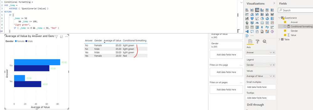
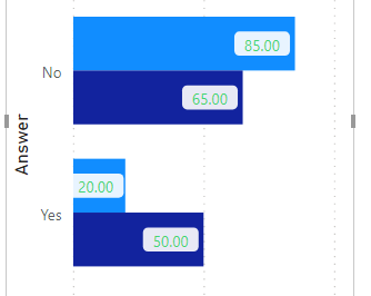
The desired result is that labels are coloured matching the value that you actually see on screen:
So "20" should be red, and the others green. Creating seperate slicers or charts is not an option I'm affraid. The sample I've given (red below 50, green above) is simplified. Actually, we want to use these colouring to show if results are significantly different or not, and we are looking for a way to visualise the result of this measure (true/false) in the barchart.
- Mark as New
- Bookmark
- Subscribe
- Mute
- Subscribe to RSS Feed
- Permalink
- Report Inappropriate Content
then put the gender on x axis to group the yes or no. instead of legend.
It will hold the conditional formatting that you want.
hope this helps.
- Mark as New
- Bookmark
- Subscribe
- Mute
- Subscribe to RSS Feed
- Permalink
- Report Inappropriate Content
Thanks for the suggestion, mussaenda! Unfortunately, we already use the X-axis to visualise the different subjects in this graph:
As said, we want to use these colouring to show if results are significantly different or not, and we are looking for a way to visualise the result of this measure (true/false) in the barchart.
- Mark as New
- Bookmark
- Subscribe
- Mute
- Subscribe to RSS Feed
- Permalink
- Report Inappropriate Content
@Barendnu , I checked this, I think it works on the overall number, not the line number. 55 Is Avg. you can check.
Unless documentation says, it should work at line level, this might be by design
- Mark as New
- Bookmark
- Subscribe
- Mute
- Subscribe to RSS Feed
- Permalink
- Report Inappropriate Content
Thanks for the reply! Do you have a suggestion if/how I could verify this? I was unable to find more documentation than the mentioned in the Power BI July 2021 Feature Summary.
I'm in doubt to submit a bug report, but am not sure if it is actually a bug 🙂
- Mark as New
- Bookmark
- Subscribe
- Mute
- Subscribe to RSS Feed
- Permalink
- Report Inappropriate Content
Helpful resources
| User | Count |
|---|---|
| 78 | |
| 74 | |
| 42 | |
| 32 | |
| 28 |
| User | Count |
|---|---|
| 104 | |
| 93 | |
| 52 | |
| 50 | |
| 46 |
