Join us at FabCon Vienna from September 15-18, 2025
The ultimate Fabric, Power BI, SQL, and AI community-led learning event. Save €200 with code FABCOMM.
Get registeredGo To
- Power BI forums
- Get Help with Power BI
- Desktop
- Service
- Report Server
- Power Query
- Mobile Apps
- Developer
- DAX Commands and Tips
- Custom Visuals Development Discussion
- Health and Life Sciences
- Power BI Spanish forums
- Translated Spanish Desktop
- Training and Consulting
- Instructor Led Training
- Dashboard in a Day for Women, by Women
- Galleries
- Data Stories Gallery
- Themes Gallery
- Contests Gallery
- Quick Measures Gallery
- Notebook Gallery
- Translytical Task Flow Gallery
- TMDL Gallery
- R Script Showcase
- Webinars and Video Gallery
- Ideas
- Custom Visuals Ideas (read-only)
- Issues
- Issues
- Events
- Upcoming Events
Turn on suggestions
Auto-suggest helps you quickly narrow down your search results by suggesting possible matches as you type.
Showing results for
Enhance your career with this limited time 50% discount on Fabric and Power BI exams. Ends August 31st. Request your voucher.
- Power BI forums
- Forums
- Get Help with Power BI
- Desktop
- Bar Chart
Reply
Topic Options
- Subscribe to RSS Feed
- Mark Topic as New
- Mark Topic as Read
- Float this Topic for Current User
- Bookmark
- Subscribe
- Printer Friendly Page
- Mark as New
- Bookmark
- Subscribe
- Mute
- Subscribe to RSS Feed
- Permalink
- Report Inappropriate Content
Bar Chart
10-08-2018
04:55 PM
Hi everyone,
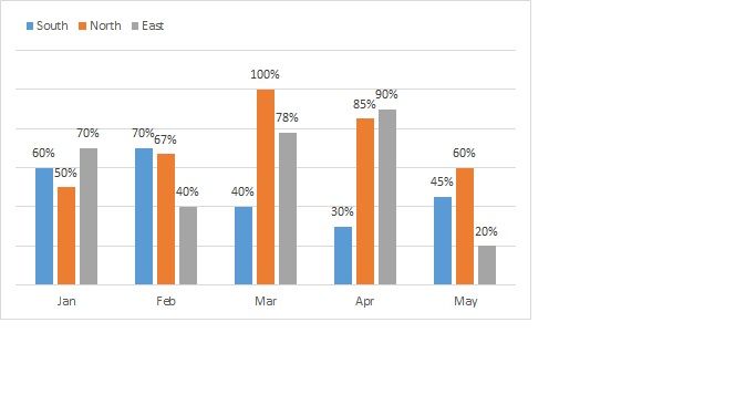
Please I need help. I want to plot the following data:
| Month | Score | Region |
| Jan | 60% | South |
| Feb | 70% | South |
| Mar | 40% | South |
| Apr | 30% | South |
| May | 45% | South |
| Jan | 50% | North |
| Feb | 67% | North |
| Mar | 100% | North |
| Apr | 85% | North |
| May | 60% | North |
| Jan | 70% | East |
| Feb | 40% | East |
| Mar | 78% | East |
| Apr | 90% | East |
| May | 20% | East |
Like this:
Thank you all in advance:
Solved! Go to Solution.
1 ACCEPTED SOLUTION
- Mark as New
- Bookmark
- Subscribe
- Mute
- Subscribe to RSS Feed
- Permalink
- Report Inappropriate Content
10-08-2018
05:16 PM
Hi,
You can use the clustered column chart on PBI
Use the Month column as Axis
score as Value
and region as Legend
In order to show data labels go to Format and adjust it there
2 REPLIES 2
Anonymous
Not applicable
- Mark as New
- Bookmark
- Subscribe
- Mute
- Subscribe to RSS Feed
- Permalink
- Report Inappropriate Content
10-09-2018
02:25 AM
- Mark as New
- Bookmark
- Subscribe
- Mute
- Subscribe to RSS Feed
- Permalink
- Report Inappropriate Content
10-08-2018
05:16 PM
Hi,
You can use the clustered column chart on PBI
Use the Month column as Axis
score as Value
and region as Legend
In order to show data labels go to Format and adjust it there


