Join us at FabCon Vienna from September 15-18, 2025
The ultimate Fabric, Power BI, SQL, and AI community-led learning event. Save €200 with code FABCOMM.
Get registered- Power BI forums
- Get Help with Power BI
- Desktop
- Service
- Report Server
- Power Query
- Mobile Apps
- Developer
- DAX Commands and Tips
- Custom Visuals Development Discussion
- Health and Life Sciences
- Power BI Spanish forums
- Translated Spanish Desktop
- Training and Consulting
- Instructor Led Training
- Dashboard in a Day for Women, by Women
- Galleries
- Data Stories Gallery
- Themes Gallery
- Contests Gallery
- Quick Measures Gallery
- Notebook Gallery
- Translytical Task Flow Gallery
- TMDL Gallery
- R Script Showcase
- Webinars and Video Gallery
- Ideas
- Custom Visuals Ideas (read-only)
- Issues
- Issues
- Events
- Upcoming Events
Enhance your career with this limited time 50% discount on Fabric and Power BI exams. Ends September 15. Request your voucher.
- Power BI forums
- Forums
- Get Help with Power BI
- Desktop
- Re: Bar Chart with multiple Columns as Axis and Co...
- Subscribe to RSS Feed
- Mark Topic as New
- Mark Topic as Read
- Float this Topic for Current User
- Bookmark
- Subscribe
- Printer Friendly Page
- Mark as New
- Bookmark
- Subscribe
- Mute
- Subscribe to RSS Feed
- Permalink
- Report Inappropriate Content
Bar Chart with multiple Columns as Axis and Count for value
First post here and I've tried searching a few things and I am sure this has been asked but I wasn't sure what the right terms were. Thank you for all your help so far!
I have a sample table below which looks like this:
Invoice#Test1Test2Country
1 | 1 | 0 | US |
| 2 | 0 | 0 | US |
| 3 | 0 | 0 | US |
| 4 | 0 | 0 | US |
| 5 | 0 | 0 | Can |
| 6 | 0 | 1 | Can |
| 7 | 1 | 1 | US |
| 8 | 1 | 0 | US |
| 9 | 1 | 0 | US |
| 10 | 0 | 0 | US |
| 11 | 1 | 1 | US |
| 12 | 1 | 0 | US |
| 13 | 0 | 0 | Can |
| 14 | 0 | 1 | Can |
| 15 | 1 | 1 | Can |
I am looking to create a bar chart that would show the number of 1s in Test 1 and Test 2. So the axis of the chart would show Test1, Test2, while the value of each bar would be the count of 1s or sum of the Test1/2 column. I can summarize the values into another table but I found that I lost the ability to use a slicer on the country column - this is just a sample data set and the real data set has multiple values I would need to use slicers with so I would need a way to dynamically summarize, which I was not able to find.
Thank you for your help!
Solved! Go to Solution.
- Mark as New
- Bookmark
- Subscribe
- Mute
- Subscribe to RSS Feed
- Permalink
- Report Inappropriate Content
Hi @Anonymous,
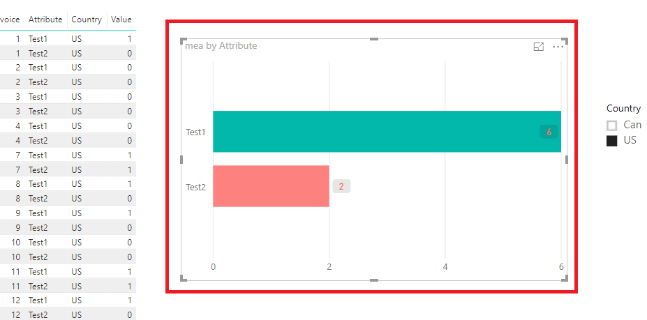
Do you want to get the output below?
If it is, you could folloe the steps below.
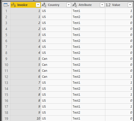
1. We need do some change for your data model in Query Editor. Upivot columns Test1 and Test2, then you will get the table like below.
2. Apply and Close. Create the measure with the formula below.
mea = CALCULATE(COUNTROWS('Table1'),FILTER('Table1','Table1'[Value]=1))
3. Create the Bar chart with Attribute as Axis and measure as value.
More details, you could refer to the attachment.
If you still need help, please share your desired output so that we could help further on it.
Best Regards,
Cherry
If this post helps, then please consider Accept it as the solution to help the other members find it more quickly.
- Mark as New
- Bookmark
- Subscribe
- Mute
- Subscribe to RSS Feed
- Permalink
- Report Inappropriate Content
Can you please explain how you made the changes to the data in the query?


