Fabric Data Days starts November 4th!
Advance your Data & AI career with 50 days of live learning, dataviz contests, hands-on challenges, study groups & certifications and more!
Get registered- Power BI forums
- Get Help with Power BI
- Desktop
- Service
- Report Server
- Power Query
- Mobile Apps
- Developer
- DAX Commands and Tips
- Custom Visuals Development Discussion
- Health and Life Sciences
- Power BI Spanish forums
- Translated Spanish Desktop
- Training and Consulting
- Instructor Led Training
- Dashboard in a Day for Women, by Women
- Galleries
- Data Stories Gallery
- Themes Gallery
- Contests Gallery
- QuickViz Gallery
- Quick Measures Gallery
- Visual Calculations Gallery
- Notebook Gallery
- Translytical Task Flow Gallery
- TMDL Gallery
- R Script Showcase
- Webinars and Video Gallery
- Ideas
- Custom Visuals Ideas (read-only)
- Issues
- Issues
- Events
- Upcoming Events
Get Fabric Certified for FREE during Fabric Data Days. Don't miss your chance! Request now
- Power BI forums
- Forums
- Get Help with Power BI
- Desktop
- Re: Background color variation in conditional form...
- Subscribe to RSS Feed
- Mark Topic as New
- Mark Topic as Read
- Float this Topic for Current User
- Bookmark
- Subscribe
- Printer Friendly Page
- Mark as New
- Bookmark
- Subscribe
- Mute
- Subscribe to RSS Feed
- Permalink
- Report Inappropriate Content
Background color variation in conditional formatting of cells to match Excel?
Hello!
I'm trying to follow the instructions in this older thread here.
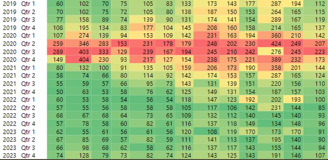
I have basically the same problem as the poster there, I'm trying to duplicate columns that have conditional formatting in Excel, into PowerBI. The problem is that PowerBI by default doesn't give enough contrast between green and yellow (I need it to follow the Excel rule of 50 percentile). I can't share the file but the data looks like this in PowerBI:
*Note each column in the PBI table is a measure.
*Note that I can't just change the PBI conditional formatting center value to be 'custom' set to about the average of each column, because there will be filtering where the values can severerly change, hope that makes sense. The Min, Center, and Max values of the conditional formatting must be lowest value, middle value, and highest value.
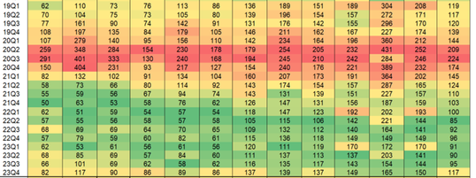
Ignoring slightly different numbers the Excel looks like this (for example first column in the PBI is too 'green' it needs more yellow like the Excel):
So I tried to duplicate the two formulas in the linked post above:
- Mark as New
- Bookmark
- Subscribe
- Mute
- Subscribe to RSS Feed
- Permalink
- Report Inappropriate Content
Hello!
I have made a sample file that illustrates my problem, here it is:
https://drive.google.com/file/d/14fskb352Uh-OHtFmd5c8QWcajyk_FaOW/view?usp=sharing
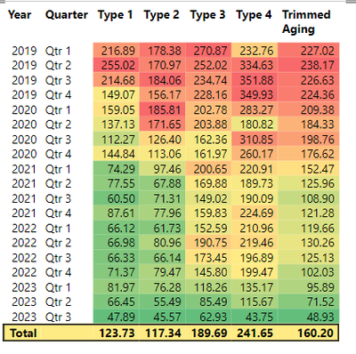
Here is the PBI view:
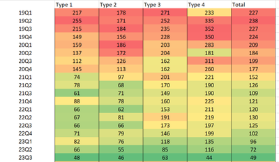
Here is the Excel view:
If you look at Type 1 2022-2023 for example, the Excel shows much more varialbity than the PowerBI, because the Excel is using the 50 percentile. My question is: how can I use DAX (or any other solution) to get closer to the Excel view?
Please note: my actual data has 13 measures (columns), and the issue with Type 1 is more apparent in the actual data. Also I can't just adjust the conditional formatting middle value because the actual data has filters, so the middle value has to be automatic.
Thank you!
- Mark as New
- Bookmark
- Subscribe
- Mute
- Subscribe to RSS Feed
- Permalink
- Report Inappropriate Content
@Donny620 check it these 2 videos on my channel helps:
Developing Custom Gradient Color Scales for Columns in Matrix Visuals in Power BI: Part 1 - YouTube
How to create your own color gradient scale for each column in a matrix visual - Part 2 - YouTube
Subscribe to the @PowerBIHowTo YT channel for an upcoming video on List and Record functions in Power Query!!
Learn Power BI and Fabric - subscribe to our YT channel - Click here: @PowerBIHowTo
If my solution proved useful, I'd be delighted to receive Kudos. When you put effort into asking a question, it's equally thoughtful to acknowledge and give Kudos to the individual who helped you solve the problem. It's a small gesture that shows appreciation and encouragement! ❤
Did I answer your question? Mark my post as a solution. Proud to be a Super User! Appreciate your Kudos 🙂
Feel free to email me with any of your BI needs.
- Mark as New
- Bookmark
- Subscribe
- Mute
- Subscribe to RSS Feed
- Permalink
- Report Inappropriate Content
Hi Parry thank you so much for sharing, those videos were very helpful to give me context. Unfortunately both of the use cases are very specific and I can't see how I can change it to fit what I need. I just need to mirror the Excel rule of 50 percentile. But my requirements are:
*Each column in the PBI table is a measure. There are 13 columns/measures in the PBI table. Each column has conditional formatting as each is independent in terms of the color scale.
*I tried to change the PBI conditional formatting center value to be 'custom' set to about the average of each column, I found that the result is close to the Excel 50 percentile. However because there will be filtering on the table, so this means this solution won't work because if I drill down the values/scale changes and it doesn't look right
So I think I need measures that changes the color scale to 50 percentile, like the Excel.
As I mentioned above, there was another post very similar to mine with a PBI that I tested but didn't work for me (see above).
Any ideas?
Thanks so much!
Helpful resources

Power BI Monthly Update - November 2025
Check out the November 2025 Power BI update to learn about new features.

Fabric Data Days
Advance your Data & AI career with 50 days of live learning, contests, hands-on challenges, study groups & certifications and more!

| User | Count |
|---|---|
| 98 | |
| 72 | |
| 50 | |
| 50 | |
| 43 |


