FabCon is coming to Atlanta
Join us at FabCon Atlanta from March 16 - 20, 2026, for the ultimate Fabric, Power BI, AI and SQL community-led event. Save $200 with code FABCOMM.
Register now!- Power BI forums
- Get Help with Power BI
- Desktop
- Service
- Report Server
- Power Query
- Mobile Apps
- Developer
- DAX Commands and Tips
- Custom Visuals Development Discussion
- Health and Life Sciences
- Power BI Spanish forums
- Translated Spanish Desktop
- Training and Consulting
- Instructor Led Training
- Dashboard in a Day for Women, by Women
- Galleries
- Data Stories Gallery
- Themes Gallery
- Contests Gallery
- QuickViz Gallery
- Quick Measures Gallery
- Visual Calculations Gallery
- Notebook Gallery
- Translytical Task Flow Gallery
- TMDL Gallery
- R Script Showcase
- Webinars and Video Gallery
- Ideas
- Custom Visuals Ideas (read-only)
- Issues
- Issues
- Events
- Upcoming Events
The Power BI Data Visualization World Championships is back! Get ahead of the game and start preparing now! Learn more
- Power BI forums
- Forums
- Get Help with Power BI
- Desktop
- Average of measure in a table
- Subscribe to RSS Feed
- Mark Topic as New
- Mark Topic as Read
- Float this Topic for Current User
- Bookmark
- Subscribe
- Printer Friendly Page
- Mark as New
- Bookmark
- Subscribe
- Mute
- Subscribe to RSS Feed
- Permalink
- Report Inappropriate Content
Average of measure in a table
Hi Support,
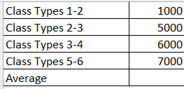
The below are measures which I have created in PBI
Class Types 1-2 =
CALCULATE([User Learner Types],ga4_data[audience]="1-2")
Class Types 2-3 =
CALCULATE([User Learner Types],ga4_data[audience]="2-3")
Class Types 3-4 =
CALCULATE([User Learner Types],ga4_data[audience]="3-4")
Class Types 5-6 =
CALCULATE([User Learner Types],ga4_data[audience]="5-6")
1) What measure in dax can I create to get the average from these 4 measures and display them in a table
2) How can I get all all 4 measure on one Line chart graph as per below with the average as line number 5 which is the dotted graph
The bottom axis of the chart will have weeks and class types.
Thanks
Solved! Go to Solution.
- Mark as New
- Bookmark
- Subscribe
- Mute
- Subscribe to RSS Feed
- Permalink
- Report Inappropriate Content
@Anonymous ,
To achieve this in Power BI, you can follow these steps:
1 - Create a new measure to calculate the average of the four measures:
Average_Class_Types = (([Class Types 1-2]) + ([Class Types 2-3]) + ([Class Types 3-4]) + ([Class Types 5-6])) / 4
2 - Create a line chart with all four measures and the average measure:
-
- Place the dates or categories on the axis of the line chart.
- Add the four measures (
[Class Types 1-2],[Class Types 2-3],[Class Types 3-4],[Class Types 5-6]) to the Values area of the line chart. - Add the
Average_Class_Typesmeasure to the Values area as well. - Customize the visual as needed to display the lines with different colors/styles.
- Ensure that the visual is showing the data as you expect, with all four measures and the average displayed correctly
This setup will give you a line chart with all four measures displayed as lines, and the average displayed as a fifth line. You can customize the visual further to adjust the colors, styles, and other formatting options as desired.
Regards,
Marcel Magalhães
Microsoft Power BI Official Partner
MCT | Certified PL-300 Power BI
- Mark as New
- Bookmark
- Subscribe
- Mute
- Subscribe to RSS Feed
- Permalink
- Report Inappropriate Content
You cannot measure a measure directly. Either materialize it first, or create a separate measure that implements the entire business logic.
- Mark as New
- Bookmark
- Subscribe
- Mute
- Subscribe to RSS Feed
- Permalink
- Report Inappropriate Content
@Anonymous ,
To achieve this in Power BI, you can follow these steps:
1 - Create a new measure to calculate the average of the four measures:
Average_Class_Types = (([Class Types 1-2]) + ([Class Types 2-3]) + ([Class Types 3-4]) + ([Class Types 5-6])) / 4
2 - Create a line chart with all four measures and the average measure:
-
- Place the dates or categories on the axis of the line chart.
- Add the four measures (
[Class Types 1-2],[Class Types 2-3],[Class Types 3-4],[Class Types 5-6]) to the Values area of the line chart. - Add the
Average_Class_Typesmeasure to the Values area as well. - Customize the visual as needed to display the lines with different colors/styles.
- Ensure that the visual is showing the data as you expect, with all four measures and the average displayed correctly
This setup will give you a line chart with all four measures displayed as lines, and the average displayed as a fifth line. You can customize the visual further to adjust the colors, styles, and other formatting options as desired.
Regards,
Marcel Magalhães
Microsoft Power BI Official Partner
MCT | Certified PL-300 Power BI
- Mark as New
- Bookmark
- Subscribe
- Mute
- Subscribe to RSS Feed
- Permalink
- Report Inappropriate Content
Helpful resources

Power BI Dataviz World Championships
The Power BI Data Visualization World Championships is back! Get ahead of the game and start preparing now!

| User | Count |
|---|---|
| 39 | |
| 38 | |
| 38 | |
| 28 | |
| 27 |
| User | Count |
|---|---|
| 124 | |
| 88 | |
| 73 | |
| 66 | |
| 65 |


