FabCon is coming to Atlanta
Join us at FabCon Atlanta from March 16 - 20, 2026, for the ultimate Fabric, Power BI, AI and SQL community-led event. Save $200 with code FABCOMM.
Register now!- Power BI forums
- Get Help with Power BI
- Desktop
- Service
- Report Server
- Power Query
- Mobile Apps
- Developer
- DAX Commands and Tips
- Custom Visuals Development Discussion
- Health and Life Sciences
- Power BI Spanish forums
- Translated Spanish Desktop
- Training and Consulting
- Instructor Led Training
- Dashboard in a Day for Women, by Women
- Galleries
- Data Stories Gallery
- Themes Gallery
- Contests Gallery
- QuickViz Gallery
- Quick Measures Gallery
- Visual Calculations Gallery
- Notebook Gallery
- Translytical Task Flow Gallery
- TMDL Gallery
- R Script Showcase
- Webinars and Video Gallery
- Ideas
- Custom Visuals Ideas (read-only)
- Issues
- Issues
- Events
- Upcoming Events
Get Fabric certified for FREE! Don't miss your chance! Learn more
- Power BI forums
- Forums
- Get Help with Power BI
- Desktop
- Re: Average Line from another table
- Subscribe to RSS Feed
- Mark Topic as New
- Mark Topic as Read
- Float this Topic for Current User
- Bookmark
- Subscribe
- Printer Friendly Page
- Mark as New
- Bookmark
- Subscribe
- Mute
- Subscribe to RSS Feed
- Permalink
- Report Inappropriate Content
Average Line from another table
I am trying to create a Column and Line chart with information from 2 tables. The first table has the date field and the main information with dates associated. The second table has other information also with a date associated with in the same range.
When I then try to add a line from the second table and create an average it ignores the dates and simply provides an average of the entire date range shown on the chart.
If the tables are linked through a calendar table or directly with the dates then the average does not show at all.
Some pointers would be great.
- Mark as New
- Bookmark
- Subscribe
- Mute
- Subscribe to RSS Feed
- Permalink
- Report Inappropriate Content
Yes your example works perfectly however for the data I am using it still is giving me some issues. I have tried the method you have shown but it is not acting as it should. I will send over the dashboard via a private message
- Mark as New
- Bookmark
- Subscribe
- Mute
- Subscribe to RSS Feed
- Permalink
- Report Inappropriate Content
Both your date columns were in DateTime format including a time component. That prevented them from successfully linking to the calendar table.
Sent you the file via DM.
- Mark as New
- Bookmark
- Subscribe
- Mute
- Subscribe to RSS Feed
- Permalink
- Report Inappropriate Content
Read about the TREATAS() function.
Please provide sample data that covers your issue or question completely.
https://community.powerbi.com/t5/Community-Blog/How-to-provide-sample-data-in-the-Power-BI-Forum/ba-...
Please show the expected outcome based on the sample data you provided.
https://community.powerbi.com/t5/Desktop/How-to-Get-Your-Question-Answered-Quickly/m-p/1447523
- Mark as New
- Bookmark
- Subscribe
- Mute
- Subscribe to RSS Feed
- Permalink
- Report Inappropriate Content
Thanks @lbendlin
I have looked at TREATAS() but I am not sure that this is giving me what I need.
| Date | Incident |
| 1 jan 2022 | A |
| 3 jan 2022 | B |
| 8 jan 2022 | A |
| 19 jan 2022 | A |
| 2 feb 2022 | C |
| 4 feb 2022 | A |
| 8 feb 2022 | B |
| 10 feb 2022 | C |
| 14 feb 2022 | A |
| Date | Quantity |
| 2 jan 2022 | 3% |
| 7 jan 2022 | 6% |
| 9 jan 2022 | 5% |
| 18 jan 2022 | 6% |
| 4 feb 2022 | 5% |
| 9 feb 2022 | 4% |
| 11 feb 2022 | 6% |
| 13 feb 2022 | 7% |
| 14 feb 2022 | 3% |
These two table are an example
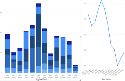
And this is the kind of output but ideally I would like to show the line on the bar chart. The line is an average of per month, the bars are a count per month.
I can link the data but if I do that, either directly or via a calendar table (with days) neither works correctly.
Regards
Phillip
- Mark as New
- Bookmark
- Subscribe
- Mute
- Subscribe to RSS Feed
- Permalink
- Report Inappropriate Content
Helpful resources

Join our Fabric User Panel
Share feedback directly with Fabric product managers, participate in targeted research studies and influence the Fabric roadmap.

Power BI Monthly Update - January 2026
Check out the January 2026 Power BI update to learn about new features.

| User | Count |
|---|---|
| 68 | |
| 59 | |
| 44 | |
| 20 | |
| 15 |
| User | Count |
|---|---|
| 104 | |
| 102 | |
| 37 | |
| 26 | |
| 25 |


