FabCon is coming to Atlanta
Join us at FabCon Atlanta from March 16 - 20, 2026, for the ultimate Fabric, Power BI, AI and SQL community-led event. Save $200 with code FABCOMM.
Register now!- Power BI forums
- Get Help with Power BI
- Desktop
- Service
- Report Server
- Power Query
- Mobile Apps
- Developer
- DAX Commands and Tips
- Custom Visuals Development Discussion
- Health and Life Sciences
- Power BI Spanish forums
- Translated Spanish Desktop
- Training and Consulting
- Instructor Led Training
- Dashboard in a Day for Women, by Women
- Galleries
- Data Stories Gallery
- Themes Gallery
- Contests Gallery
- QuickViz Gallery
- Quick Measures Gallery
- Visual Calculations Gallery
- Notebook Gallery
- Translytical Task Flow Gallery
- TMDL Gallery
- R Script Showcase
- Webinars and Video Gallery
- Ideas
- Custom Visuals Ideas (read-only)
- Issues
- Issues
- Events
- Upcoming Events
The Power BI Data Visualization World Championships is back! Get ahead of the game and start preparing now! Learn more
- Power BI forums
- Forums
- Get Help with Power BI
- Desktop
- Re: Automatic y-axis scale shown in Desktop and Pr...
- Subscribe to RSS Feed
- Mark Topic as New
- Mark Topic as Read
- Float this Topic for Current User
- Bookmark
- Subscribe
- Printer Friendly Page
- Mark as New
- Bookmark
- Subscribe
- Mute
- Subscribe to RSS Feed
- Permalink
- Report Inappropriate Content
Automatic y-axis scale shown in Desktop and Pro is different
Hi,
I have a visual, line and custom column chart, with an y-axis automatic scale. Start = 0, End = Auto.
In PBI Desktop it shows the correct scale. 1 line value = max 10,500, column value = max 9,300. The y-axis showed is from 0 to 10,000, with grid step 2,000. Perfect. I publiced this visual to my dashboard and report in PBI Pro. There, the report shows a y-axis from 0 to 8,000 !! Why not to 10K like the Desktop visual?
I can't make the scale fixed, cause there's also a page filter with the region we use.
Please help?
Solved! Go to Solution.
- Mark as New
- Bookmark
- Subscribe
- Mute
- Subscribe to RSS Feed
- Permalink
- Report Inappropriate Content
Hi @erwinvanmanen ,
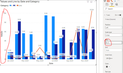
--Before fixing 'Start' in PBI Desktop
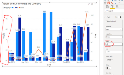
--After fixing 'Start' in PBI Desktop
Test version: 2.92.706.0 64-bit (April 2021)
As you can see, when I fixed ‘Start’, my Y axis changed. This is different from yours. I guess it’s the version.
However, in either case, my Y axis will not change in Power BI Service.
So Which is your Power BI Desktop version? Please update to latest version.
Best regards,
Lionel Chen
If this post helps, then please consider Accept it as the solution to help the other members find it more quickly.
- Mark as New
- Bookmark
- Subscribe
- Mute
- Subscribe to RSS Feed
- Permalink
- Report Inappropriate Content
Hi @erwinvanmanen ,
Are there any filters on the report in Power Bi Service which is showing the difference in scale?
Also you will need add more to your query like screenshots of the issue, etc.
https://community.powerbi.com/t5/Desktop/How-to-Get-Your-Question-Answered-Quickly/m-p/1447523
Thanks,
Pragati
- Mark as New
- Bookmark
- Subscribe
- Mute
- Subscribe to RSS Feed
- Permalink
- Report Inappropriate Content
Hi Pragati,
Thx for answering.
Yes, there are filters present. They show for each filter used a different y-axis. Obviously. But, with no filters used they show:
Screenshot from PBI Desktop
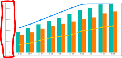
Screenshot from PBI Pro:
As you can see, a different y-axis. It flattens out my blue line.
- Mark as New
- Bookmark
- Subscribe
- Mute
- Subscribe to RSS Feed
- Permalink
- Report Inappropriate Content
Hi @erwinvanmanen ,
--Before fixing 'Start' in PBI Desktop
--After fixing 'Start' in PBI Desktop
Test version: 2.92.706.0 64-bit (April 2021)
As you can see, when I fixed ‘Start’, my Y axis changed. This is different from yours. I guess it’s the version.
However, in either case, my Y axis will not change in Power BI Service.
So Which is your Power BI Desktop version? Please update to latest version.
Best regards,
Lionel Chen
If this post helps, then please consider Accept it as the solution to help the other members find it more quickly.
- Mark as New
- Bookmark
- Subscribe
- Mute
- Subscribe to RSS Feed
- Permalink
- Report Inappropriate Content
Hi Lionel,
The y axis didn't change in my PBI Desktop, after fixing 'Start'. But, i changed the start value to 'Auto' and now viewing the visual in PBI Service is the same as in PBI Desktop.
Thx.
Helpful resources

Power BI Monthly Update - November 2025
Check out the November 2025 Power BI update to learn about new features.

Fabric Data Days
Advance your Data & AI career with 50 days of live learning, contests, hands-on challenges, study groups & certifications and more!

| User | Count |
|---|---|
| 58 | |
| 45 | |
| 42 | |
| 21 | |
| 18 |


