FabCon is coming to Atlanta
Join us at FabCon Atlanta from March 16 - 20, 2026, for the ultimate Fabric, Power BI, AI and SQL community-led event. Save $200 with code FABCOMM.
Register now!- Power BI forums
- Get Help with Power BI
- Desktop
- Service
- Report Server
- Power Query
- Mobile Apps
- Developer
- DAX Commands and Tips
- Custom Visuals Development Discussion
- Health and Life Sciences
- Power BI Spanish forums
- Translated Spanish Desktop
- Training and Consulting
- Instructor Led Training
- Dashboard in a Day for Women, by Women
- Galleries
- Data Stories Gallery
- Themes Gallery
- Contests Gallery
- QuickViz Gallery
- Quick Measures Gallery
- Visual Calculations Gallery
- Notebook Gallery
- Translytical Task Flow Gallery
- TMDL Gallery
- R Script Showcase
- Webinars and Video Gallery
- Ideas
- Custom Visuals Ideas (read-only)
- Issues
- Issues
- Events
- Upcoming Events
The Power BI Data Visualization World Championships is back! Get ahead of the game and start preparing now! Learn more
- Power BI forums
- Forums
- Get Help with Power BI
- Desktop
- Aster Plot
- Subscribe to RSS Feed
- Mark Topic as New
- Mark Topic as Read
- Float this Topic for Current User
- Bookmark
- Subscribe
- Printer Friendly Page
- Mark as New
- Bookmark
- Subscribe
- Mute
- Subscribe to RSS Feed
- Permalink
- Report Inappropriate Content
Aster Plot
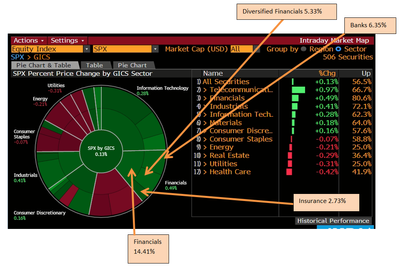
I'm trying to achieve the same kind of visualisation (Extracted from Bloomberg) as shown above. In each sector (i.e Finance, Energy, Utilities) segment, they are further divided into smaller segment within the sector segment.
May I know if Aster plot is able to achieve the mentioned or are there any pie-like chart for recommendation?
Solved! Go to Solution.
- Mark as New
- Bookmark
- Subscribe
- Mute
- Subscribe to RSS Feed
- Permalink
- Report Inappropriate Content
Hi @alexyap,
As far as I know that is not possible with the Aster plot visual (but maybe someone knows a workaround or a way ?!) Anyway perhaps this visual is something that you can use ?
https://appsource.microsoft.com/en-us/product/power-bi-visuals/WA104380767?tab=Overview
I have no experience with that visual but I read that it is meant for hierarchical data, and it looks like it might be usefull to your case.
Regards,
L.Meijdam
- Mark as New
- Bookmark
- Subscribe
- Mute
- Subscribe to RSS Feed
- Permalink
- Report Inappropriate Content
Hi @alexyap,
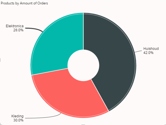
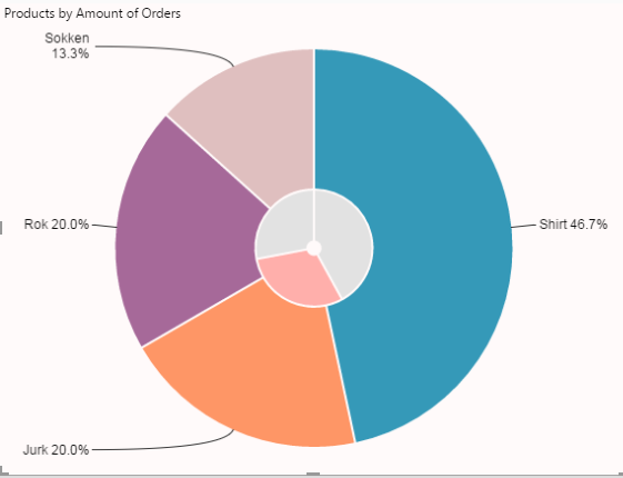
A visualisation I personally use alot is the drill down donut chart, in the begin you would see the different sectors and their percentages. And when you would for example click on financials, the chart drills down to the next level.
Here I have a screenshot of an example(note this one is boring since there isnt much data in the set):


I am not sure if this is 100% what you are looking for but I think you can use this for your needs.
The visual is a custom visual downloaded from here:
https://appsource.microsoft.com/en-us/product/power-bi-visuals/WA104380858?tab=Overview
Regards,
L.Meijdam
- Mark as New
- Bookmark
- Subscribe
- Mute
- Subscribe to RSS Feed
- Permalink
- Report Inappropriate Content
Hi @Anonymous,
Thank you for the reply.
Yes. I'm aware about the Drill Down Donut chart. However, I'm looking for something like what I've attached; not having to click to drill down. You can see at one glance within the whole pie of the main category and sub-category.
By any chance do you know if the Aster plot able to achieve that? Because I tried and doesn't seem to work so I'm not sure if I'm doing the right way or is the limitation of the plot.
Regards,
Alex
- Mark as New
- Bookmark
- Subscribe
- Mute
- Subscribe to RSS Feed
- Permalink
- Report Inappropriate Content
Hi @alexyap,
As far as I know that is not possible with the Aster plot visual (but maybe someone knows a workaround or a way ?!) Anyway perhaps this visual is something that you can use ?
https://appsource.microsoft.com/en-us/product/power-bi-visuals/WA104380767?tab=Overview
I have no experience with that visual but I read that it is meant for hierarchical data, and it looks like it might be usefull to your case.
Regards,
L.Meijdam
- Mark as New
- Bookmark
- Subscribe
- Mute
- Subscribe to RSS Feed
- Permalink
- Report Inappropriate Content
Hi @Anonymous,
Noted. Thank u!
Will explore on your suggestion.
Regards,
Alex
Helpful resources

Power BI Dataviz World Championships
The Power BI Data Visualization World Championships is back! Get ahead of the game and start preparing now!

| User | Count |
|---|---|
| 38 | |
| 37 | |
| 33 | |
| 32 | |
| 29 |
| User | Count |
|---|---|
| 132 | |
| 88 | |
| 82 | |
| 68 | |
| 64 |


