FabCon is coming to Atlanta
Join us at FabCon Atlanta from March 16 - 20, 2026, for the ultimate Fabric, Power BI, AI and SQL community-led event. Save $200 with code FABCOMM.
Register now!- Power BI forums
- Get Help with Power BI
- Desktop
- Service
- Report Server
- Power Query
- Mobile Apps
- Developer
- DAX Commands and Tips
- Custom Visuals Development Discussion
- Health and Life Sciences
- Power BI Spanish forums
- Translated Spanish Desktop
- Training and Consulting
- Instructor Led Training
- Dashboard in a Day for Women, by Women
- Galleries
- Data Stories Gallery
- Themes Gallery
- Contests Gallery
- QuickViz Gallery
- Quick Measures Gallery
- Visual Calculations Gallery
- Notebook Gallery
- Translytical Task Flow Gallery
- TMDL Gallery
- R Script Showcase
- Webinars and Video Gallery
- Ideas
- Custom Visuals Ideas (read-only)
- Issues
- Issues
- Events
- Upcoming Events
The Power BI Data Visualization World Championships is back! Get ahead of the game and start preparing now! Learn more
- Power BI forums
- Forums
- Get Help with Power BI
- Desktop
- Assign sale amounts into different prices ranges
- Subscribe to RSS Feed
- Mark Topic as New
- Mark Topic as Read
- Float this Topic for Current User
- Bookmark
- Subscribe
- Printer Friendly Page
- Mark as New
- Bookmark
- Subscribe
- Mute
- Subscribe to RSS Feed
- Permalink
- Report Inappropriate Content
Assign sale amounts into different prices ranges
Hi,
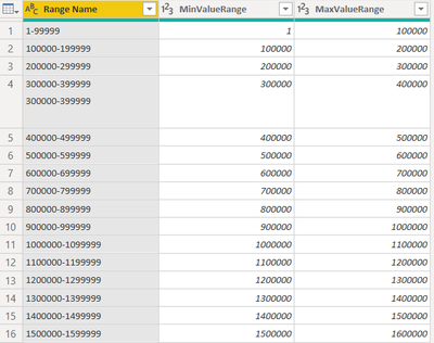
I have a table with sales value. i created another table with price ranges as shown below with price ranges
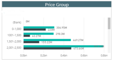
So i wanted to create a visulization with price ranges in one column and sales in other column in a way that sales is distributed according to price ranges. I want end result to be somthing like shown below:
Solved! Go to Solution.
- Mark as New
- Bookmark
- Subscribe
- Mute
- Subscribe to RSS Feed
- Permalink
- Report Inappropriate Content
Hi @Mkhubaib ,
You can directly add the Price range column to the Sales table.
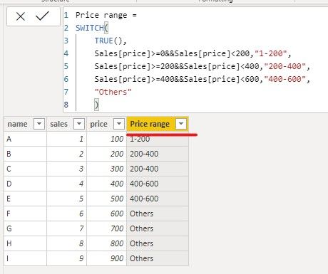
We create a sample and use SWITCH function to meet your requirement.
Price range =
SWITCH(
    TRUE(),
    Sales[price]>=0&&Sales[price]<200,"1-200",
    Sales[price]>=200&&Sales[price]<400,"200-400",
    Sales[price]>=400&&Sales[price]<600,"400-600",
    "Others"
    )
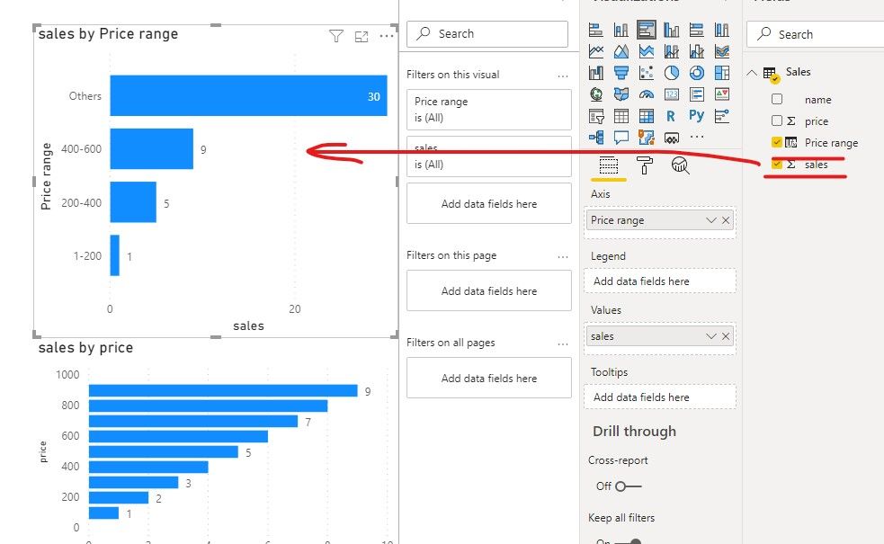
Then we can create a column chart using price range and sales amount.
If it doesn’t meet your requirement, could you please show the exact expected result based on some fake data?
Best regards,
Community Support Team _ zhenbw
If this post helps, then please consider Accept it as the solution to help the other members find it more quickly.
BTW, pbix as attached.
- Mark as New
- Bookmark
- Subscribe
- Mute
- Subscribe to RSS Feed
- Permalink
- Report Inappropriate Content
@Mkhubaib , these buckets not matching with the data you shared. Is it on different data
Refer, if these can help
https://www.daxpatterns.com/dynamic-segmentation/
https://www.daxpatterns.com/static-segmentation/
https://www.poweredsolutions.co/2020/01/11/dax-vs-power-query-static-segmentation-in-power-bi-dax-po...
https://radacad.com/grouping-and-binning-step-towards-better-data-visualization
- Mark as New
- Bookmark
- Subscribe
- Mute
- Subscribe to RSS Feed
- Permalink
- Report Inappropriate Content
- Mark as New
- Bookmark
- Subscribe
- Mute
- Subscribe to RSS Feed
- Permalink
- Report Inappropriate Content
Hi @Mkhubaib ,
You can directly add the Price range column to the Sales table.
We create a sample and use SWITCH function to meet your requirement.
Price range =
SWITCH(
    TRUE(),
    Sales[price]>=0&&Sales[price]<200,"1-200",
    Sales[price]>=200&&Sales[price]<400,"200-400",
    Sales[price]>=400&&Sales[price]<600,"400-600",
    "Others"
    )
Then we can create a column chart using price range and sales amount.
If it doesn’t meet your requirement, could you please show the exact expected result based on some fake data?
Best regards,
Community Support Team _ zhenbw
If this post helps, then please consider Accept it as the solution to help the other members find it more quickly.
BTW, pbix as attached.
- Mark as New
- Bookmark
- Subscribe
- Mute
- Subscribe to RSS Feed
- Permalink
- Report Inappropriate Content
Hi @Mkhubaib
Highly reccomend to use this technique https://docs.microsoft.com/en-us/power-bi/create-reports/desktop-grouping-and-binning
Helpful resources

Power BI Monthly Update - November 2025
Check out the November 2025 Power BI update to learn about new features.

Fabric Data Days
Advance your Data & AI career with 50 days of live learning, contests, hands-on challenges, study groups & certifications and more!

| User | Count |
|---|---|
| 58 | |
| 45 | |
| 42 | |
| 20 | |
| 18 |
| User | Count |
|---|---|
| 172 | |
| 110 | |
| 91 | |
| 55 | |
| 45 |


