FabCon is coming to Atlanta
Join us at FabCon Atlanta from March 16 - 20, 2026, for the ultimate Fabric, Power BI, AI and SQL community-led event. Save $200 with code FABCOMM.
Register now!- Power BI forums
- Get Help with Power BI
- Desktop
- Service
- Report Server
- Power Query
- Mobile Apps
- Developer
- DAX Commands and Tips
- Custom Visuals Development Discussion
- Health and Life Sciences
- Power BI Spanish forums
- Translated Spanish Desktop
- Training and Consulting
- Instructor Led Training
- Dashboard in a Day for Women, by Women
- Galleries
- Data Stories Gallery
- Themes Gallery
- Contests Gallery
- QuickViz Gallery
- Quick Measures Gallery
- Visual Calculations Gallery
- Notebook Gallery
- Translytical Task Flow Gallery
- TMDL Gallery
- R Script Showcase
- Webinars and Video Gallery
- Ideas
- Custom Visuals Ideas (read-only)
- Issues
- Issues
- Events
- Upcoming Events
The Power BI Data Visualization World Championships is back! Get ahead of the game and start preparing now! Learn more
- Power BI forums
- Forums
- Get Help with Power BI
- Desktop
- Assign multiple colors to background of scatter ch...
- Subscribe to RSS Feed
- Mark Topic as New
- Mark Topic as Read
- Float this Topic for Current User
- Bookmark
- Subscribe
- Printer Friendly Page
- Mark as New
- Bookmark
- Subscribe
- Mute
- Subscribe to RSS Feed
- Permalink
- Report Inappropriate Content
Assign multiple colors to background of scatter chart (I.e. by quadrant)?
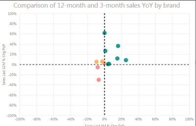
Is it possible to assign separate colors (one for each quadrant) to the background of a scatter plot? Rather than coloring the points by value (See current screenshot), I'd rather have the background be that color, but I'm struggling to figure out how.
Thanks in advance for any suggestions.
Solved! Go to Solution.
- Mark as New
- Bookmark
- Subscribe
- Mute
- Subscribe to RSS Feed
- Permalink
- Report Inappropriate Content
@Eric_Zhang Thanks, in the meantime, looks like I can create a background image in pain and upload it.
- Mark as New
- Bookmark
- Subscribe
- Mute
- Subscribe to RSS Feed
- Permalink
- Report Inappropriate Content
Hello
I am looking for an alternative where I can divide the background of the line and stacked graph into three different categories ranging from 0-30, 30-70 and 70-100. I tried multiple options but none of them worked. If possible could you please suggest me a way out.
Regards
- Mark as New
- Bookmark
- Subscribe
- Mute
- Subscribe to RSS Feed
- Permalink
- Report Inappropriate Content
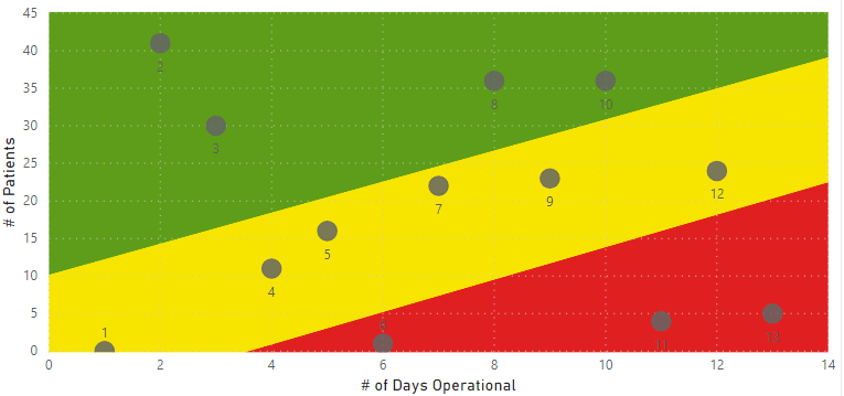
Here's an example of creating a custom image for the plot background.
- Mark as New
- Bookmark
- Subscribe
- Mute
- Subscribe to RSS Feed
- Permalink
- Report Inappropriate Content
@jmoskow wrote:
Is it possible to assign separate colors (one for each quadrant) to the background of a scatter plot? Rather than coloring the points by value (See current screenshot), I'd rather have the background be that color, but I'm struggling to figure out how.
Thanks in advance for any suggestions.
It is not supported at this moment. You can check this idea Ability to show quadrants on scatter chart and vote it up.
- Mark as New
- Bookmark
- Subscribe
- Mute
- Subscribe to RSS Feed
- Permalink
- Report Inappropriate Content
@Eric_Zhang Thanks, in the meantime, looks like I can create a background image in pain and upload it.
Helpful resources

Power BI Monthly Update - November 2025
Check out the November 2025 Power BI update to learn about new features.

Fabric Data Days
Advance your Data & AI career with 50 days of live learning, contests, hands-on challenges, study groups & certifications and more!

| User | Count |
|---|---|
| 58 | |
| 43 | |
| 42 | |
| 23 | |
| 17 |
| User | Count |
|---|---|
| 190 | |
| 121 | |
| 96 | |
| 65 | |
| 46 |


