FabCon is coming to Atlanta
Join us at FabCon Atlanta from March 16 - 20, 2026, for the ultimate Fabric, Power BI, AI and SQL community-led event. Save $200 with code FABCOMM.
Register now!- Power BI forums
- Get Help with Power BI
- Desktop
- Service
- Report Server
- Power Query
- Mobile Apps
- Developer
- DAX Commands and Tips
- Custom Visuals Development Discussion
- Health and Life Sciences
- Power BI Spanish forums
- Translated Spanish Desktop
- Training and Consulting
- Instructor Led Training
- Dashboard in a Day for Women, by Women
- Galleries
- Data Stories Gallery
- Themes Gallery
- Contests Gallery
- Quick Measures Gallery
- Notebook Gallery
- Translytical Task Flow Gallery
- TMDL Gallery
- R Script Showcase
- Webinars and Video Gallery
- Ideas
- Custom Visuals Ideas (read-only)
- Issues
- Issues
- Events
- Upcoming Events
To celebrate FabCon Vienna, we are offering 50% off select exams. Ends October 3rd. Request your discount now.
- Power BI forums
- Forums
- Get Help with Power BI
- Desktop
- Re: ArcGIS map cuts off points after adding a tool...
- Subscribe to RSS Feed
- Mark Topic as New
- Mark Topic as Read
- Float this Topic for Current User
- Bookmark
- Subscribe
- Printer Friendly Page
- Mark as New
- Bookmark
- Subscribe
- Mute
- Subscribe to RSS Feed
- Permalink
- Report Inappropriate Content
ArcGIS map cuts off points after adding a tooltip
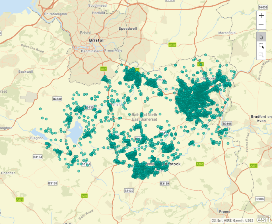
I'm trying to plot this data onto an ArcGIS map. When I drag just the latitude and longitude columns into the fields to use, it looks as I'm expecting:
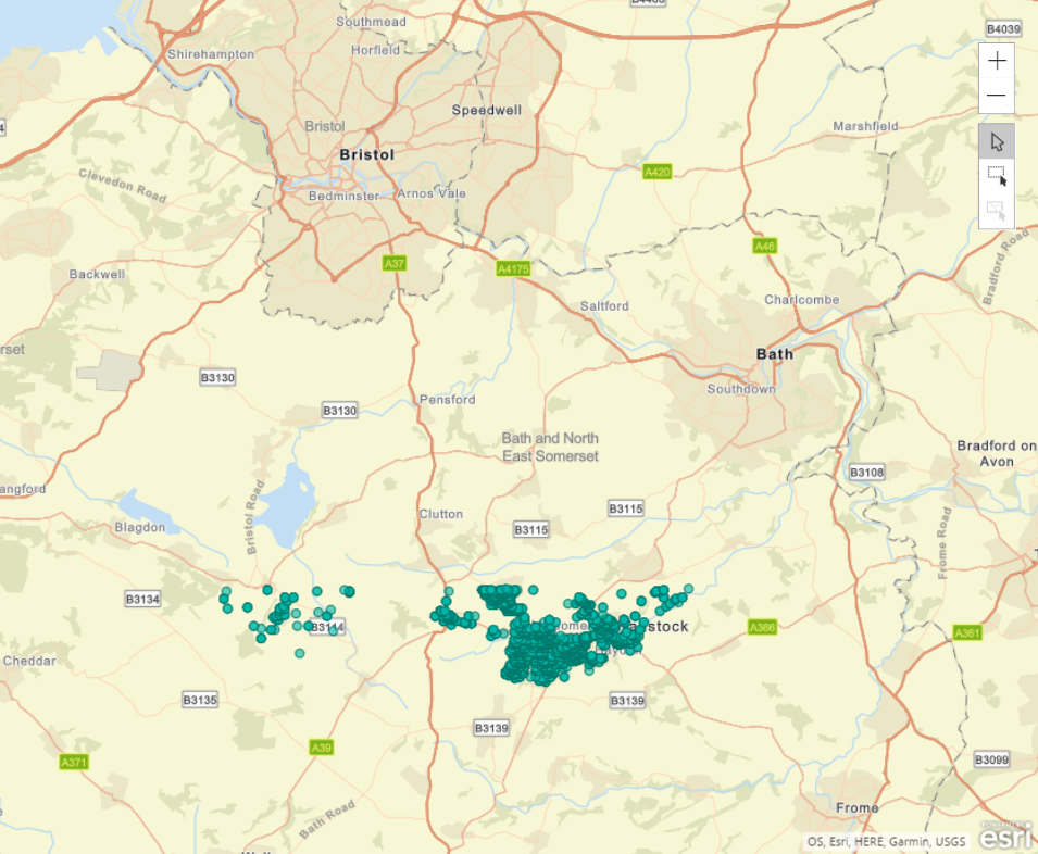
However, when I drag the "Price" column onto the "Tooltip" field, all of a sudden it fails to plot every point whose latitude (or maybe it's longitude...) is above a certain value:
What could be causing this? I know some visuals have upper limits on the number of rows of data it can display, but this shouldn't be being changed just by simply adding a column to the Tooltip field, right?
- Mark as New
- Bookmark
- Subscribe
- Mute
- Subscribe to RSS Feed
- Permalink
- Report Inappropriate Content
Those images don't seem to loading, I'll try uploadng them again:
- Mark as New
- Bookmark
- Subscribe
- Mute
- Subscribe to RSS Feed
- Permalink
- Report Inappropriate Content
Hm, can anyone clarify whether they're able to see the images in my post and it's just me that they're not loading for, or if they're not visible to anyone...
- Mark as New
- Bookmark
- Subscribe
- Mute
- Subscribe to RSS Feed
- Permalink
- Report Inappropriate Content
I can see these images, and I'm having the exact same issue! No idea what's going on here.
Helpful resources
| User | Count |
|---|---|
| 98 | |
| 76 | |
| 75 | |
| 49 | |
| 27 |


