FabCon is coming to Atlanta
Join us at FabCon Atlanta from March 16 - 20, 2026, for the ultimate Fabric, Power BI, AI and SQL community-led event. Save $200 with code FABCOMM.
Register now!- Power BI forums
- Get Help with Power BI
- Desktop
- Service
- Report Server
- Power Query
- Mobile Apps
- Developer
- DAX Commands and Tips
- Custom Visuals Development Discussion
- Health and Life Sciences
- Power BI Spanish forums
- Translated Spanish Desktop
- Training and Consulting
- Instructor Led Training
- Dashboard in a Day for Women, by Women
- Galleries
- Data Stories Gallery
- Themes Gallery
- Contests Gallery
- Quick Measures Gallery
- Notebook Gallery
- Translytical Task Flow Gallery
- TMDL Gallery
- R Script Showcase
- Webinars and Video Gallery
- Ideas
- Custom Visuals Ideas (read-only)
- Issues
- Issues
- Events
- Upcoming Events
To celebrate FabCon Vienna, we are offering 50% off select exams. Ends October 3rd. Request your discount now.
- Power BI forums
- Forums
- Get Help with Power BI
- Desktop
- Re: Analyze feature on column
- Subscribe to RSS Feed
- Mark Topic as New
- Mark Topic as Read
- Float this Topic for Current User
- Bookmark
- Subscribe
- Printer Friendly Page
- Mark as New
- Bookmark
- Subscribe
- Mute
- Subscribe to RSS Feed
- Permalink
- Report Inappropriate Content
Analyze feature on column
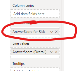
Trying out the "analyze" feature which produces excellent derived visuals but the column value is filtered but do not understand how the filtering on the field "risk" is achieved. Any help would be appreciated.
Regards
Donald
- Mark as New
- Bookmark
- Subscribe
- Mute
- Subscribe to RSS Feed
- Permalink
- Report Inappropriate Content
Hi @Ailteir ,
I'm not so clear about your description, can you please explain more about your requirement?
How to Get Your Question Answered Quickly
Regards,
Xiaoxin Sheng
- Mark as New
- Bookmark
- Subscribe
- Mute
- Subscribe to RSS Feed
- Permalink
- Report Inappropriate Content
Xiaoxin.
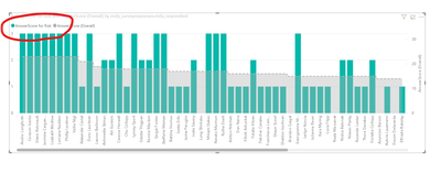
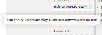
Using the "Analyse" feature on a barchart which then produces a second visual. The second visual has a new column name which is an aggregated sum of an orginal column but seem to be filtered somehow by another column value "risk". I cannot see, nor understand, where the filter is applied. Image below of field detail.
Regards
Donald
- Mark as New
- Bookmark
- Subscribe
- Mute
- Subscribe to RSS Feed
- Permalink
- Report Inappropriate Content
Hi @Ailteir ,
Maybe you can take a look at the official document to know more about this feature:
Use insights in Power BI Desktop to find where a distribution is different (Preview)
Regards,
Xiaoxin Sheng
- Mark as New
- Bookmark
- Subscribe
- Mute
- Subscribe to RSS Feed
- Permalink
- Report Inappropriate Content
Xiaoxin,
Thanks for that. Unfortunately the issue is with the resultant visual the "analyze" feature creates. The line and stacked column visual seems to filter at column level. There seems to be no indication of filtering at report, page or visual to explain it.
Regards
Donald


