FabCon is coming to Atlanta
Join us at FabCon Atlanta from March 16 - 20, 2026, for the ultimate Fabric, Power BI, AI and SQL community-led event. Save $200 with code FABCOMM.
Register now!- Power BI forums
- Get Help with Power BI
- Desktop
- Service
- Report Server
- Power Query
- Mobile Apps
- Developer
- DAX Commands and Tips
- Custom Visuals Development Discussion
- Health and Life Sciences
- Power BI Spanish forums
- Translated Spanish Desktop
- Training and Consulting
- Instructor Led Training
- Dashboard in a Day for Women, by Women
- Galleries
- Data Stories Gallery
- Themes Gallery
- Contests Gallery
- QuickViz Gallery
- Quick Measures Gallery
- Visual Calculations Gallery
- Notebook Gallery
- Translytical Task Flow Gallery
- TMDL Gallery
- R Script Showcase
- Webinars and Video Gallery
- Ideas
- Custom Visuals Ideas (read-only)
- Issues
- Issues
- Events
- Upcoming Events
The Power BI Data Visualization World Championships is back! Get ahead of the game and start preparing now! Learn more
- Power BI forums
- Forums
- Get Help with Power BI
- Desktop
- Re: Alignment issue on AXIS for Clustered Bar Char...
- Subscribe to RSS Feed
- Mark Topic as New
- Mark Topic as Read
- Float this Topic for Current User
- Bookmark
- Subscribe
- Printer Friendly Page
- Mark as New
- Bookmark
- Subscribe
- Mute
- Subscribe to RSS Feed
- Permalink
- Report Inappropriate Content
Alignment issue on AXIS for Clustered Bar Chart
Hello All,
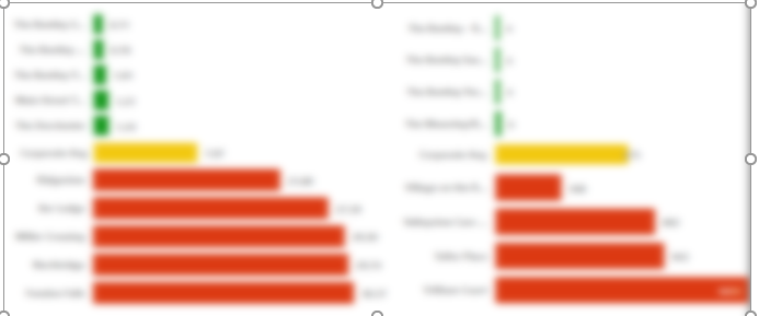
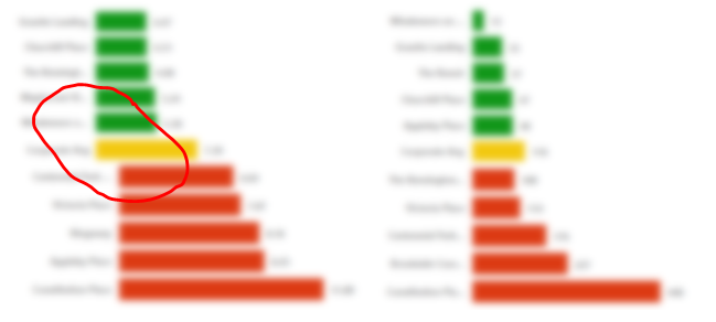
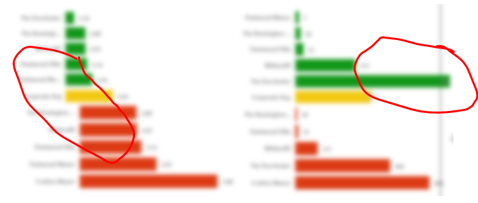
I am showing Top 5 / Corporate / Bottom 5 of my sales data. Assume that it's a store sales data. Now when I select different visuals my top 5 / Bottom 5 also changes. With these changes, the Store name which is on Axis is not aligned properly. Below are screenshots from my PBIX. I would like to see if there are any options for fixing the width of the name in Axis.
In total there are three visuals for Clustered Bar chart 1) top 5 2) Corporate Avg 3) Bottom 5
Default state

- Mark as New
- Bookmark
- Subscribe
- Mute
- Subscribe to RSS Feed
- Permalink
- Report Inappropriate Content
Hi, @Anonymous
Unfortunately, it is unsupported to fix the width of the name in Axis for a bar chart in Power BI currently. I'd like to suggest you vote on the similar idea and add your comments there to improve Power BI for making this feature coming sooner.
Best Regards
Allan
If this post helps, then please consider Accept it as the solution to help the other members find it more quickly.
- Mark as New
- Bookmark
- Subscribe
- Mute
- Subscribe to RSS Feed
- Permalink
- Report Inappropriate Content
@Anonymous ,While you can not combine visual
You can to measure and use in same visual
example
City Rank = RANKX(all(Geography[City]),[Sales],,desc,dense)
Top 5 = sumx(filter(VALUES(Geography[City]),[City Rank]<=5),[Sales] )
City Rank 1 = RANKX(all(Geography[City]),[Sales],,asc,dense)
Bottom 5 = sumx(filter(VALUES(Geography[City]),[City Rank 1]<=5),[Sales] )
or use them togther in a measure
Top Bottom 5 = sumx(filter(VALUES(Geography[City]),[City Rank]<=5 || [City Rank 1]<=5),[Sales] )
- Mark as New
- Bookmark
- Subscribe
- Mute
- Subscribe to RSS Feed
- Permalink
- Report Inappropriate Content
Hi @amitchandak
Thanks for your help. I would like to have corporate average in between top 5 and bottom 5 in one measure only. How can I get that?
- Mark as New
- Bookmark
- Subscribe
- Mute
- Subscribe to RSS Feed
- Permalink
- Report Inappropriate Content
Hi @Anonymous
Sorry I don't think there is an option to do that on clusterd bar chart.
Did I answer your question? Mark my post as a solution! Appreciate your Kudos!!
Regards,
Pranit
Helpful resources

Power BI Monthly Update - November 2025
Check out the November 2025 Power BI update to learn about new features.

Fabric Data Days
Advance your Data & AI career with 50 days of live learning, contests, hands-on challenges, study groups & certifications and more!

| User | Count |
|---|---|
| 57 | |
| 43 | |
| 40 | |
| 21 | |
| 17 |
| User | Count |
|---|---|
| 183 | |
| 114 | |
| 93 | |
| 61 | |
| 45 |


