Fabric Data Days starts November 4th!
Advance your Data & AI career with 50 days of live learning, dataviz contests, hands-on challenges, study groups & certifications and more!
Get registered- Power BI forums
- Get Help with Power BI
- Desktop
- Service
- Report Server
- Power Query
- Mobile Apps
- Developer
- DAX Commands and Tips
- Custom Visuals Development Discussion
- Health and Life Sciences
- Power BI Spanish forums
- Translated Spanish Desktop
- Training and Consulting
- Instructor Led Training
- Dashboard in a Day for Women, by Women
- Galleries
- Data Stories Gallery
- Themes Gallery
- Contests Gallery
- QuickViz Gallery
- Quick Measures Gallery
- Visual Calculations Gallery
- Notebook Gallery
- Translytical Task Flow Gallery
- TMDL Gallery
- R Script Showcase
- Webinars and Video Gallery
- Ideas
- Custom Visuals Ideas (read-only)
- Issues
- Issues
- Events
- Upcoming Events
Get Fabric Certified for FREE during Fabric Data Days. Don't miss your chance! Request now
- Power BI forums
- Forums
- Get Help with Power BI
- Desktop
- Aggregating month data from two SharePoint lists
- Subscribe to RSS Feed
- Mark Topic as New
- Mark Topic as Read
- Float this Topic for Current User
- Bookmark
- Subscribe
- Printer Friendly Page
- Mark as New
- Bookmark
- Subscribe
- Mute
- Subscribe to RSS Feed
- Permalink
- Report Inappropriate Content
Aggregating month data from two SharePoint lists
Hi, new to Power BI here - apologies for my lack of knowledge. I am generating a report using two separate SharePoint 2013 lists, which deal with three different categories of documents (1 on the first list and 2 on the second). Each document type has a separate "Month" column in its list, denoting the month of the year that an individual document was sent. I have also created a measure which calculates the percentage of documents that were sent on time (number of documents sent on time/total number of documents sent).
When I plot this sent on time measure for one document type against the appropriate "Month" metric (and sort the Month by a MonthNumber column to get them to appear in the correct order), I get the following bar chart:
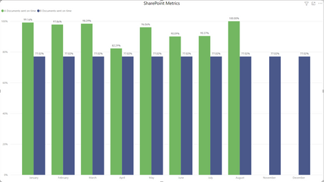
This works fine, but if I try to introduce another document type's sent on time measure to the same bar chart, I get the following:
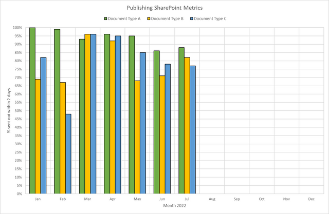
For the second document type (in blue), only the overall percentage for all time is shown in each month. This is despite bringing in the other "Month" metric for B-type documents in as an axis. I presume this is because the "Month" data comes from two separate columns on two separate lists and so cannot be treated "as one"and/or you can only have one X axis on a bar chart. Is there a way to aggregate (not sure if that's the correct term) the Month data so I can achieve a bar chart which something that looks like this (created in Excel):
- Mark as New
- Bookmark
- Subscribe
- Mute
- Subscribe to RSS Feed
- Permalink
- Report Inappropriate Content
You may need to get the two datasets combined (UNIONed) into one, then you can play with the Legend attribute of column and bar charts.
Proud to be a Super User! |  |
Helpful resources

Power BI Monthly Update - November 2025
Check out the November 2025 Power BI update to learn about new features.

Fabric Data Days
Advance your Data & AI career with 50 days of live learning, contests, hands-on challenges, study groups & certifications and more!


