FabCon is coming to Atlanta
Join us at FabCon Atlanta from March 16 - 20, 2026, for the ultimate Fabric, Power BI, AI and SQL community-led event. Save $200 with code FABCOMM.
Register now!- Power BI forums
- Get Help with Power BI
- Desktop
- Service
- Report Server
- Power Query
- Mobile Apps
- Developer
- DAX Commands and Tips
- Custom Visuals Development Discussion
- Health and Life Sciences
- Power BI Spanish forums
- Translated Spanish Desktop
- Training and Consulting
- Instructor Led Training
- Dashboard in a Day for Women, by Women
- Galleries
- Data Stories Gallery
- Themes Gallery
- Contests Gallery
- Quick Measures Gallery
- Notebook Gallery
- Translytical Task Flow Gallery
- TMDL Gallery
- R Script Showcase
- Webinars and Video Gallery
- Ideas
- Custom Visuals Ideas (read-only)
- Issues
- Issues
- Events
- Upcoming Events
Calling all Data Engineers! Fabric Data Engineer (Exam DP-700) live sessions are back! Starting October 16th. Sign up.
- Power BI forums
- Forums
- Get Help with Power BI
- Desktop
- Re: Addition Problem
- Subscribe to RSS Feed
- Mark Topic as New
- Mark Topic as Read
- Float this Topic for Current User
- Bookmark
- Subscribe
- Printer Friendly Page
- Mark as New
- Bookmark
- Subscribe
- Mute
- Subscribe to RSS Feed
- Permalink
- Report Inappropriate Content
Addition Problem
Hi,
I'll try to explain my problem with example.
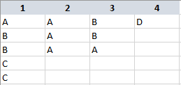
This is my data:
I want to create visualization that will show the total number of 'As', 'Bs', 'Cs' and 'Ds' in my four columns. So the result should be:
A - 5
B - 4
C - 2
D - 1
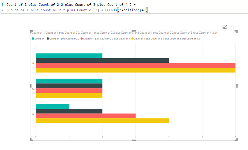
What I did was: I choosed Clustered Bar Chart > Insert Column 1 in Values > New Quick Measure > Addition > Added Colum 2 > New Quick Measure > Addition > Added Column 3 > New Quick Measure > Addition > Added Column 4.
What I got is this:
As you can see, this is not the result I wanted. I got 6 Bs, 4 As, 2 Cs, and no Ds, which doesn't correspond to the real data.
What should I do to get the correct result?
I'd really appreciate your help.
Thank you!
Solved! Go to Solution.
- Mark as New
- Bookmark
- Subscribe
- Mute
- Subscribe to RSS Feed
- Permalink
- Report Inappropriate Content
You might use Power Query to reshape your table and then create a measure using DAX to show the count of occurences. Hope this solution helps.
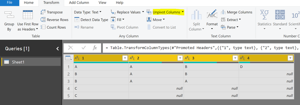
1. Click on Edit Queries -> select Transform tab -> select all your columns and then click on unpivot columns
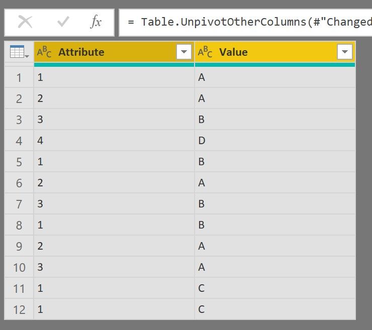
2. once done, you will get the following table
3. Click on Close and apply. Now use the following DAX to create a measure as below:

- Mark as New
- Bookmark
- Subscribe
- Mute
- Subscribe to RSS Feed
- Permalink
- Report Inappropriate Content
Thank you everyone!
This method with unpivoting columns works if I only had these 4 columns. However, I have additional columns, and when I unpivot these columns, that disrupts my statistics for other variables.
- Mark as New
- Bookmark
- Subscribe
- Mute
- Subscribe to RSS Feed
- Permalink
- Report Inappropriate Content
Just a thought. You can create a new table using those 4 columns, unpivot it and get the desired result. For rest of the calculations you can use your original table. Let me know if this works.
- Mark as New
- Bookmark
- Subscribe
- Mute
- Subscribe to RSS Feed
- Permalink
- Report Inappropriate Content
Hi, you can go to Edit Query, Select your columns and Apply an Unpivot Columns. Finally delete empty rows
Now with this, just apply a simple count in your visual
Regards
Victor
Lima - Peru
- Mark as New
- Bookmark
- Subscribe
- Mute
- Subscribe to RSS Feed
- Permalink
- Report Inappropriate Content
HI @Nejovic
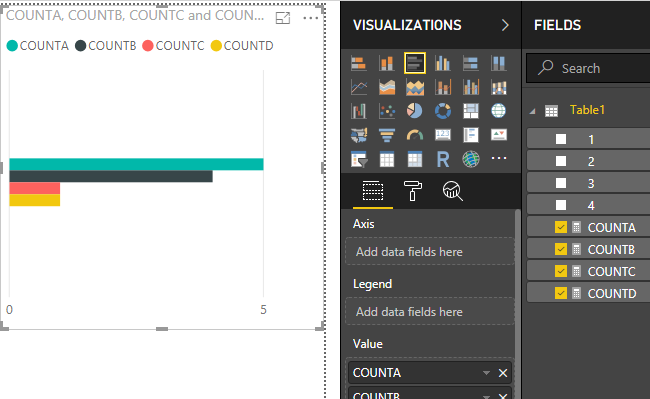
How about creating measures like -->
COUNTA = COUNTROWS(FILTER(Table1,Table1[1] = "A")) + COUNTROWS(FILTER(Table1,Table1[2] = "A")) + COUNTROWS(FILTER(Table1,Table1[3] = "A")) + COUNTROWS(FILTER(Table1,Table1[4] = "A"))
And then showing a visual for all measures?
Is that applicable?
