FabCon is coming to Atlanta
Join us at FabCon Atlanta from March 16 - 20, 2026, for the ultimate Fabric, Power BI, AI and SQL community-led event. Save $200 with code FABCOMM.
Register now!- Power BI forums
- Get Help with Power BI
- Desktop
- Service
- Report Server
- Power Query
- Mobile Apps
- Developer
- DAX Commands and Tips
- Custom Visuals Development Discussion
- Health and Life Sciences
- Power BI Spanish forums
- Translated Spanish Desktop
- Training and Consulting
- Instructor Led Training
- Dashboard in a Day for Women, by Women
- Galleries
- Data Stories Gallery
- Themes Gallery
- Contests Gallery
- QuickViz Gallery
- Quick Measures Gallery
- Visual Calculations Gallery
- Notebook Gallery
- Translytical Task Flow Gallery
- TMDL Gallery
- R Script Showcase
- Webinars and Video Gallery
- Ideas
- Custom Visuals Ideas (read-only)
- Issues
- Issues
- Events
- Upcoming Events
The Power BI Data Visualization World Championships is back! It's time to submit your entry. Live now!
- Power BI forums
- Forums
- Get Help with Power BI
- Desktop
- Adding a decrease/increase column in Report sectio...
- Subscribe to RSS Feed
- Mark Topic as New
- Mark Topic as Read
- Float this Topic for Current User
- Bookmark
- Subscribe
- Printer Friendly Page
- Mark as New
- Bookmark
- Subscribe
- Mute
- Subscribe to RSS Feed
- Permalink
- Report Inappropriate Content
Adding a decrease/increase column in Report section...?
Hello,
I am very, very new to Power BI and have been asked to provide a proof of concept of a excel report I create. Had one days training but need more help!
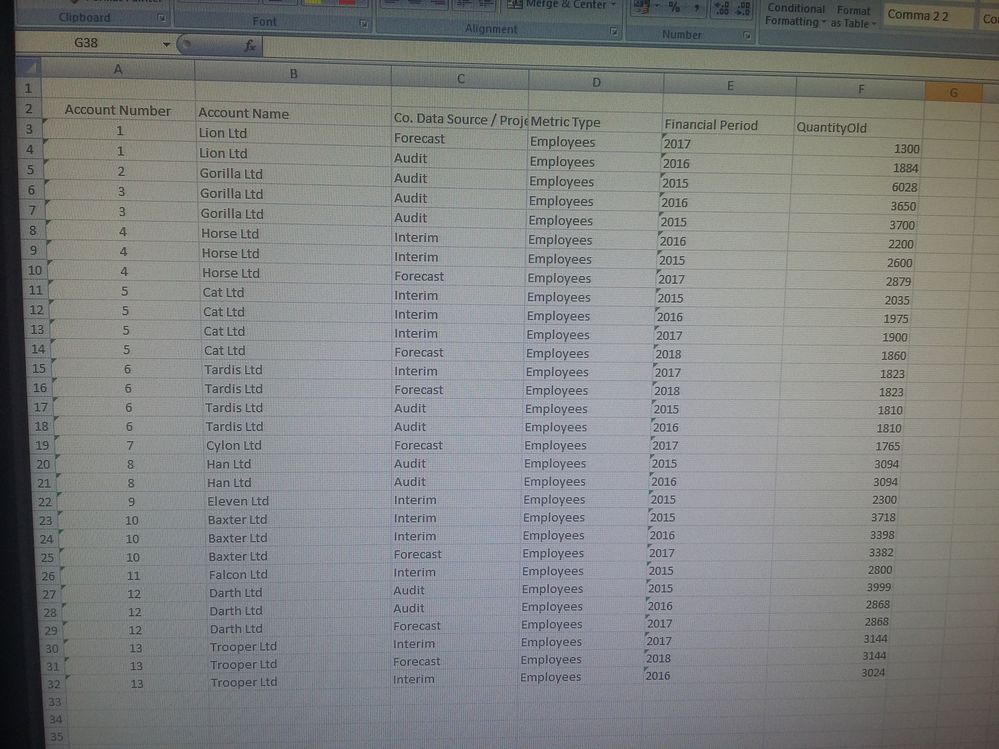
My data set is vertical based in that it has multiples of the same company/companies with different financial years scrolling down. Picture of fake data in the style of my real data for info.
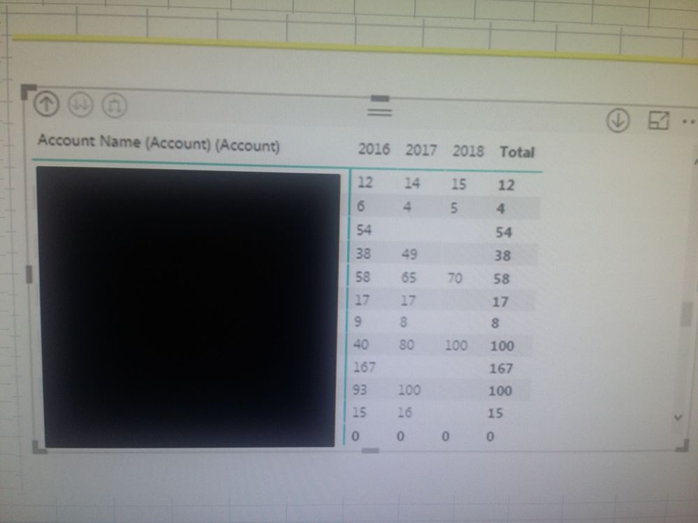
I have used a Matrix visualization to show the companies and their financial periods year to year, I have attached a screenshot of this, with the real company names blacked out, for info.
I need to insert a column in the Matrix visualization that shows either an increase or decrease in the figures per year, can you help??
I though this would be relatively easy but cannot seem to get it to work!!
If I can do this i can hopefully get my report completed without too much pain.
You are my only hope!!
AGT

- Mark as New
- Bookmark
- Subscribe
- Mute
- Subscribe to RSS Feed
- Permalink
- Report Inappropriate Content
Hi,
A quick solution if you only have that table and a POC in mind would be to move the period to rows and the create a measure like this:
(I assume that you have two quantity columns, one for current and one for old, if you only have one you can change the names and 2015 will be 0)
CHANGE =
IF(HASONEVALUE(Financial Period)
,SWITCH(VALUES(Financial Period))
,2015,DIVIDE(CALCULATE(SUM(QUANTITYNEW),Financial Period = 2015),CALCULATE(SUM(QUANTITOLD),Financial Period = 2015))
,2016,DIVIDE(CALCULATE(SUM(QUANTITYNEW),Financial Period = 2016)/CALCULATE(SUM(QUANTITOLD),Financial Period = 2016))
,2017,DIVIDE(CALCULATE(SUM(QUANTITYNEW),Financial Period = 2017)/CALCULATE(SUM(QUANTITOLD),Financial Period = 2017))
,2018,DIVIDE(CALCULATE(SUM(QUANTITYNEW),Financial Period = 2018)/CALCULATE(SUM(QUANTITOLD),Financial Period = 2018))
,BLANK()
)
,BLANK()
)
By doing this you will get a positive or a negative value to display the Increase/Decrease.
If this doesnt work, please display your expected and wanted result in excel format as an example.
Best regards,
G
- Mark as New
- Bookmark
- Subscribe
- Mute
- Subscribe to RSS Feed
- Permalink
- Report Inappropriate Content
Hi G!
Thank you so much for your reply !
Unfortunately there is only one quantity column, would you be able to, if not too rude, to give me one example of the format you decribed here " if you only have one you can change the names and 2015 will be 0" , just so I can copy it for the others 🙂
The data being vertical is an issue as have to create a pivot to do the comparisons even in excel.
Thank you again.
A
- Mark as New
- Bookmark
- Subscribe
- Mute
- Subscribe to RSS Feed
- Permalink
- Report Inappropriate Content
Hi @AGT
I have uploaded an example .pbix solution here:
Name: AGT_Solution
https://1drv.ms/u/s!AgUIGKdICZfnjhZsRIluDpIgOGVT
Please let me know if this helps you out.
Best regards,
G
- Mark as New
- Bookmark
- Subscribe
- Mute
- Subscribe to RSS Feed
- Permalink
- Report Inappropriate Content
Hi @AGT,
Share the link from where i can download your file. Also, show the expected result.
Regards,
Ashish Mathur
http://www.ashishmathur.com
https://www.linkedin.com/in/excelenthusiasts/
Helpful resources

Power BI Dataviz World Championships
The Power BI Data Visualization World Championships is back! It's time to submit your entry.

Power BI Monthly Update - January 2026
Check out the January 2026 Power BI update to learn about new features.

| User | Count |
|---|---|
| 61 | |
| 49 | |
| 30 | |
| 25 | |
| 23 |
| User | Count |
|---|---|
| 129 | |
| 104 | |
| 56 | |
| 39 | |
| 31 |

