Fabric Data Days starts November 4th!
Advance your Data & AI career with 50 days of live learning, dataviz contests, hands-on challenges, study groups & certifications and more!
Get registered- Power BI forums
- Get Help with Power BI
- Desktop
- Service
- Report Server
- Power Query
- Mobile Apps
- Developer
- DAX Commands and Tips
- Custom Visuals Development Discussion
- Health and Life Sciences
- Power BI Spanish forums
- Translated Spanish Desktop
- Training and Consulting
- Instructor Led Training
- Dashboard in a Day for Women, by Women
- Galleries
- Data Stories Gallery
- Themes Gallery
- Contests Gallery
- Quick Measures Gallery
- Visual Calculations Gallery
- Notebook Gallery
- Translytical Task Flow Gallery
- TMDL Gallery
- R Script Showcase
- Webinars and Video Gallery
- Ideas
- Custom Visuals Ideas (read-only)
- Issues
- Issues
- Events
- Upcoming Events
Join us at FabCon Atlanta from March 16 - 20, 2026, for the ultimate Fabric, Power BI, AI and SQL community-led event. Save $200 with code FABCOMM. Register now.
- Power BI forums
- Forums
- Get Help with Power BI
- Desktop
- Re: Adding a custom reference point on scatter plo...
- Subscribe to RSS Feed
- Mark Topic as New
- Mark Topic as Read
- Float this Topic for Current User
- Bookmark
- Subscribe
- Printer Friendly Page
- Mark as New
- Bookmark
- Subscribe
- Mute
- Subscribe to RSS Feed
- Permalink
- Report Inappropriate Content
Adding a custom reference point on scatter plot
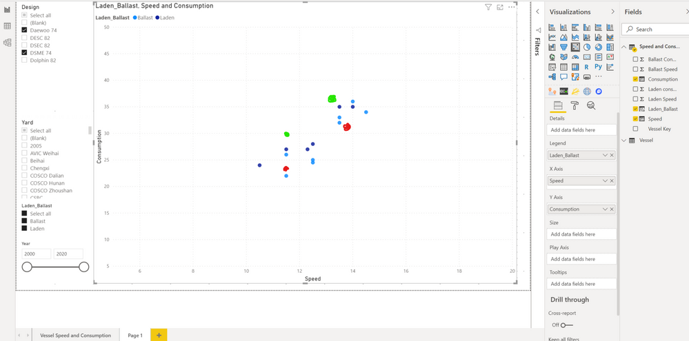
I am working on a scatter chart to display Speed (X-axis) vs Consumption (Y-axis) of different vehicle designs. The goal of the report is to examine that for the same design, is the particular vehicle specified by the user (that is not available in the current data set) more or less efficient than that of others in the data set.
I would like to know if it is possible for the user to input the specifications for the user specific vehicle's X-axis and Y-axis within the report itself so that the user can compare it visually.
As seen in the image below, say the user has input the specifications for the specific vehicle when it is laden (in red) and when it is ballast (in green).

@amitchandak sir, wondering if you could assist!
Solved! Go to Solution.
- Mark as New
- Bookmark
- Subscribe
- Mute
- Subscribe to RSS Feed
- Permalink
- Report Inappropriate Content
I have been trying this out for the past week, the only method that worked (for me at least), was via PowerApps.
Thank you everyone for contributing to the discussion.
- Mark as New
- Bookmark
- Subscribe
- Mute
- Subscribe to RSS Feed
- Permalink
- Report Inappropriate Content
I have been trying this out for the past week, the only method that worked (for me at least), was via PowerApps.
Thank you everyone for contributing to the discussion.
- Mark as New
- Bookmark
- Subscribe
- Mute
- Subscribe to RSS Feed
- Permalink
- Report Inappropriate Content
@Anonymous , As X and Y, are measure. Do want to say specific values to be highlighted. We can use conditional formatting, but I doubt that will work with a legend.
- Mark as New
- Bookmark
- Subscribe
- Mute
- Subscribe to RSS Feed
- Permalink
- Report Inappropriate Content
Thanks for the suggestion. Let's say the legend isn't there, how should I go ahead using conditional formatting to achieve the desired result?
- Mark as New
- Bookmark
- Subscribe
- Mute
- Subscribe to RSS Feed
- Permalink
- Report Inappropriate Content
Hi @Anonymous ,
"I would like to know if it is possible for the user to input the specifications for the user specific vehicle's X-axis and Y-axis within the report itself so that the user can compare it visually."
You can add the X-axis and Y-axis fields to the slicer, and modify the X-axis and Y-axis values through the slicer.
Best regards,
Lionel Chen
If this post helps, then please consider Accept it as the solution to help the other members find it more quickly.
- Mark as New
- Bookmark
- Subscribe
- Mute
- Subscribe to RSS Feed
- Permalink
- Report Inappropriate Content
Hi @v-lionel-msft ,
Thank you for taking time to reply. I have tried your suggestion and unfortunately it did not achieve what I have intended.
What I am trying to achieve is to have the user insert a customised data point can be plotted on the scatter chart - that is not already on the existing data set, as opposed to what you are suggesting that highlights an existing data point on the scatter chart.
Say for example when I filter for a particular make of the vehicle, I obtain 3 data points, e.g. (10.0. 12.3), (11.9, 14.2). (14.3, 17.9). I would like the user to be able to enter a customised data point, say (13.0, 15.0), to see how it compared to the existing data points.
Helpful resources

Fabric Data Days
Advance your Data & AI career with 50 days of live learning, contests, hands-on challenges, study groups & certifications and more!

Power BI Monthly Update - October 2025
Check out the October 2025 Power BI update to learn about new features.

| User | Count |
|---|---|
| 82 | |
| 48 | |
| 36 | |
| 31 | |
| 29 |
