Fabric Data Days starts November 4th!
Advance your Data & AI career with 50 days of live learning, dataviz contests, hands-on challenges, study groups & certifications and more!
Get registered- Power BI forums
- Get Help with Power BI
- Desktop
- Service
- Report Server
- Power Query
- Mobile Apps
- Developer
- DAX Commands and Tips
- Custom Visuals Development Discussion
- Health and Life Sciences
- Power BI Spanish forums
- Translated Spanish Desktop
- Training and Consulting
- Instructor Led Training
- Dashboard in a Day for Women, by Women
- Galleries
- Data Stories Gallery
- Themes Gallery
- Contests Gallery
- QuickViz Gallery
- Quick Measures Gallery
- Visual Calculations Gallery
- Notebook Gallery
- Translytical Task Flow Gallery
- TMDL Gallery
- R Script Showcase
- Webinars and Video Gallery
- Ideas
- Custom Visuals Ideas (read-only)
- Issues
- Issues
- Events
- Upcoming Events
Get Fabric Certified for FREE during Fabric Data Days. Don't miss your chance! Request now
- Power BI forums
- Forums
- Get Help with Power BI
- Desktop
- Re: Adding Gridlines to Matrix columns
- Subscribe to RSS Feed
- Mark Topic as New
- Mark Topic as Read
- Float this Topic for Current User
- Bookmark
- Subscribe
- Printer Friendly Page
- Mark as New
- Bookmark
- Subscribe
- Mute
- Subscribe to RSS Feed
- Permalink
- Report Inappropriate Content
Adding Gridlines to Matrix columns
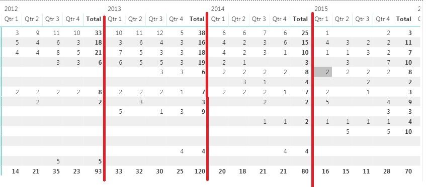
I am trying to add borders/gridlines to separate the years in a date hierarchy for a matrix (as seen below). Is there any way to do this? When i turn gridlines on, it applies to each column, is there a way to only do it for the years?
- Mark as New
- Bookmark
- Subscribe
- Mute
- Subscribe to RSS Feed
- Permalink
- Report Inappropriate Content
Voted for this feature, strange why we cant do this easily.
- Mark as New
- Bookmark
- Subscribe
- Mute
- Subscribe to RSS Feed
- Permalink
- Report Inappropriate Content
Hi everyone,
For a vertical separator, you can use the following workaround:
- Create a measure that returns a blank (example: Separator Measure = BLANK() )
- add it as a column where you need the separator to be
- rename the label to a “.”
- change the Font color and Background color to be the exact same.
- resize the column to the desired size (I normally shrink as much as it allows me to).
If you need more separators just add the same measure to the table or matrix again.
I hope this helps until the PBI teams provides with a proper way of accomplishing this.
- Mark as New
- Bookmark
- Subscribe
- Mute
- Subscribe to RSS Feed
- Permalink
- Report Inappropriate Content
Thank you for this solution! It is crazy that it is 6 years later and Microsoft still has not implemented this basic functionality
- Mark as New
- Bookmark
- Subscribe
- Mute
- Subscribe to RSS Feed
- Permalink
- Report Inappropriate Content
It sucks that this is not a basic feature but this workaround is perfetct! Just add blank measure with blank name in matrix and set background of this column to a desired color! Thanks a lot for this tip!
- Mark as New
- Bookmark
- Subscribe
- Mute
- Subscribe to RSS Feed
- Permalink
- Report Inappropriate Content
Hi @parry2k that unfortunately gives each field in the matrix value area's column a border, the OP was asking if a border can be added to just the column field which is encompassing the values.
I can't seem to find a solution to this either.
- Mark as New
- Bookmark
- Subscribe
- Mute
- Subscribe to RSS Feed
- Permalink
- Report Inappropriate Content
I would also like to be able to do this... or at least some way of better distinguishing the column groupings (in your case, the Years)
- Mark as New
- Bookmark
- Subscribe
- Mute
- Subscribe to RSS Feed
- Permalink
- Report Inappropriate Content
I too would like have such a feature to add border to specific column in matrix view
- Mark as New
- Bookmark
- Subscribe
- Mute
- Subscribe to RSS Feed
- Permalink
- Report Inappropriate Content
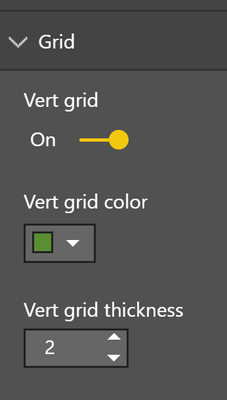
@Anonymous @jbhwcm @gidster99 this can be achieve by turning on vertical grid and you can set the color the grid line and the thickness
Subscribe to the @PowerBIHowTo YT channel for an upcoming video on List and Record functions in Power Query!!
Learn Power BI and Fabric - subscribe to our YT channel - Click here: @PowerBIHowTo
If my solution proved useful, I'd be delighted to receive Kudos. When you put effort into asking a question, it's equally thoughtful to acknowledge and give Kudos to the individual who helped you solve the problem. It's a small gesture that shows appreciation and encouragement! ❤
Did I answer your question? Mark my post as a solution. Proud to be a Super User! Appreciate your Kudos 🙂
Feel free to email me with any of your BI needs.
- Mark as New
- Bookmark
- Subscribe
- Mute
- Subscribe to RSS Feed
- Permalink
- Report Inappropriate Content
HI, @jbhwcm
After my research, I'm afraid it couldn't achieve in Power BI for now.
But you can color the total column to achieve your requirement.
For example:
select matrix visual
then click Format->Subtotals->Font color and Format->Grand Total->Font color
Result:
Best Regards,
Lin
If this post helps, then please consider Accept it as the solution to help the other members find it more quickly.
- Mark as New
- Bookmark
- Subscribe
- Mute
- Subscribe to RSS Feed
- Permalink
- Report Inappropriate Content
This idea to use subtotals column to separate quarters worked pretty well for me. I simply changed the text format background to match the font color so that it appears there are no values. Ended up with something as shown below (grey columns separate quarters in the year). thanks!
- Mark as New
- Bookmark
- Subscribe
- Mute
- Subscribe to RSS Feed
- Permalink
- Report Inappropriate Content
@v-lili6-msft wrote:After my research, I'm afraid it couldn't achieve in Power BI for now.
>2 years later and we still can't do this - is there any plan to implement this? I would also like to be able to do it.
In my case I want gridlines separating each row at the top level of my row hierarchy, without separating the sublevels.
i.e. Say I have a 'UserId' field and an 'OrderId' field. Each 'UserId' can have 1 or many 'OrderId's associated with it. I want to count the number of 'Items' in each order and subsequently the total number of 'Items' ordered by each user, so I have 'UserId' and 'OrderId' as different row levels. I should be able to have gridlines separating the 'UserId' field without also separating the 'OrderId' field, but the Matrix visual formatting options don't stretch this far. The same should be possible for columns.
This seems like it should be a pretty important design feature of a 'pivot table' style visual to help as a visual aid and I'm surprised Microsoft could overlook this so easily.
- Mark as New
- Bookmark
- Subscribe
- Mute
- Subscribe to RSS Feed
- Permalink
- Report Inappropriate Content
I've added this as an idea for future visuals:
Go and vote on it, so that it can be implemented.
Helpful resources

Fabric Data Days
Advance your Data & AI career with 50 days of live learning, contests, hands-on challenges, study groups & certifications and more!

Power BI Monthly Update - October 2025
Check out the October 2025 Power BI update to learn about new features.


