Join us at FabCon Vienna from September 15-18, 2025
The ultimate Fabric, Power BI, SQL, and AI community-led learning event. Save €200 with code FABCOMM.
Get registered- Power BI forums
- Get Help with Power BI
- Desktop
- Service
- Report Server
- Power Query
- Mobile Apps
- Developer
- DAX Commands and Tips
- Custom Visuals Development Discussion
- Health and Life Sciences
- Power BI Spanish forums
- Translated Spanish Desktop
- Training and Consulting
- Instructor Led Training
- Dashboard in a Day for Women, by Women
- Galleries
- Data Stories Gallery
- Themes Gallery
- Contests Gallery
- Quick Measures Gallery
- Notebook Gallery
- Translytical Task Flow Gallery
- TMDL Gallery
- R Script Showcase
- Webinars and Video Gallery
- Ideas
- Custom Visuals Ideas (read-only)
- Issues
- Issues
- Events
- Upcoming Events
Enhance your career with this limited time 50% discount on Fabric and Power BI exams. Ends September 15. Request your voucher.
- Power BI forums
- Forums
- Get Help with Power BI
- Desktop
- Add text in a shape map by regions
- Subscribe to RSS Feed
- Mark Topic as New
- Mark Topic as Read
- Float this Topic for Current User
- Bookmark
- Subscribe
- Printer Friendly Page
- Mark as New
- Bookmark
- Subscribe
- Mute
- Subscribe to RSS Feed
- Permalink
- Report Inappropriate Content
Add text in a shape map by regions
I want to know if I can add text on a shape map in Power BI. I'm looking for how I can add information about regions in each of them, but I can't find a solution.
What I want to say is that, for example, in the region of Catalonia there are 4 million inhabitants. I want this information to appear on the map within the region of Catalonia. Can anyone help me?
Solved! Go to Solution.
- Mark as New
- Bookmark
- Subscribe
- Mute
- Subscribe to RSS Feed
- Permalink
- Report Inappropriate Content
I solved my problem:
It's not possible with shape maps. For solve this problem, it's necessary to use R or Python Script.
- Firtsly, you have to drag the variables what you're going to use onto the python visual. For example, "regions" and "num_inhabitants"
- Secondly, you need to read your geojson field and merging with default dataset (composed by dragged variables):
import geopandas as gpd
import matplotlib.pyplot as plt

# Reading geojson
mapa = gpd.read_file('map.geojson')

# Merging by the common column
mapa_pedidos_venta = mapa.merge(dataset, left_on='region_name', right_on=dataset.region_name)
Careful! It's essential that two columns that you're going to merge having exactly the same names. For example, "Catalonia" have to be on both map.geojson and the region field.
Then you can displaying the map and add labels with something like this:
# Plotting the map
mapa_pedidos_venta.plot()

#Adding labels
for idx, row in mapa_pedidos_venta.iterrows():
    labels = '{:.2%}'.format(row['inhabitants'])
    plt.annotate(text=etiqueta, xy=row['geometry'].centroid.coords[0], ha='center', fontsize=40)

# Displaying the map
plt.show()
"geometry" is the name of the column of geojson file that contains the coordinates.
- Mark as New
- Bookmark
- Subscribe
- Mute
- Subscribe to RSS Feed
- Permalink
- Report Inappropriate Content
Hi @powerbi2srm ,
According to your description, do you want to show the population of the country in the shape chart, right?
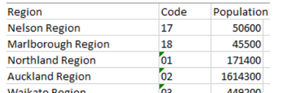
After enabling the preview feature of Shape Map, get the data from Regions Excel file, which includes data set as below;
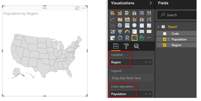
To get the first view of this visual, you need to drag and drop a field into it. Start with using Region as the Location, and Use Population as Color Saturation.
Or you can also convert the details to a .json file to add to the PBIX file.
Please refer: Use Shape maps in Power BI Desktop (Preview) - Power BI | Microsoft Learn
Shape Map Better than the Filled Map - RADACAD
Best Regards,
Neeko Tang
If this post helps, then please consider Accept it as the solution to help the other members find it more quickly.
Helpful resources
| User | Count |
|---|---|
| 69 | |
| 65 | |
| 63 | |
| 55 | |
| 28 |
| User | Count |
|---|---|
| 112 | |
| 81 | |
| 65 | |
| 48 | |
| 42 |


