FabCon is coming to Atlanta
Join us at FabCon Atlanta from March 16 - 20, 2026, for the ultimate Fabric, Power BI, AI and SQL community-led event. Save $200 with code FABCOMM.
Register now!- Power BI forums
- Get Help with Power BI
- Desktop
- Service
- Report Server
- Power Query
- Mobile Apps
- Developer
- DAX Commands and Tips
- Custom Visuals Development Discussion
- Health and Life Sciences
- Power BI Spanish forums
- Translated Spanish Desktop
- Training and Consulting
- Instructor Led Training
- Dashboard in a Day for Women, by Women
- Galleries
- Data Stories Gallery
- Themes Gallery
- Contests Gallery
- QuickViz Gallery
- Quick Measures Gallery
- Visual Calculations Gallery
- Notebook Gallery
- Translytical Task Flow Gallery
- TMDL Gallery
- R Script Showcase
- Webinars and Video Gallery
- Ideas
- Custom Visuals Ideas (read-only)
- Issues
- Issues
- Events
- Upcoming Events
The Power BI Data Visualization World Championships is back! Get ahead of the game and start preparing now! Learn more
- Power BI forums
- Forums
- Get Help with Power BI
- Desktop
- Add multiple columns as X axis in stack column cha...
- Subscribe to RSS Feed
- Mark Topic as New
- Mark Topic as Read
- Float this Topic for Current User
- Bookmark
- Subscribe
- Printer Friendly Page
- Mark as New
- Bookmark
- Subscribe
- Mute
- Subscribe to RSS Feed
- Permalink
- Report Inappropriate Content
Add multiple columns as X axis in stack column chart
Hi All.
I have a requirement something similar to below:
Data:
Emp Group 1 Group 2 Group 3
| A | Group 1 | ||
| B | Group 2 | ||
| C | Group 1 | ||
| D | Group 2 | ||
| E | Group 3 | ||
| F | Group 1 |
I need to show this data in line and stacked column chart with X Axis as group 1, group 2, group 3 and Y axis as count against each group.
Thanks in advance
Solved! Go to Solution.
- Mark as New
- Bookmark
- Subscribe
- Mute
- Subscribe to RSS Feed
- Permalink
- Report Inappropriate Content
Hi @Anonymous ,
Please check the following step as below.
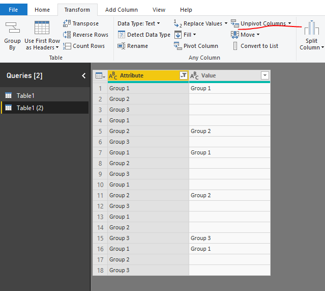
1. Unpivot the table in power query. Please check the M code for your reference.
let
    Source = Table.FromRows(Json.Document(Binary.Decompress(Binary.FromText("i45WclTSUXIvyi8tUDAEskAoVidayQnChkgYwUSdsap1warWFaoCJmEMFnXDNCEWAA==", BinaryEncoding.Base64), Compression.Deflate)), let _t = ((type text) meta [Serialized.Text = true]) in type table [Emp = _t, #"Group 1" = _t, #"Group 2" = _t, #"Group 3" = _t]),
    #"Changed Type" = Table.TransformColumnTypes(Source,{{"Emp", type text}, {"Group 1", type text}, {"Group 2", type text}, {"Group 3", type text}}),
    #"Unpivoted Columns" = Table.UnpivotOtherColumns(#"Changed Type", {}, "Attribute", "Value"),
    #"Filtered Rows" = Table.SelectRows(#"Unpivoted Columns", each ([Attribute] <> "Emp"))
in
    #"Filtered Rows"
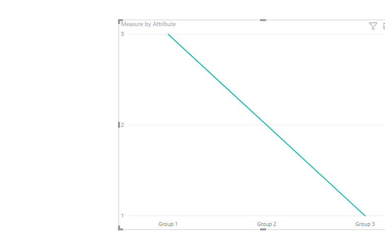
2. Then create a measure as below and add it to the line chart to get the result as we need.
Measure = CALCULATE(COUNTROWS('Table1 (2)'),FILTER('Table1 (2)','Table1 (2)'[Value]<>BLANK()))
Please check the pbix as attached.
Regards,
Frank
If this post helps, then please consider Accept it as the solution to help the others find it more quickly.
- Mark as New
- Bookmark
- Subscribe
- Mute
- Subscribe to RSS Feed
- Permalink
- Report Inappropriate Content
Thanks a lot Frank. This really helped![]()
Helpful resources

Power BI Dataviz World Championships
The Power BI Data Visualization World Championships is back! Get ahead of the game and start preparing now!

| User | Count |
|---|---|
| 66 | |
| 47 | |
| 41 | |
| 36 | |
| 23 |
| User | Count |
|---|---|
| 189 | |
| 124 | |
| 106 | |
| 78 | |
| 52 |


