FabCon is coming to Atlanta
Join us at FabCon Atlanta from March 16 - 20, 2026, for the ultimate Fabric, Power BI, AI and SQL community-led event. Save $200 with code FABCOMM.
Register now!- Power BI forums
- Get Help with Power BI
- Desktop
- Service
- Report Server
- Power Query
- Mobile Apps
- Developer
- DAX Commands and Tips
- Custom Visuals Development Discussion
- Health and Life Sciences
- Power BI Spanish forums
- Translated Spanish Desktop
- Training and Consulting
- Instructor Led Training
- Dashboard in a Day for Women, by Women
- Galleries
- Data Stories Gallery
- Themes Gallery
- Contests Gallery
- QuickViz Gallery
- Quick Measures Gallery
- Visual Calculations Gallery
- Notebook Gallery
- Translytical Task Flow Gallery
- TMDL Gallery
- R Script Showcase
- Webinars and Video Gallery
- Ideas
- Custom Visuals Ideas (read-only)
- Issues
- Issues
- Events
- Upcoming Events
Learn from the best! Meet the four finalists headed to the FINALS of the Power BI Dataviz World Championships! Register now
- Power BI forums
- Forums
- Get Help with Power BI
- Desktop
- Re: Add data points to filled map
- Subscribe to RSS Feed
- Mark Topic as New
- Mark Topic as Read
- Float this Topic for Current User
- Bookmark
- Subscribe
- Printer Friendly Page
- Mark as New
- Bookmark
- Subscribe
- Mute
- Subscribe to RSS Feed
- Permalink
- Report Inappropriate Content
Add data points to filled map
Hello All,
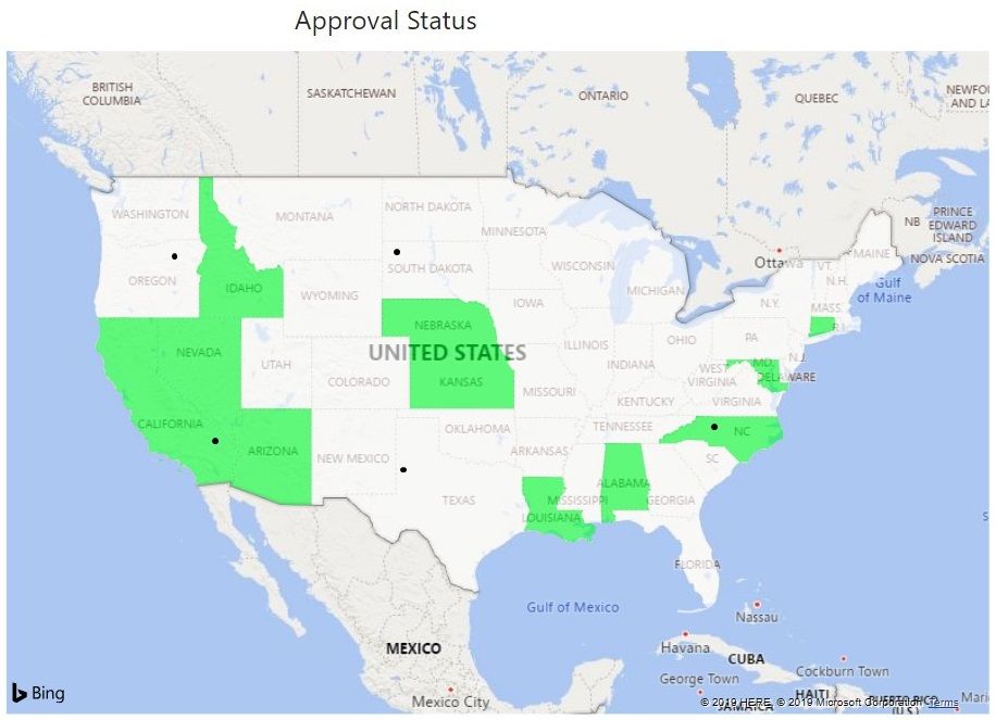
I have a simple filled map where I would like to include a handful of data points, in this case field offices. The states are shaded based on whether I am approved in that state (shown in green below). I've added the field office points manually using a graphics program so that you can see an example of what I am pursuing. I have searched the Power BI community board without success. I have also attemped to create this using R Visual, however it is beyond my working knowledge of R. I was able to plot the map and points, but I could not get the state shading to work at all. It seems like a simple task and I'm sure I'm overlooking an option through PBI.
Any help you can offer will be greatly appreciated. Thank you!
- Mark as New
- Bookmark
- Subscribe
- Mute
- Subscribe to RSS Feed
- Permalink
- Report Inappropriate Content
@geotech Hi there! were you able to resolve your scenario? am also facing the same scenario. please share any resolutions on this.
Thanks!
- Mark as New
- Bookmark
- Subscribe
- Mute
- Subscribe to RSS Feed
- Permalink
- Report Inappropriate Content
@geotech so I understood your question, you want to shade the State but at the same time you want to show a point where the acctual office is? Is this correct understanding?
Subscribe to the @PowerBIHowTo YT channel for an upcoming video on List and Record functions in Power Query!!
Learn Power BI and Fabric - subscribe to our YT channel - Click here: @PowerBIHowTo
If my solution proved useful, I'd be delighted to receive Kudos. When you put effort into asking a question, it's equally thoughtful to acknowledge and give Kudos to the individual who helped you solve the problem. It's a small gesture that shows appreciation and encouragement! ❤
Did I answer your question? Mark my post as a solution. Proud to be a Super User! Appreciate your Kudos 🙂
Feel free to email me with any of your BI needs.
- Mark as New
- Bookmark
- Subscribe
- Mute
- Subscribe to RSS Feed
- Permalink
- Report Inappropriate Content
Hi @parry2k, you are correct. There are essentially two sets of data being displayed (or desired to be displayed).
- Mark as New
- Bookmark
- Subscribe
- Mute
- Subscribe to RSS Feed
- Permalink
- Report Inappropriate Content
Hi @geotech ,
After my research, I'm afraid it couldn't achieve in Power BI for now. Maybe you could try to generate a custom map visual,refer to this post:Filled regions and points on map. You can also come up with a new idea and add your comments there to make this feature coming sooner. Here is a similar idea, you can vote: Add customized points on Filled Map
Best Regards,
Community Support Team _ Joey
If this post helps, then please consider Accept it as the solution to help the other members find it more quickly.
- Mark as New
- Bookmark
- Subscribe
- Mute
- Subscribe to RSS Feed
- Permalink
- Report Inappropriate Content
@v-joesh-msft , thanks for that - the response seems to be similar to a few posts that I've come across after digging around the community. I'll do my part and vote on similar suggestions. Do you happen to have a good resource for developing maps in R Visual where I can format states based on certain conditions? I realize this isn't a R forum - I've searched on this topic for a few hours today and haven't come across anything yet on this topic.
Helpful resources

Join our Fabric User Panel
Share feedback directly with Fabric product managers, participate in targeted research studies and influence the Fabric roadmap.

Power BI Monthly Update - February 2026
Check out the February 2026 Power BI update to learn about new features.

| User | Count |
|---|---|
| 66 | |
| 60 | |
| 45 | |
| 19 | |
| 15 |
| User | Count |
|---|---|
| 108 | |
| 108 | |
| 41 | |
| 30 | |
| 27 |

