FabCon is coming to Atlanta
Join us at FabCon Atlanta from March 16 - 20, 2026, for the ultimate Fabric, Power BI, AI and SQL community-led event. Save $200 with code FABCOMM.
Register now!- Power BI forums
- Get Help with Power BI
- Desktop
- Service
- Report Server
- Power Query
- Mobile Apps
- Developer
- DAX Commands and Tips
- Custom Visuals Development Discussion
- Health and Life Sciences
- Power BI Spanish forums
- Translated Spanish Desktop
- Training and Consulting
- Instructor Led Training
- Dashboard in a Day for Women, by Women
- Galleries
- Data Stories Gallery
- Themes Gallery
- Contests Gallery
- QuickViz Gallery
- Quick Measures Gallery
- Visual Calculations Gallery
- Notebook Gallery
- Translytical Task Flow Gallery
- TMDL Gallery
- R Script Showcase
- Webinars and Video Gallery
- Ideas
- Custom Visuals Ideas (read-only)
- Issues
- Issues
- Events
- Upcoming Events
View all the Fabric Data Days sessions on demand. View schedule
- Power BI forums
- Forums
- Get Help with Power BI
- Desktop
- Re: 24 hour based gantt
- Subscribe to RSS Feed
- Mark Topic as New
- Mark Topic as Read
- Float this Topic for Current User
- Bookmark
- Subscribe
- Printer Friendly Page
- Mark as New
- Bookmark
- Subscribe
- Mute
- Subscribe to RSS Feed
- Permalink
- Report Inappropriate Content
24 hour based gantt
HI,
I have table with tasks done by staff, and each task has field Start_Date_Time and Close_Date_Time. As all tasks last just few hours and finish same day, I would like to display that in gantt chart but with hours on duration axis. Advice please how to do this. Thanks
Solved! Go to Solution.
- Mark as New
- Bookmark
- Subscribe
- Mute
- Subscribe to RSS Feed
- Permalink
- Report Inappropriate Content
Thanks for your quick answer,
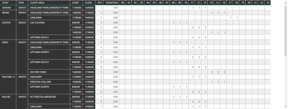
As there is no visual for hour based gantt, I created matrix with additional columns for hour based status. Formula example is 08 = IF(AND(HOUR(SCHEDUAL_TBL[START])<=8;HOUR(SCHEDUAL_TBL[CLOSE])>8);1;BLANK())
It would be interesting if Measure could be created with hours column headers, and having same result as one using new columns, and we can always use R solution http://community.powerbi.com/t5/R-Script-Showcase/Schedule-view/m-p/69026/thread-id/43
- Mark as New
- Bookmark
- Subscribe
- Mute
- Subscribe to RSS Feed
- Permalink
- Report Inappropriate Content
the mentioned 'as Timeline' AppSource is nice but is not free. I found a line chart will actually come close even if it's less pretty (removed some names with red):
It's a regular linechart with
- X-axis: time as a decimal value (03:15 becomes 3.25) for a continuous x-axis, from a floating time dimension with a record for each minute from 00:00 to 23:59
- Y-axis: The measure 'ExecutionLine' below.
- Legend: In my case an execution package name.
- Tooltips: Properly formatted times
- Data labels: Title -> Content: Custom -> The measure 'PackageLabel' below.
Measures:
'Tijd'[Tijd_continuous] is the floating dimension with 24*60 minutes as decimal.
[Package_ranking_perdag] was added in the data to get the execution packages to show on different heights in the chart. Like this: row_number() over (partition by [Datum] order by [Starttijd], [ExecutionPackageId]). So 1 for the first package that day then +1 for each package afterwards.
[Starttijd_continuous] and [Eindtijd_continuous] are the start and end times of each package, but they need to have the same datatype as 'Tijd'[Tijd_continuous] to show properly in the chart.
PackageLabel =
VAR currentTime = MAX( 'Tijd'[Tijd_continuous] )
VAR endTime = SELECTEDVALUE( 'PackageExecutionTime'[Eindtijd_continuous] )
VAR packageName = SELECTEDVALUE( 'ExecutionPackages'[ExecutionPackage] )
VAR duration = SELECTEDVALUE( 'PackageExecutionTime'[Duur_hhmm] )
VAR tolerance = 0.005 --in case the data types vary between dimension and fact
RETURN
IF(ABS(currentTime - endTime) <= tolerance, packageName & ": " & duration, BLANK())
- Mark as New
- Bookmark
- Subscribe
- Mute
- Subscribe to RSS Feed
- Permalink
- Report Inappropriate Content
I know it's been a few years since this question was posed and answered but I am having the same problems and came across this post. I found a visual in AppSource called as Timeline that allows you to create a Gnatt chart with hours/mins.
- Mark as New
- Bookmark
- Subscribe
- Mute
- Subscribe to RSS Feed
- Permalink
- Report Inappropriate Content
@Anonymous
There is no Hour type for current version of Gantt visual. Please vote this idea here to make it possible in future version.
Best Regards,
Herbert
- Mark as New
- Bookmark
- Subscribe
- Mute
- Subscribe to RSS Feed
- Permalink
- Report Inappropriate Content
Thanks for your quick answer,
As there is no visual for hour based gantt, I created matrix with additional columns for hour based status. Formula example is 08 = IF(AND(HOUR(SCHEDUAL_TBL[START])<=8;HOUR(SCHEDUAL_TBL[CLOSE])>8);1;BLANK())
It would be interesting if Measure could be created with hours column headers, and having same result as one using new columns, and we can always use R solution http://community.powerbi.com/t5/R-Script-Showcase/Schedule-view/m-p/69026/thread-id/43
- Mark as New
- Bookmark
- Subscribe
- Mute
- Subscribe to RSS Feed
- Permalink
- Report Inappropriate Content
Creating matrix seems to be a good alternative. ![]()
Best Regards,
Herbert
Helpful resources

Power BI Monthly Update - November 2025
Check out the November 2025 Power BI update to learn about new features.

Fabric Data Days
Advance your Data & AI career with 50 days of live learning, contests, hands-on challenges, study groups & certifications and more!


