FabCon is coming to Atlanta
Join us at FabCon Atlanta from March 16 - 20, 2026, for the ultimate Fabric, Power BI, AI and SQL community-led event. Save $200 with code FABCOMM.
Register now!- Power BI forums
- Get Help with Power BI
- Desktop
- Service
- Report Server
- Power Query
- Mobile Apps
- Developer
- DAX Commands and Tips
- Custom Visuals Development Discussion
- Health and Life Sciences
- Power BI Spanish forums
- Translated Spanish Desktop
- Training and Consulting
- Instructor Led Training
- Dashboard in a Day for Women, by Women
- Galleries
- Data Stories Gallery
- Themes Gallery
- Contests Gallery
- QuickViz Gallery
- Quick Measures Gallery
- Visual Calculations Gallery
- Notebook Gallery
- Translytical Task Flow Gallery
- TMDL Gallery
- R Script Showcase
- Webinars and Video Gallery
- Ideas
- Custom Visuals Ideas (read-only)
- Issues
- Issues
- Events
- Upcoming Events
The Power BI Data Visualization World Championships is back! Get ahead of the game and start preparing now! Learn more
- Power BI forums
- Forums
- Get Help with Power BI
- Desktop
- Re: 2 Y axis - columns to have no spaces
- Subscribe to RSS Feed
- Mark Topic as New
- Mark Topic as Read
- Float this Topic for Current User
- Bookmark
- Subscribe
- Printer Friendly Page
- Mark as New
- Bookmark
- Subscribe
- Mute
- Subscribe to RSS Feed
- Permalink
- Report Inappropriate Content
2 Y axis - columns to have no spaces
Hi
wow my first question!
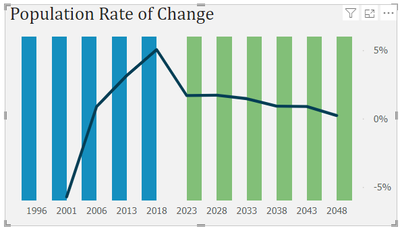
I have a 2 axis chart: but I want the columns on the 1st axis to be a completely filled space - ie all blue on one side and all green on the other - no visible space inbetween the columns.
Here is my chart - so the blue represents population actuals, and the green represents predicted values
I used a measure of 1 to build the 1st column axis and the population rate as the 2nd line axis
the measure of 1 is coloured with the record 'type' to show actual v predicted
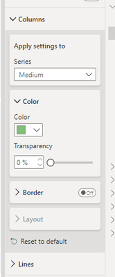
But I would rather just shade the columns to look like a 'background' on the chart
columns layer are greyed out
any ideas how I can achieve my chart?
- Mark as New
- Bookmark
- Subscribe
- Mute
- Subscribe to RSS Feed
- Permalink
- Report Inappropriate Content
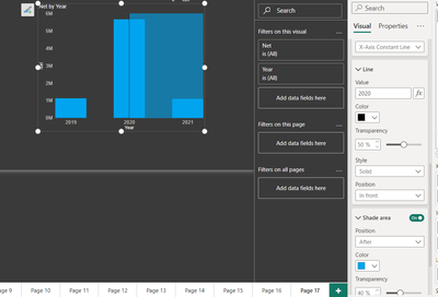
@grayv , Hope year's data type is number, the you can add X-axis Constant reference lines. (Reference line in format or old analytics pane) . Post that you can have line based on measure using Fx, I used static value.
measure you need for constant line
Maxx(filter( values(Date[Year]), not(isblank([Actual])) ), [Year])
- Mark as New
- Bookmark
- Subscribe
- Mute
- Subscribe to RSS Feed
- Permalink
- Report Inappropriate Content
thanks for that ill give it a go and let you know 😊
& yes Year is #
Helpful resources

Power BI Monthly Update - November 2025
Check out the November 2025 Power BI update to learn about new features.

Fabric Data Days
Advance your Data & AI career with 50 days of live learning, contests, hands-on challenges, study groups & certifications and more!

| User | Count |
|---|---|
| 57 | |
| 43 | |
| 40 | |
| 21 | |
| 17 |


