FabCon is coming to Atlanta
Join us at FabCon Atlanta from March 16 - 20, 2026, for the ultimate Fabric, Power BI, AI and SQL community-led event. Save $200 with code FABCOMM.
Register now!- Power BI forums
- Get Help with Power BI
- Desktop
- Service
- Report Server
- Power Query
- Mobile Apps
- Developer
- DAX Commands and Tips
- Custom Visuals Development Discussion
- Health and Life Sciences
- Power BI Spanish forums
- Translated Spanish Desktop
- Training and Consulting
- Instructor Led Training
- Dashboard in a Day for Women, by Women
- Galleries
- Data Stories Gallery
- Themes Gallery
- Contests Gallery
- Quick Measures Gallery
- Notebook Gallery
- Translytical Task Flow Gallery
- TMDL Gallery
- R Script Showcase
- Webinars and Video Gallery
- Ideas
- Custom Visuals Ideas (read-only)
- Issues
- Issues
- Events
- Upcoming Events
To celebrate FabCon Vienna, we are offering 50% off select exams. Ends October 3rd. Request your discount now.
- Power BI forums
- Forums
- Get Help with Power BI
- Desktop
- Re: 100% stacked bar chart - same legend, multiple...
- Subscribe to RSS Feed
- Mark Topic as New
- Mark Topic as Read
- Float this Topic for Current User
- Bookmark
- Subscribe
- Printer Friendly Page
- Mark as New
- Bookmark
- Subscribe
- Mute
- Subscribe to RSS Feed
- Permalink
- Report Inappropriate Content
100% stacked bar chart - same legend, multiple values
Hi,
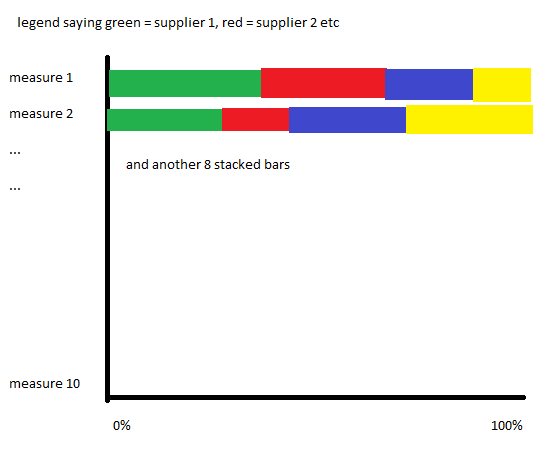
I'm having trouble getting a visual running for the data I want to show - I've got ten different csv's which are showing a bunch of different data, and the only thing they all have in common is a supplier column, the only relationships are one to many between each csv and a table I've made through merging the lot of them on the supplier column and removing all the duplicates. I've got a simple measure on each of them counting the rows which I'm feeding into cards to give an overall total of each, but I want to create a stacked bar chart to show the percentage breakdown by supplier of each measure, so something like this:
I can get one measure in fine, but only one - is there a way to get this to work in just the one visual, or some custom visual that has this functionality?
Solved! Go to Solution.
- Mark as New
- Bookmark
- Subscribe
- Mute
- Subscribe to RSS Feed
- Permalink
- Report Inappropriate Content
This can be ignored now, I've got it working by the needlessly convoluted method of adding a custom text column to every CSV with the name of each measure, appending all the CSV's together, making a new countrows measure on the new query and using the custom column as the axis
- Mark as New
- Bookmark
- Subscribe
- Mute
- Subscribe to RSS Feed
- Permalink
- Report Inappropriate Content
Just faced the same issue - would you mind providing a sample pbix? or at least a formula to get that countrows?
How does time work in this instance? Just a slicer outside the chart?
Thank you!


