- Subscribe to RSS Feed
- Mark Topic as New
- Mark Topic as Read
- Float this Topic for Current User
- Bookmark
- Subscribe
- Printer Friendly Page
- Mark as New
- Bookmark
- Subscribe
- Mute
- Subscribe to RSS Feed
- Permalink
- Report Inappropriate Content
100% stacked bar chart format
Heres a very simple one...so simple i am ashamed to post it here .....(but i just can't see the formatting option in PBI desktop)
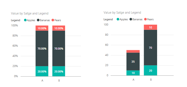
Got a 100% stacked bar chart.
Which automatically the data label displays the value of each bucket as a % of the total values.
How can i get the data label to display the value not the %.
eg
legend,value,%
apples,10,20%
bananas,35,70%
pears,5,10%
I want pear data label to display 5 not 10% ???
I know i can drop the value into tooltip to see value but I want it on the chart not in the tooltip.
Help
- Mark as New
- Bookmark
- Subscribe
- Mute
- Subscribe to RSS Feed
- Permalink
- Report Inappropriate Content
Hi @DavidMoss
This is probably way past any requirement you may have had.
At present, this is still not possible in Power BI. Though, now, you can use one of the custom visuals to achieve this. This still has some minor limitations like Legend colours can be switched but not directly in Desktop. Unlike the ability to switch colours with the stock stacked charts.
Download link for the custom visual in this page
https://pbivizedit.com/gallery/column_100stack_label_value
the link is to a column chart, but a horizontal bar chart can be achieved as well using the editor in website
This was made with our Custom Visual creator tool PBIVizEdit.com. With this tool,
- anyone, irrespective of technical skills, can create their own visuals
- 15 minutes to create a visual from scratch
- opens up many additional attributes to edit (for e.g. labels, tooltips, legends position, etc)
Give this a shot and let us know if you face any problem/errors.
You can use the editor to modify your visual further (some modifications cannot be done in Power BI window and have to be in editor).
thanks,
AsitM (PBIVizEdit)
- Mark as New
- Bookmark
- Subscribe
- Mute
- Subscribe to RSS Feed
- Permalink
- Report Inappropriate Content
I have the same issue. I need to have control over the label. I'd like to have a label field that it could put on each section, like the tooltip, but always visible. Can someone give us an idea if this is going to be implemented? It would save time trying to figure out some kind of work around or another software to solve my issue.
- Mark as New
- Bookmark
- Subscribe
- Mute
- Subscribe to RSS Feed
- Permalink
- Report Inappropriate Content
Any news or other visualizations which can resolve this? Facing the same issue.
- Mark as New
- Bookmark
- Subscribe
- Mute
- Subscribe to RSS Feed
- Permalink
- Report Inappropriate Content
Has this issue been resolved by MS? This is the exact graph I need without the % as the Y axis, it makes no sense to have that there and any other graph used like the 'Stacked' one isn't what I need. Seems ridiculous that this has been an issue for this long.
- Mark as New
- Bookmark
- Subscribe
- Mute
- Subscribe to RSS Feed
- Permalink
- Report Inappropriate Content
Hi, do you know if the problem has been solved?
Thank you very much for your help
- Mark as New
- Bookmark
- Subscribe
- Mute
- Subscribe to RSS Feed
- Permalink
- Report Inappropriate Content
I have the same requirement, as this sort of visual is very handy.
I can do it in Excel, so dissapointing we still can't do it in Power Bi.
- Mark as New
- Bookmark
- Subscribe
- Mute
- Subscribe to RSS Feed
- Permalink
- Report Inappropriate Content
I have also tried to do this in the past without success. Tried again today hoping that it has been added to some recent update to Power BI but sadly it still doesn't exist.
- Mark as New
- Bookmark
- Subscribe
- Mute
- Subscribe to RSS Feed
- Permalink
- Report Inappropriate Content
This is also a feature that I really need, disappointed it has not been added yet still!
- Mark as New
- Bookmark
- Subscribe
- Mute
- Subscribe to RSS Feed
- Permalink
- Report Inappropriate Content
This is also a feature that I really need, disappointed it has not been added yet still!
- Mark as New
- Bookmark
- Subscribe
- Mute
- Subscribe to RSS Feed
- Permalink
- Report Inappropriate Content
Hello David,
That isn't possible yet. Why you don't use the Stacked bar chart.
Turn on the data labels and you will get were you are looking for.
Hope that will help for you!
Kind Regards,
Jorre
- Mark as New
- Bookmark
- Subscribe
- Mute
- Subscribe to RSS Feed
- Permalink
- Report Inappropriate Content
Thanks but no thanks....we know we can do that with stacked vertical charts. My question was specifically for the horizontal 100% charts which my client requires displaying as per my question.
Oh well its reassuring to know that at least that there are 2 of us whom cannot get the result i require.
BUt kind of sad that such a simple formatting option which in the depth of the native source code of Power BI i am sure would not be that difficult to activate....lets hope an MS Power BI program manger has just read that !!
I'll post it to the Ideas and see if anyone offers this some of their voting weight.
Cheers David
- Mark as New
- Bookmark
- Subscribe
- Mute
- Subscribe to RSS Feed
- Permalink
- Report Inappropriate Content
Hi @DavidMoss,
I donot think it's make sense to display actual value on 100% stacked bar chart. Besacuse the Y-asix 100% stacked bar chart is Percentage. For example if you have the value below.
| Country | Legend | Value | Percentage |
| A | Apples | 10 | 20% |
| A | Bananas | 35 | 70% |
| A | Pears | 5 | 10% |
| B | Apples | 20 | 20% |
| B | Bananas | 70 | 70% |
| B | Pears | 10 | 10% |
As you can see, Apples value count 20% percentage in each country, but in country A is value is 10, and in country B is 20. If you dislay value on 100% stacked bar chart, then is should have different high. However they count same percentage in each country and they have the same high on 100% stacked bar chart.
Regards,
Charlie Liao
- Mark as New
- Bookmark
- Subscribe
- Mute
- Subscribe to RSS Feed
- Permalink
- Report Inappropriate Content
In fact showing the value makes a lot of sense because it allows another measure to be described within a single chart... a 100% stacked chart should allow you to quickly sense changes in composition (for example, sales by product line) over whatever is the X axis, but as you already said, it tells you nothing about the volume (or importance of those changes)
As it is now you could easily see that - let's say - Fruit sales went from 25% to 50% from Jan to Feb but... was that because you sold more Fruits? or because you sold less of the other products? is it truly relevant because in Feb you sell the same or a lot more than in Jan? or it is neglible because that particular Feb you almost did no sale at all?
See all those question could be answered with a 100% stacked chart that *also* allowed you to display a value but can't be answered as it is now
Makes sense?
- Mark as New
- Bookmark
- Subscribe
- Mute
- Subscribe to RSS Feed
- Permalink
- Report Inappropriate Content
@jcr1968es I can feel you have experienced the same pain i did when needing both % & values in the 100% stacked chart.
The 2 values complement each other and help consumers avoid any negligible value differnces that can have large % variances.
Think doubling sales from 1 USD to 2 USD = 100% in an emerging market and comparing that to your mature market which goes from 1 Million USD to 1.1 Million USD = 10%. I know i'd want to draw attention to the 10% irrespective of the 100% emerging market's success.
David
Helpful resources
| Subject | Author | Posted | |
|---|---|---|---|
| 08-31-2024 02:05 PM | |||
| 08-26-2024 08:09 AM | |||
| 11-05-2024 03:06 PM | |||
| 12-19-2024 04:54 PM | |||
| 10-10-2024 11:54 AM |
| User | Count |
|---|---|
| 131 | |
| 102 | |
| 85 | |
| 53 | |
| 46 |


