Join the #PBI10 DataViz contest
Power BI is turning 10, and we’re marking the occasion with a special community challenge. Use your creativity to tell a story, uncover trends, or highlight something unexpected.
Get started- Power BI forums
- Get Help with Power BI
- Desktop
- Service
- Report Server
- Power Query
- Mobile Apps
- Developer
- DAX Commands and Tips
- Custom Visuals Development Discussion
- Health and Life Sciences
- Power BI Spanish forums
- Translated Spanish Desktop
- Training and Consulting
- Instructor Led Training
- Dashboard in a Day for Women, by Women
- Galleries
- Webinars and Video Gallery
- Data Stories Gallery
- Themes Gallery
- Contests Gallery
- Quick Measures Gallery
- Notebook Gallery
- Translytical Task Flow Gallery
- R Script Showcase
- Ideas
- Custom Visuals Ideas (read-only)
- Issues
- Issues
- Events
- Upcoming Events
Join us for an expert-led overview of the tools and concepts you'll need to become a Certified Power BI Data Analyst and pass exam PL-300. Register now.
- Power BI forums
- Forums
- Get Help with Power BI
- Desktop
- 100% clustered column chart in Power BI?
- Subscribe to RSS Feed
- Mark Topic as New
- Mark Topic as Read
- Float this Topic for Current User
- Bookmark
- Subscribe
- Printer Friendly Page
- Mark as New
- Bookmark
- Subscribe
- Mute
- Subscribe to RSS Feed
- Permalink
- Report Inappropriate Content
100% clustered column chart in Power BI?
Hello, I use the clustered column chart in a lot of my dashboards, but I cannot see one that can be used when the value is a %. For these I'm using the 100% stacked column chart but the clustered would be much better. Can anyone advise how to create a 100% clustered chart? Many thanks
Solved! Go to Solution.
- Mark as New
- Bookmark
- Subscribe
- Mute
- Subscribe to RSS Feed
- Permalink
- Report Inappropriate Content
Hi @Anthea,
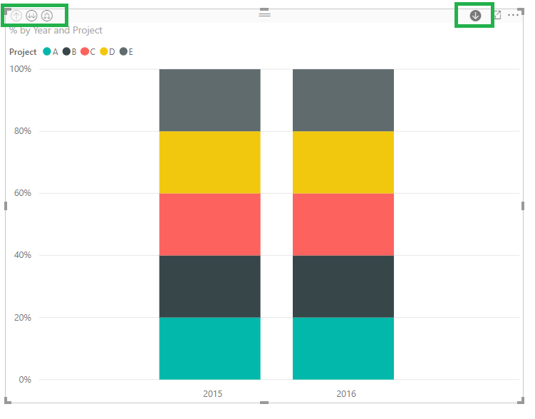
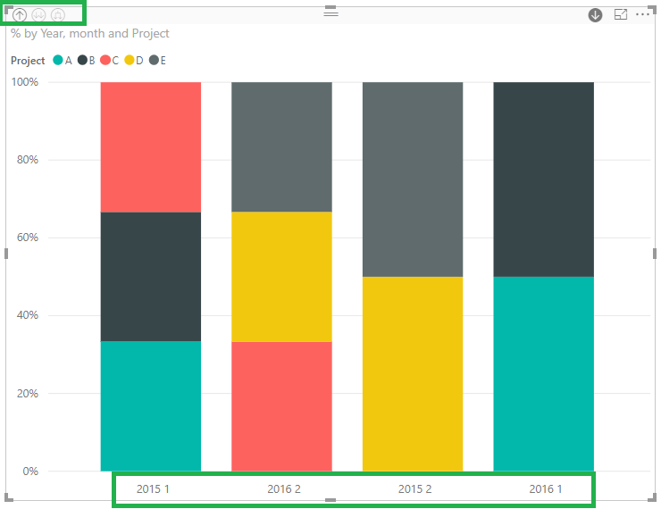
Do you want have Year and month on your X-axis? In this case use the 100% stacked column chart and place both year and month on tyour x-axis you will get an hierarchy that will allow you to have both years and months on the same chart.
If you double click the year it will give you the months for the select year, if youclick on the last arrow it give you the image on the bottom with all years and months.
Read this documentation regarding the hierarchy use, this works for all type of visuals.
Regards.
MFelix
Regards
Miguel Félix
Did I answer your question? Mark my post as a solution!
Proud to be a Super User!
Check out my blog: Power BI em Português- Mark as New
- Bookmark
- Subscribe
- Mute
- Subscribe to RSS Feed
- Permalink
- Report Inappropriate Content
Hi @Anthea,
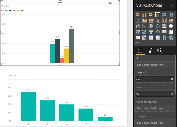
You can use the % on any of the charts you have, so if you had the % column to a clustered bar chart it will give you the results you need:
Top chart is categories in legend bottom is categories on axis, however you can also have values on both axis and legends.
Regards,
MFelix
Regards
Miguel Félix
Did I answer your question? Mark my post as a solution!
Proud to be a Super User!
Check out my blog: Power BI em Português- Mark as New
- Bookmark
- Subscribe
- Mute
- Subscribe to RSS Feed
- Permalink
- Report Inappropriate Content
HI M Felix, thanks for the response.
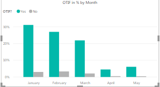
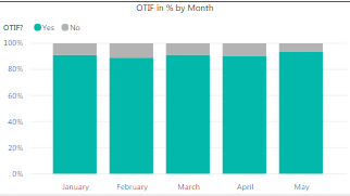
When I try this using the Clustered column chart it converts my data to a % but so that the totals across the x axis total 100%, rather than each value totalling 100%.
On my attached example the green columns across the months total 100%, however I would want the amount in January to total 100% (between those that are 'yes' and those that are 'no')
This is how it appears when I do the 100% stacked column which is how I would like it to appear as it gives the right percentage values, however the benefit for me of using a clustered chart is that I can then show the values across different years in the legend. Is that possible?
Many thanks
- Mark as New
- Bookmark
- Subscribe
- Mute
- Subscribe to RSS Feed
- Permalink
- Report Inappropriate Content
Hi @Anthea,
Do you want have Year and month on your X-axis? In this case use the 100% stacked column chart and place both year and month on tyour x-axis you will get an hierarchy that will allow you to have both years and months on the same chart.
If you double click the year it will give you the months for the select year, if youclick on the last arrow it give you the image on the bottom with all years and months.
Read this documentation regarding the hierarchy use, this works for all type of visuals.
Regards.
MFelix
Regards
Miguel Félix
Did I answer your question? Mark my post as a solution!
Proud to be a Super User!
Check out my blog: Power BI em Português- Mark as New
- Bookmark
- Subscribe
- Mute
- Subscribe to RSS Feed
- Permalink
- Report Inappropriate Content
Great thank you!
Helpful resources

Join our Fabric User Panel
This is your chance to engage directly with the engineering team behind Fabric and Power BI. Share your experiences and shape the future.

Power BI Monthly Update - June 2025
Check out the June 2025 Power BI update to learn about new features.

| User | Count |
|---|---|
| 79 | |
| 73 | |
| 58 | |
| 36 | |
| 32 |
| User | Count |
|---|---|
| 90 | |
| 62 | |
| 61 | |
| 49 | |
| 45 |
